Results 141 to 160 of 422
Thread: Automobile 101
-
30th May 2012, 03:42 PM #141
-
10th June 2012, 02:45 AM #142
-
10th June 2012, 08:51 PM #143
Re: Automobile 101
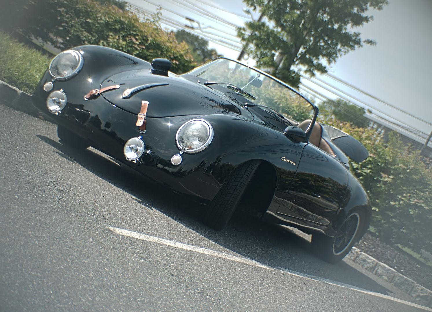
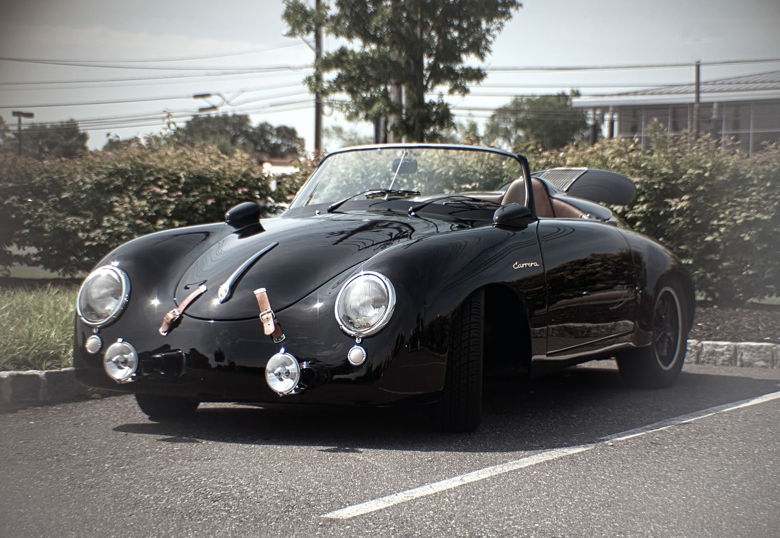
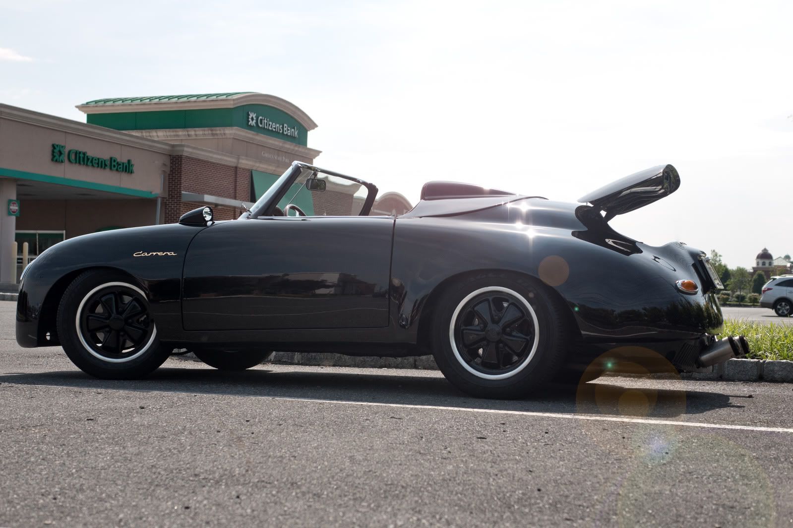
The Impala was a bench test, yesterday I shot most of my photos +/- .66EV to see how well HDR on cars would work. As I was sorting the photos the Impala caught my eye for a first edit. Here is a Porsche 356R...R for Replica...

3 shot 00, +.66, -.66 HDR played with the settings, cleaned up the image, then dropped in a vib/sat layer.
Thanks
Ryo
-
11th June 2012, 09:31 AM #144
-
11th June 2012, 11:41 AM #145
Re: Automobile 101
Hi Ryo, the images of the cars are great but the backgrounds, particularly poles and wires detract from the beauty of the vehicles. In the last one, a slightly different shooting angle can avoid the sun flair spots and bright green bank building.
-
11th June 2012, 07:50 PM #146
Re: Automobile 101
Frank, good looking out. I had considered blowing out the skyline to kill the poles and wires. (also cloning them out) But at that point I may as well cut out the car and place it in a custom backdrop, PS style. It is the nature of shooting at the coffee and cars location. I have offered to shoot any of these fine autos in better surroundings but as of yet no one has taken me up on my offer. So mostly I use the photos for experimenting and learning and refining editing techniques, so when the time comes to do a proper shoot I will be well prepared. The lens flare on the last shot was PS'd in.
Thanks
Ryo
-
12th June 2012, 12:09 PM #147
-
13th June 2012, 03:30 AM #148
-
13th June 2012, 11:39 AM #149
Re: Automobile 101
Really digging the shots Jon, see you were out and about in the Auto Ambulance! One shot I would try is the head on shot but looking up from the ground. That grill is really cool. Hope you dont mind but I snagged pic #2 to see how it would look slightly PS'd. Here are my results:

Added in a vib/sat layer, brought back a hint of color in what I thought were the main features. Burned/Dodged the at 10% to give a bit more drama, and finished with a gradient boarder to draw back to the headlight.
Here is a project I have been working on for two days, its the same shot that I posted on the 10th, but PS in the back ground and worked the blending. Step by step in just 4 layers.

Hope to see you work out a good time on that R8, looking forward to seeing the final images.
Thanks
RyoLast edited by Ryogenetic; 14th June 2012 at 12:06 PM.
-
13th June 2012, 12:24 PM #150
Re: Automobile 101
Now you are really rocking!
I am totally sucked in by the beauty of the composition to the point that I have to force myself to stop and think about the post processing.
And that's the way it should be.
The viewer should be so taken in by the image that even a fellow photographer doesn't think about how it was processed but rather sits back and enjoys the image for what it delivers.
-
13th June 2012, 07:41 PM #151
Re: Automobile 101
Ryo, thanks for the comments. Snag away whatever you would like, I don't do PS so I am always interested in what can be done with some of these shots (by people who have far more knowledge than I). I will be back, hopefully with more time(maybe even while I am not working). I thought of the low angle front end shot about the time I got 2 miles away, kicked myself but knew I would be back. I am hopeful that this Saturday will work out for the R8. I will post when done, that is for sure.
I love what you have done with the 356r. I have to say "ditto" to Franks comments. Very nicely done.
-
13th June 2012, 08:22 PM #152
-
13th June 2012, 11:42 PM #153
Re: Mean green
Frank,
Thanks; your comments are truly a treat. It pleases me to no end to have someone with your Post processing skills, give pause and not see the edited image but the complete package. I have got to keep reminding myself when I shoot to make good compositions,(seems I forget it all the time) and so I can leave this editing backgrounds behind. I would be interested to hear your feed back on what you can pick out of my 4 layer edit.
Jon,
Thanks, I will be awaiting both the lower shot and the R8.
Trevor,
Looks like you got the upgraded model with chrome trim. Good time of year to shoot the dry grass and leafless trees make the green pop.
Porsche engine bay:

Liked the way the hood looked on this Packard:

Cant go wrong on a GTR headlight:

RyoLast edited by Ryogenetic; 14th June 2012 at 12:06 AM. Reason: Forgot pictures...
-
14th June 2012, 02:23 AM #154
Re: Mean green
Ryo, I'm not sure what you are looking for in the way of feedback. Without any knowledge of what you did in each of the four layers I couldn't provide effective feedback on anything but the completed image.
-
14th June 2012, 09:29 AM #155
Re: Mean green
Frank, I am always seeking to improve my editing skills. I took a 2 days working on the 356. I would edit, leave it alone, edit some more, leave it, see something that needed a bit of a tweak, edit. Its a new to me process, usually I can see most of what needs to be matched from the start. This time I took the time to try and get everything just right. I was looking for feedback from your knowledgeable set of eyes to see if you could find any tale tell signs of Photoshopping. Pixel peeping as it were.
Thanks
Ryo
-
14th June 2012, 10:08 AM #156
-
14th June 2012, 12:09 PM #157
Re: Mean green
Ho-boy! OK. Here goes. I hope I don’t hurt your feelings.
My take on this is that if someone is going to pixel-peep an image, their goal is not to enjoy the artistic value of the image but rather to find something wrong with it. Those folks should usually be ignored unless you know the person well and they are really trying to help.
The blending in this image has been post processed better than most of mine and the two day effort shows - or should I say 'goes unnoticed' as well it should.
If I look critically at the image with an eye to where it 'might' be improved I could start with a long list of what was done well but you already know that so I'll move on to the areas for improvement.
1. There is a necessary transition from asphalt to gravel under the front of the vehicle and part of the parking stripe is still visible. I say 'necessary' as that is the best way to retain the accuracy of the vehicle's shadow.
2. The car's shadow is very strong but the shadows of the brush are very soft.
3. The color in the mountains is that of a reflected sunset but the suns and sky’s reflections in the car surface doesn't match.
4. The background is desert wilderness but the reflection in the car is city streets complete with telephone poles and lots of wires, buildings and tall trees.
There are three primary levels of reaction one could expect to get when someone views a post processed image:
1. What the heck happened here? The errors are noticeable.
2. Nice image, I’ve seen a million of them. The errors aren’t obvious.
3. Now that’s really spectacular! Errors? What errors?
This image is obviously a ‘3’ in that regard so I wouldn’t worry about the minor pixel-peeping inconsistencies. Hope this helps!
-
14th June 2012, 01:18 PM #158
Re: Mean green
Frank, that is exactly what I am looking for, it is very helpful, this will allow me to work on some more process's. Thank you for taking the time to review and respond.
Sorry if this next bit is a ramble, but I use this as to keep notes.
1. I tried to blend out the parking stripe with replace color using three sets to kill the highlight, mids and shadows, perhaps I will clone by section, merged and continued bit by bit
2. When I search google for a backdrop I try to get and image with the lighting source in the same location, this one was a challenge.
3/4. Here I also used color replace on the side to try to match tones, picking from the mountains, and replacing the colors on the car, giving it that purple hue instead of the black that it is. As to the reflections, I will have to watch those while I am shooting the original, and work out a process for smoothing them out prior to insertion on a backdrop. One thing to be careful of is making the image to flat with too much smoothing. I am not entirely sure I can match it up, but I am kicking my self for not getting a shot where the grass is not touching the wheels.
Thanks again
Ryo
Results one:

Last edited by Ryogenetic; 14th June 2012 at 01:52 PM. Reason: Add edit
-
14th June 2012, 04:25 PM #159
Re: Mean green
You are probably at the point where additional post processing will start to degrade the image. I doubt that anyone noticed the things I mentioned so the real benefit of additional changes is not for this image but for your learning process to make the next one even better.
I find the more of this I do, the better and faster I become at the post processing and the easier it is to get the image closer to perfect in-camera. By continually asking yourself the 'what-if' questions and exploring the possible solutions you learn new techniques and determine what works well and what doesn't.
I ask myself "what if" I cloned in the desert gravel under the front of the car and then, given that the background shadows are soft, blend in just enough of the car's shadow to softly match the desert brush's shadow tone? Would I need to soften the shadow on the front tire to complete the look?
And "what if" I left the door panel untouched except for the subtle mountain color tone and softened or removed just the telephone pole? Would that give a sharper reflection on the door and make the eye think that the wires are actually lines formed by the edges of the clouds? Could I minimize the rear quarter telephone pole, particularly the transformer reflection without softening the rest of the panel to the point where it appears dull? Would the telephone wires be obvious if there was no telephone pole?
And "what if", (oh, there I go again...) I just softened the sun's reflection in the front quarter and just add a hint of mountain color around it? Would that match the 'sunset' look better? Could I then retain the essence of the sharp reflections which make the car's finish really 'pop'?
“What if” I changed the reflection of the building in the front quarter just enough to look like foliage by removing the sharp straight edge and replace it with a sharp foliage edge?
"What if" I copied the logo and then flipped the image then pasted the logo back in. Would the image look better if the heavy black of the car were on the right side of the composition so that the eye travels from left to right in the composition?
I don't know the answers to these questions but by continuously asking myself questions like these and experimenting, I come up with the kinds of results you see in my P51 thread, and no, it doesn't always work out!
We could spend days playing with the 'what if' options but at some point we'd need to wrap this one up, grab the camera and our new-found techniques and go get some fresh images to play with!
I am enjoying watching your PP skills improve with each new experience. Hope this helps!
Last edited by FrankMi; 15th June 2012 at 12:38 AM.
-
15th June 2012, 08:52 PM #160

 Helpful Posts:

 Reply With Quote


