Page 1 of 2 12 LastLast
Results 1 to 20 of 26

Thread: what I hate to do

  1. #1
    Plumcrak's Avatar
    Join Date
    Feb 2012
    Location
    Ft. Wayne, Indiana
    Posts
    1,548
    Real Name
    Jon

    what I hate to do

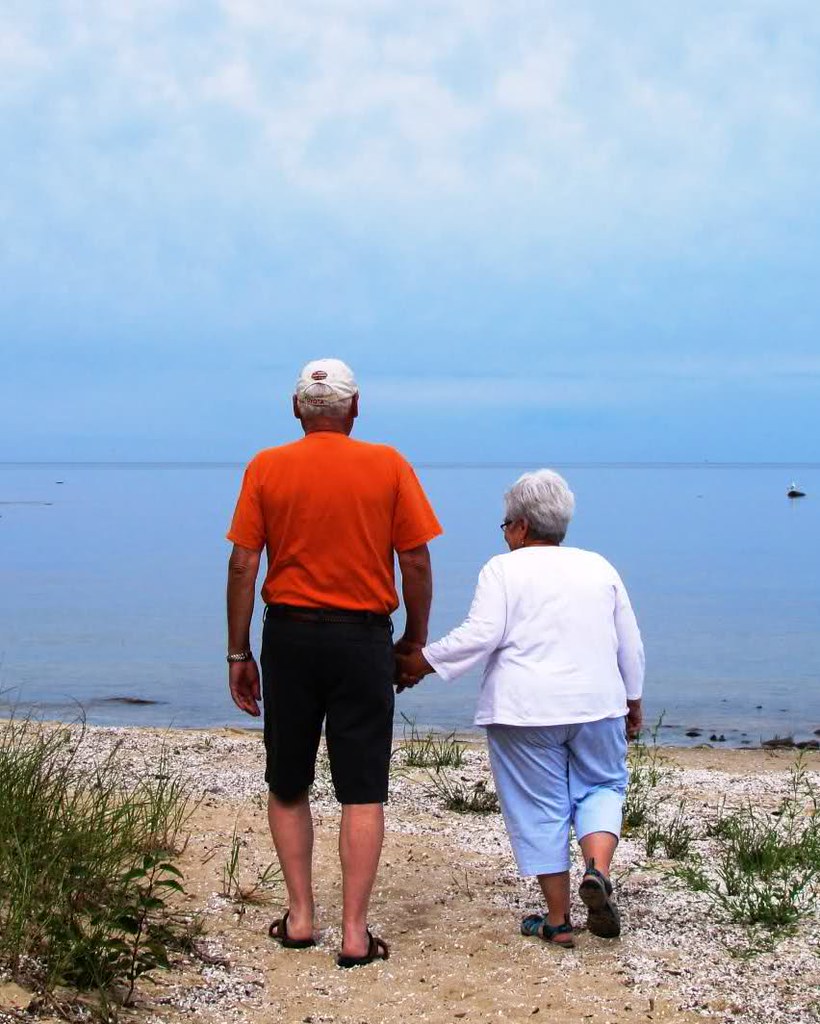
    I have never , even remotely, liked any picture I have ever taken with people in it. But for some reason I kinda like this one. Is it because it is Mom and Dad? Thoughts please. Maybe I will try to work on my people skills??what I hate to do

  2. #2
    FrankMi's Avatar
    Join Date
    May 2011
    Location
    Fort Mill, South Carolina, USA
    Posts
    6,294
    Real Name
    Frank Miller

    Re: what I hate to do

    Hi Jon, having people in some images can really enhance to image by adding a 'human' element to an otherwise static view. In this case, having loved ones in the image can be even more pleasurable. One thing to check out, however, is the pesky tilting horizon. All the water can run to one side and ruin an otherwise endearing photo!

  3. #3
    Plumcrak's Avatar
    Join Date
    Feb 2012
    Location
    Ft. Wayne, Indiana
    Posts
    1,548
    Real Name
    Jon

    Re: what I hate to do

    rotated 2 degrees. Thanks, I missed that.
    what I hate to do

  4. #4
    rpcrowe's Avatar
    Join Date
    Jul 2008
    Location
    Southern California, USA
    Posts
    17,402
    Real Name
    Richard

    Re: what I hate to do

    This image gives me a warm feeling. Two older people who are obviously in love. I like the straightened horizon! Additionally, I kind of like the image a bit more with some of the top and the right side cropped out. It seems to me that there is more emphasis on the couple...

  5. #5
    Moderator Donald's Avatar
    Join Date
    Feb 2009
    Location
    Glenfarg, Scotland
    Posts
    21,402
    Real Name
    Just add 'MacKenzie'

    Re: what I hate to do

    Quote Originally Posted by rpcrowe View Post
    ... I kind of like the image a bit more with some of the top and the right side cropped out. It seems to me that there is more emphasis on the couple...
    That was my first thought as well. More of your Mom & Dad in the frame and less beach and surroundings. Sure, we need enough of that to show the context; i.e. tell the story - two people on a beach. But at the moment I'm not sure if we're meant to think that the beach or the people are the subject. So, I'd want to check out what it looks like with different crop ratios, inclusing a portrait orientation that really cuts out on the left and right hand sides.

    I think the idea of the picture, with them comfortable holding hands as the walk onto the beach, is absolutely beautiful.

  6. #6
    Plumcrak's Avatar
    Join Date
    Feb 2012
    Location
    Ft. Wayne, Indiana
    Posts
    1,548
    Real Name
    Jon

    Re: what I hate to do

    Donald and Richard, Thank you for your thoughts. I will play around with some different crops this weekend. Thank you for taking the time to look at, and comment on my picture. I really appreciate it.

  7. #7

    Join Date
    Jan 2009
    Location
    South Devon, UK
    Posts
    14,513

    Re: what I hate to do

    My first thoughts were also about a crop, Jon.

    If retaining a sense of location is important I would first consider a slight crop from the right and top, as Richard suggested. This would move the people a little more off centre.

  8. #8
    Plumcrak's Avatar
    Join Date
    Feb 2012
    Location
    Ft. Wayne, Indiana
    Posts
    1,548
    Real Name
    Jon

    Re: what I hate to do

    Quick cropping...what do you think? I think I like this because I did not have to "pose" anybody in the photo. I really dislike doing that.
    what I hate to do

  9. #9
    FrankMi's Avatar
    Join Date
    May 2011
    Location
    Fort Mill, South Carolina, USA
    Posts
    6,294
    Real Name
    Frank Miller

    Re: what I hate to do

    Jon, it looks like you are really getting on to the 'people' composition. I really like how this is turning out. Great image!

  10. #10
    Moderator Donald's Avatar
    Join Date
    Feb 2009
    Location
    Glenfarg, Scotland
    Posts
    21,402
    Real Name
    Just add 'MacKenzie'

    Re: what I hate to do

    Much stronger, I think. Now we know what (who) we're meant to be looking at.

    I have to confess, I still like the idea of a 4:5 portrait shot. But this is your image, not mine.
    Last edited by Donald; 9th March 2012 at 10:39 PM.

  11. #11
    Plumcrak's Avatar
    Join Date
    Feb 2012
    Location
    Ft. Wayne, Indiana
    Posts
    1,548
    Real Name
    Jon

    Re: what I hate to do

    Quote Originally Posted by Donald View Post
    Much stronger, I think. Now we know what (who) we're meant to be looking at.

    I have to confess, I still like the idea of a 4:5 portrait shot. But this is your image, not mine.
    Donald, I don't understand the "4:5 portrait shot". Could you please explain what this is for my feeble mind to grasp.

  12. #12
    Plumcrak's Avatar
    Join Date
    Feb 2012
    Location
    Ft. Wayne, Indiana
    Posts
    1,548
    Real Name
    Jon

    Re: what I hate to do

    Quote Originally Posted by FrankMi View Post
    Jon, it looks like you are really getting on to the 'people' composition. I really like how this is turning out. Great image!
    Thanks Frank. I am just learning as I go with this stuff. But I am having a blast while doing it, thanks to all the wonderful people on CiC

  13. #13
    Moderator Donald's Avatar
    Join Date
    Feb 2009
    Location
    Glenfarg, Scotland
    Posts
    21,402
    Real Name
    Just add 'MacKenzie'

    Re: what I hate to do

    Quote Originally Posted by plumcrak View Post
    Donald, I don't understand the "4:5 portrait shot". Could you please explain what this is for my feeble mind to grasp.
    Jon

    This is what I mean. The aspect ratio is 4:5 (which means it would fit in a standard frame available in a high street store for 8" x 10" pictures).

    what I hate to do

  14. #14
    FrankMi's Avatar
    Join Date
    May 2011
    Location
    Fort Mill, South Carolina, USA
    Posts
    6,294
    Real Name
    Frank Miller

    Re: what I hate to do

    Quote Originally Posted by plumcrak View Post
    Thanks Frank. I am just learning as I go with this stuff. But I am having a blast while doing it, thanks to all the wonderful people on CiC
    Somewhere down the road I'll be posting a shot I took on vacation where the 'thing' that makes the image work (for me) is an older couple sitting down in front and enjoying the scenery that I was photographing so all I see of them is their back. I really welcomed their presence because, like your image, it adds a human element to the scene.

    Update: Here is a link to the image I was referring to above. Project 52 by Frank Miller
    Last edited by FrankMi; 11th March 2012 at 05:41 PM.

  15. #15
    Plumcrak's Avatar
    Join Date
    Feb 2012
    Location
    Ft. Wayne, Indiana
    Posts
    1,548
    Real Name
    Jon

    Re: what I hate to do

    what I hate to do
    Donald, I found where to do this. It is amazing what you can find when you start hitting buttons. I do like this crop better. Thanks for your input.

    Jon

  16. #16
    Moderator Donald's Avatar
    Join Date
    Feb 2009
    Location
    Glenfarg, Scotland
    Posts
    21,402
    Real Name
    Just add 'MacKenzie'

    Re: what I hate to do

    Quote Originally Posted by plumcrak View Post
    Thanks for your input.
    Glad to be of help. And the good thing is that you have just taken another step along the learning curve.

  17. #17
    Plumcrak's Avatar
    Join Date
    Feb 2012
    Location
    Ft. Wayne, Indiana
    Posts
    1,548
    Real Name
    Jon

    Re: what I hate to do

    Here is one of my daughter that I took awhile back and didn't like. But then I played with it a little bit (B&W conversion and crop). Any comments would be great.
    Thanks
    what I hate to do

  18. #18
    Moderator Donald's Avatar
    Join Date
    Feb 2009
    Location
    Glenfarg, Scotland
    Posts
    21,402
    Real Name
    Just add 'MacKenzie'

    Re: what I hate to do

    Quote Originally Posted by plumcrak View Post
    Here is one of my daughter that I took awhile back and didn't like. But then I played with it a little bit (B&W conversion and crop). Any comments would be great.
    We obviously don't know how much of a crop was applied, but I think the proportion of daughter to the whole frame (if you see what I mean) is okay.

    What I don't think works so well are, in my opinion:
    • The light is too bright falling on her face. He forehead is blown and, as such, is, I think, too distracting. It seems that you have gone for this sort-of high key approach. But I think if you do that you have to go all the way with it. At the moment it feels a bit like, 'I'll try it, but I won't push it too far' and your left with something that's stuck in the middle.
    • It's a very 'straight on' mugshot. I think her torso needed to be angled and not been so 'straight on'
    • That horizontal plank is cutting right across her head.

  19. #19
    Plumcrak's Avatar
    Join Date
    Feb 2012
    Location
    Ft. Wayne, Indiana
    Posts
    1,548
    Real Name
    Jon

    Re: what I hate to do

    This was what I started with. As you can see, I still have a lot of work to do on my people skills.
    Donald, thanks for your input.

    what I hate to do

  20. #20

    Join Date
    Jan 2009
    Location
    South Devon, UK
    Posts
    14,513

    Re: what I hate to do

    I think, Jon, I would try for a portrait ratio instead of landscape. Possibly something around 4 x 5 ratio might work and, being closer at the sides, would reduce the impact of the fence.

Page 1 of 2 12 LastLast

Posting Permissions

  • You may not post new threads
  • You may not post replies
  • You may not post attachments
  • You may not edit your posts
  •