Hi All,
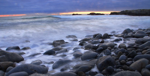
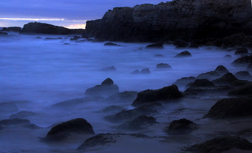
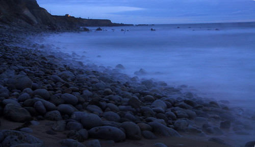
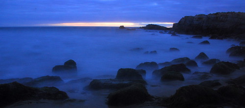
Last Saturday I thought of taking a "Classic Colorful Sunset" shot at Half Moon Bay, California but luck was not on my side , ended up shooting a dull colorless cloudy sunset .(Due to thick cloud) here are the results. Any thoughts?
The dots you see on top of Pic 1 are water droplets, once waves overrun me ...
Pic 1
Pic 2
Pic 3
Pic 4
Pic 5
Pic 6
Please comment.
Regards
Ajith
 Helpful Posts: 0
Results 1 to 9 of 9
Thread: A dull-colorless-cloudy-sunset
-
16th June 2009, 04:34 AM #1
A dull-colorless-cloudy-sunset
Last edited by ajith.rajeswari; 16th June 2009 at 04:42 AM.
-
16th June 2009, 05:01 AM #2

- Join Date
- Dec 2008
- Location
- New Zealand
- Posts
- 17,660
- Real Name
- Have a guess :)
Re: A dull-colorless-cloudy-sunset
Hi Ajith,
I think that you're "getting there" with the approach that your taking - unfortunately - if the weather doesn't co-operate then there's nothing that you can do about it, as was the case here ...
... so hard to tell how they might have turned out.
First thing that occured to me though was "watch your horizons" - normally place them 1/3 down from the top or (depending on the composition), 1/3 up from the bottom -- these are creeping up a bit too high. As a basic technique with a WA lens, set the horizon 1/3 down from the top and (whilst keeping the horizon there) lower the camera until the foreground objects take on a "healthy" size (you may even have to move the camera closer to them). I appreciate that wave splashes are a consideration too - so you can only try your best in these situations.
1 & 2 look like the best compositions to me.
Keep at it
-
16th June 2009, 06:39 AM #3
Re: A dull-colorless-cloudy-sunset
Hi Ajith,
The other thing I noticed with #1, whilst checking the horizon, was that because it is so near the top edge of frame, it seems to be barrelled somewhat, the clouds and horizon on left really tilt down on left, but the rocks on right tilt down on right.
And yet I can also see it looks like you have had a go at straightening already on #2 and #3 (top right telltale). If you do this you need to finish the job and if that leaves you with a little transparent triangle which you can't crop off for compositional reasons, just clone in some adjacent sky - it doesn't take long.
I agree with Colin the general landscape composition is best on 1 and 2, but I quite like 5 and 6 too.
If possible, I'd prefer them all at a 680 width to make the most of the space, 500 is a bit titchy for my eyes. I suspect 500 is the default width, what's the next size up, a 1000? If you used that it would limit to 680 and we could see bigger if need be.
Also, as Colin says, if the weather's not playing ball, you're sunk!
Thanks,
-
17th June 2009, 02:08 AM #4
Re: A dull-colorless-cloudy-sunset
WOW Ajith....nothing dull or colorless in these images. I like the bold colors and mystical feel. Surely this is where fairies dwell.
Chuck
-
17th June 2009, 09:53 AM #5
Re: A dull-colorless-cloudy-sunset
I like no 6...for no particular reason, just 'works'
-
17th June 2009, 04:11 PM #6
-
17th June 2009, 04:12 PM #7
-
17th June 2009, 04:13 PM #8
-
17th June 2009, 04:18 PM #9


 Reply With Quote
