 Helpful Posts: 0
Results 1 to 9 of 9
Thread: Tell me what you think!
-
16th March 2012, 01:04 AM #1

- Join Date
- Feb 2012
- Location
- New Jersey
- Posts
- 177
- Real Name
- Zach
Tell me what you think!
-
16th March 2012, 09:10 AM #2

- Join Date
- Sep 2011
- Posts
- 674
Re: Tell me what you think!
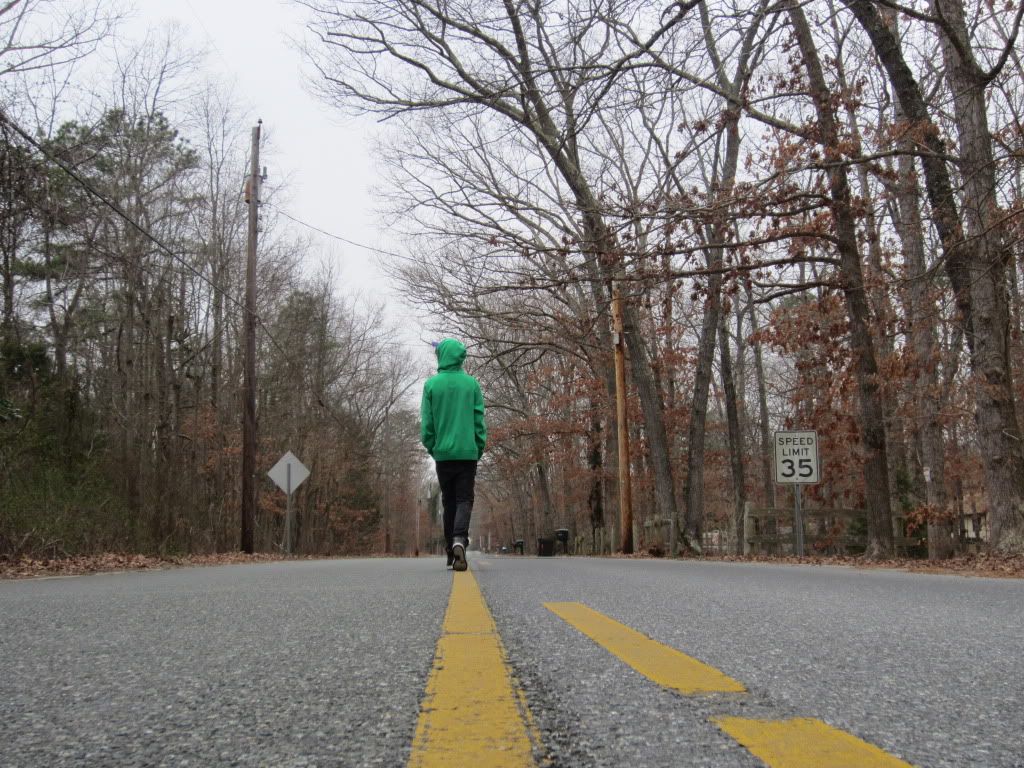
Please remember I'm no expert. But how I see it is the angle is great as is the subject. I would however clone out the road signs and the telegraph pole. I think it would give it a more eerie feel.
-
16th March 2012, 04:43 PM #3
Re: Tell me what you think!
I get an emotional feeling from this image. However, I think it may have had a stronger impact with a closer crop in a narrow vertical format...
-
16th March 2012, 07:15 PM #4
Re: Tell me what you think!
It's definitely the perspective I think that makes this capture. It gives the sense of someone walking to infinity.
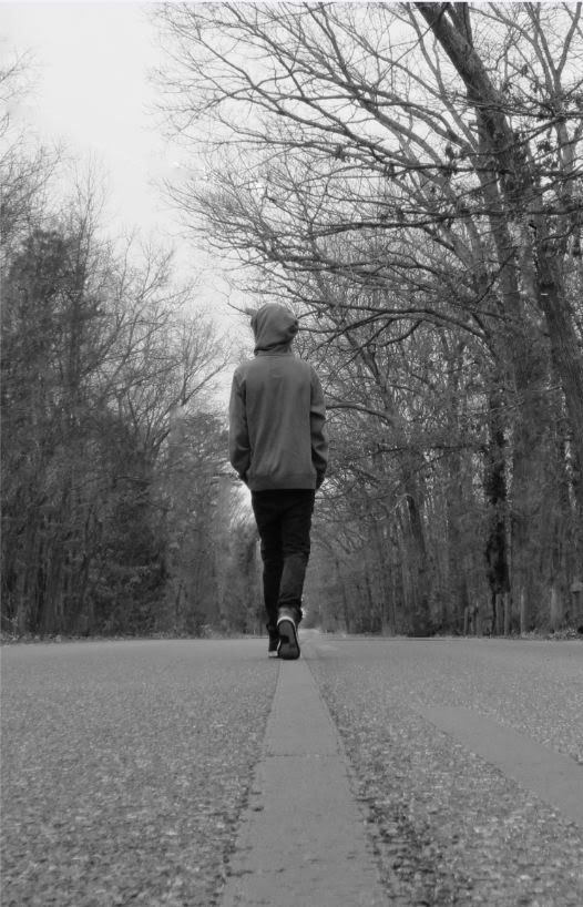
Two suggestions from me - I'd actually try and get rid of the power lines as well as the sign, and I'd try it as a black and white as well.
-
16th March 2012, 08:09 PM #5
Re: Tell me what you think!
How about trying it as a square crop from just inside the road signs and below the power line. That would put the horizon line in the center - against all "composition rules". It might not work, but i would like to see it that way.
-
16th March 2012, 11:52 PM #6
Re: Tell me what you think!
My initial response was "stupid piney get out of the middle of the street!!" While that response is not really appropriate, it would spark a conversation that will allow outsiders some insight to Jerzey's sub cultures. So I digress and only to inquire what do you like about the photo?
Ryo
-
17th March 2012, 03:46 AM #7

- Join Date
- Feb 2012
- Location
- New Jersey
- Posts
- 177
- Real Name
- Zach
Re: Tell me what you think!
I think I'm gonna try getting rid of the signs and changing it to B/W, thanks for the input!
-Zach
-
17th March 2012, 04:26 AM #8
-
17th March 2012, 11:09 AM #9
Re: Tell me what you think!


 Reply With Quote

