
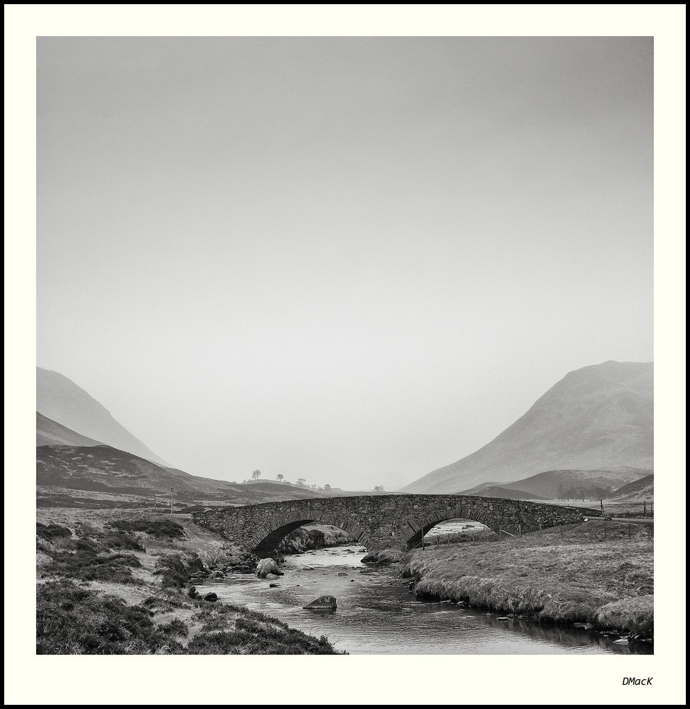
Another product of my wonderful early morning trip through highland Perth-shire and up into Aberdeen-shire by way of Glenshee.
C & C welcomed.
40D, 17-85mm f/4-5.6 IS USM @ 28mm. ISO100. 1/15@f16. 2-Stop GND
 Helpful Posts: 0
Results 1 to 16 of 16
Thread: On the Road to Braemar
-
25th March 2012, 09:36 PM #1Moderator


- Join Date
- Feb 2009
- Location
- Glenfarg, Scotland
- Posts
- 21,402
- Real Name
- Just add 'MacKenzie'
On the Road to Braemar
-
25th March 2012, 11:10 PM #2

- Join Date
- Sep 2011
- Location
- Columbus, Ohio, USA
- Posts
- 1,960
- Real Name
- Kevin
Re: On the Road to Braemar
Hi, Donald
This really needs to be viewed in lightbox to do it justice. Love the texure and tonal range. The diagonals of the hills really frame and focus the bridge and foreground. What I cant decide is whether I prefer it as is, or with a more 3:2 crop that seems to place more emphasis on the bridge. Seems to work very well either way. Lovely shot. I really yearn to visit Scotland.
Kevin
-
26th March 2012, 12:32 AM #3

- Join Date
- Jul 2008
- Location
- Southern California, USA
- Posts
- 17,409
- Real Name
- Richard
Re: On the Road to Braemar
Love it! It almost looks like a Fairy Tale.
Stone bridges are wonderful and Donald really shows this one very well.
I love old bridges...
-
26th March 2012, 05:39 AM #4

- Join Date
- Jun 2011
- Location
- BOTSWANA
- Posts
- 455
- Real Name
- Clive
Re: On the Road to Braemar
Hi Donald very good indeed. To me; my eye is first led up the stream then stopped by the bridge with that lovely curve that leads to the distant trees then up the sides of the hills. Gives a feeling of wide open space and freedom. I'm torn between the sky too much or just right!!!
-
26th March 2012, 05:43 AM #5

- Join Date
- Jan 2011
- Location
- Seattle Washington
- Posts
- 3,550
- Real Name
- Paul
Re: On the Road to Braemar
Let me jump on and say I agree with the above....another beautiful DMack image!
 Well done Donald.
-
26th March 2012, 07:20 AM #6
- Join Date
- Nov 2009
- Location
- Chandigarh, India
- Posts
- 1,541
- Real Name
- Sahil Jain
Re: On the Road to Braemar
A brilliant shot, Donald. Love the composition & B&W conversion.
You gotta get it framed & put it on the best wall at your place.
-
26th March 2012, 07:30 AM #7
- Join Date
- Dec 2008
- Location
- New Zealand
- Posts
- 17,660
- Real Name
- Have a guess :)
Re: On the Road to Braemar
Hi Donald,
Lovely shot, but I'm just wondering if the tones are slightly washed out through the bridge area, and if there's perhaps just a touch too much high-frequency sharpening? (some of the brick work & surrounding vegetation is looking a bit too "crunchy")? Just wondering if raising the black clipping point, or running a burn tool set to shadows over the brick work might give it a slight LCE improvement?
-
26th March 2012, 11:22 AM #8Moderator
- Join Date
- Feb 2009
- Location
- Glenfarg, Scotland
- Posts
- 21,402
- Real Name
- Just add 'MacKenzie'
Re: On the Road to Braemar
Thank you for all of the above comments.
Colin - I am not on my own computer and can't evaluate what you say. However, I can perfectly understand and accept what you say. I know I was quite aggressive with the 'Fine Structure' slider in Silver Efex Pro 2 that area.
Which introduces another interesting point that we can learn from - Do your post-processing when you are able to give as much concentration and dedication to the task as you did to the original capture. I allowed indiscipline to creep in. I was probably too tired at the end of a long day and wanted it processed. I thought I was doing a good job, but I didn't give proper attention to checking the effect of each action.
A good lesson to learn.
Will re-process this evening.
-
26th March 2012, 11:45 AM #9

- Join Date
- Mar 2012
- Location
- RV somewhere in America or Canada
- Posts
- 112
- Real Name
- Johnny
Re: On the Road to Braemar
I have to agree wth Colin's assessment of the image. I was quite pleased with it right down to the top of the bridge and then it all began to come apart. I just got SEP and was giving thought to SEP2 but of late, I've noticed a lot of images on here which exhibit this over-agressive grain structuring, which is not really indicitive of a fine art photo unless the negative was push processed in development. I've blown 35mm (Ilford Pan) up to 16 x 20 with less grain than this image is exhibiting.
Compositionally, it is an exquisite image. Overall, I think less would have been more in your post production work.
-
26th March 2012, 12:00 PM #10
- Join Date
- Dec 2011
- Location
- Québec,Canada
- Posts
- 696
- Real Name
- Louise
Re: On the Road to Braemar
A wounderfull work of photography, an a great example for me beginner to follow. Talking about following, I think I followed Colin PP(post production) process explanation of Donald's work, up to "slight LCE improvement". I would much appreciate if you could expand a little Colin. Thank you in advence. Originally Posted by Colin Southern

-
26th March 2012, 12:26 PM #11
- Join Date
- Aug 2009
- Posts
- 2,342
- Real Name
- Steve
Re: On the Road to Braemar
Hi donald, first let me say , this is a real Beauty!! Fantastic image and my favorite of the series so far!!!!
On a side note, i agree with colin. A few places look a little crunchy and the bridge should have a little more pop to it. Nothing that can't be fixed. One of your best works i think, well done.
-
26th March 2012, 02:10 PM #12Moderator
- Join Date
- Feb 2009
- Location
- Glenfarg, Scotland
- Posts
- 21,402
- Real Name
- Just add 'MacKenzie'
Re: On the Road to Braemar
And now ...?
-
26th March 2012, 07:31 PM #13
- Join Date
- Mar 2012
- Location
- RV somewhere in America or Canada
- Posts
- 112
- Real Name
- Johnny
Re: On the Road to Braemar
Still seems a little gritty on the left bottom hillside and a bit crunchy yet in the water but I suspect this is more to the conversion to a much smaller file.
-
26th March 2012, 07:44 PM #14
- Join Date
- Dec 2008
- Location
- New Zealand
- Posts
- 17,660
- Real Name
- Have a guess :)
Re: On the Road to Braemar
Hi Louise, Originally Posted by wlou
Sorry - LCE is "Local Contrast Enhancement". Basically what I was saying was that some of the areas of the bridge didn't look black enough to me. That could have been changed by raising the black clipping point of the entire image - since there's little low-tones throughout the upper portion of the image then it wouldn't have affected that part much - but if one wanted to make sure that they didn't touch those areas then running a burn tool set to shadows does the same thing, but only to the areas that the brush is wiped across (hence the term "local").
Does that help?
-
26th March 2012, 07:53 PM #15
- Join Date
- Dec 2008
- Location
- New Zealand
- Posts
- 17,660
- Real Name
- Have a guess :)
Re: On the Road to Braemar
Hi Donald, Originally Posted by Donald
We're possibly getting into "personal preference" area, but I'd (personally) even go as far as this (be sure to view at 100%) ...

I suspect that what's making it worse is that "fine structure" control -- to my eye it's having the effect of over-sharpening the high-frequency components. Possibly the best way to show what I mean would be to apply a USM of 300% @ 0.3px -> it'll make it a heck of a lot worse, but it'll show you the exact stuff that I think is too crunchy (if anything, I'd almost apply a 0.3px blur to settle those areas down a bit).
Not sure how much sense I'm making ... just woke up!
-
26th March 2012, 09:08 PM #16
- Join Date
- Dec 2011
- Location
- Québec,Canada
- Posts
- 696
- Real Name
- Louise
Re: On the Road to Braemar
Ahhh, Colin, it all make sense now.

 Reply With Quote