Results 1 to 10 of 10
-
28th March 2012, 08:37 PM #1
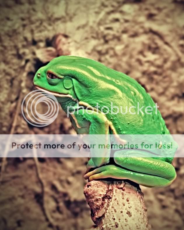
Monkey Frog...Is this better or am I doomed?
-
28th March 2012, 09:50 PM #2
Re: Monkey Frog...Is this better or am I doomed?
I'm sorry to have to tell you Ginny that I'm afraid you are terminally doomed to taking great shots of cool looking creatures. At least you heard it from a friend instead of some Bozo stranger!
Customarily, a traditional composition of a profile shot will leave some room to the side the victim is looking toward to give them room to look into. I am neither traditionally customary, nor am I customarily traditional. But something to consider.
Maybe bring your vignette in a bit and make it a bit lighter and a more gradual falloff so as not to bring attention to the corners of the frame.
I would suggest working on the eyes to bring them out if anyone asked me.
Thankfully, no one did!
Great shot, Ginny!Last edited by Loose Canon; 28th March 2012 at 10:00 PM.
-
28th March 2012, 09:54 PM #3
-
28th March 2012, 10:22 PM #4
Re: Monkey Frog...Is this better or am I doomed?
Ginny, I do like this image. Cool looking frog. It looks to be a difficult one to get the color just right. I would also rather a little more room infront of him as I see was mentioned above as well as working on the eyes. I seem to be thinking along the same lines as Terry. I had a quick play to see what was what and came up with the edit you see below. I adjusted the clipping points in levels and rightened the eye slightly. I then gave a localized sharpening and cropped it. Being I was not there I am unsure how close the color is, you'll have to tell me.


-
28th March 2012, 10:33 PM #5

- Join Date
- Apr 2011
- Location
- Ontario (mostly)
- Posts
- 6,667
- Real Name
- Bobo
Re: Monkey Frog...Is this better or am I doomed?
Last edited by Bobobird; 29th March 2012 at 02:21 AM.
-
28th March 2012, 10:37 PM #6

- Join Date
- Jan 2009
- Location
- South Devon, UK
- Posts
- 14,801
Re: Monkey Frog...Is this better or am I doomed?
I think, Ginny, that we really need to know what is the true colour of this creature. With this sort of scene, without any clear reference point like a patch of pure white for example, we are really just guessing.
I would suggest that your original is a little too yellow and the edit has gone too far to the blue side; but I don't really know without some guidance.
-
28th March 2012, 11:06 PM #7
Re: Monkey Frog...Is this better or am I doomed?
Paul got it just about perfect. The little guy is VERY bright green with cream colored stripes. He was actually staring into another frogs rear-end, which is why I cropped where I did. Great point from Terry about leaving more room in front of profile shots. I had no idea! The background was causing me the most trouble since I am such a beginner. Trying to get that right ruined the frog, trying to get the frog right, ruined the background. I am going to practice my edit again to see if I can match what Paul did. (I read the tutorial about sharpening as well).
Thanks to you all for your help.
-
28th March 2012, 11:09 PM #8
-
28th March 2012, 11:22 PM #9
Re: Monkey Frog...Is this better or am I doomed?
Ginny, glad I was close. When you are giving it a go....when working in levels, remember to adjust each color channel and not just value. I adjusted each green, red and blue individually. Being there is no straight white or absolute black it will be a trial and error by eye thing as you can't use the white or black dropper.
-
28th March 2012, 11:49 PM #10
Re: Monkey Frog...Is this better or am I doomed?
I will Paul. I can't thank you guys enough for your guidance. This site is just awesome!

 Helpful Posts:


 Reply With Quote
