 Helpful Posts: 0
Results 1 to 10 of 10
Thread: Into the woods.....
-
13th April 2012, 02:32 PM #1
Into the woods.....
Last edited by Donald; 13th April 2012 at 03:32 PM. Reason: Corrected title
-
13th April 2012, 07:11 PM #2

- Join Date
- Apr 2011
- Location
- Ontario (mostly)
- Posts
- 6,667
- Real Name
- Bobo
Re: Into the woods.....
Nice.... though different from your usual "funky" pp. hehe
I am a big fan of square and use it quite regularly, they do make one think a lot about placement.
-
13th April 2012, 08:03 PM #3Moderator


- Join Date
- Feb 2009
- Location
- Glenfarg, Scotland
- Posts
- 21,402
- Real Name
- Just add 'MacKenzie'
Re: Into the woods.....
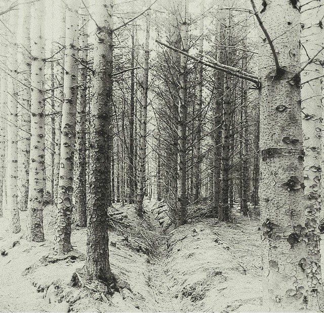
Everyone and their aunty has, over the years, done their 'Trees in the Wood' shot. And of those I still think that a certain Mr Adams and his Aspens take some beating.
But you have created a unique image and, in my view, a wonderful visual representation of your creative vision. This appeals to me enormously. I think it's gorgeous.
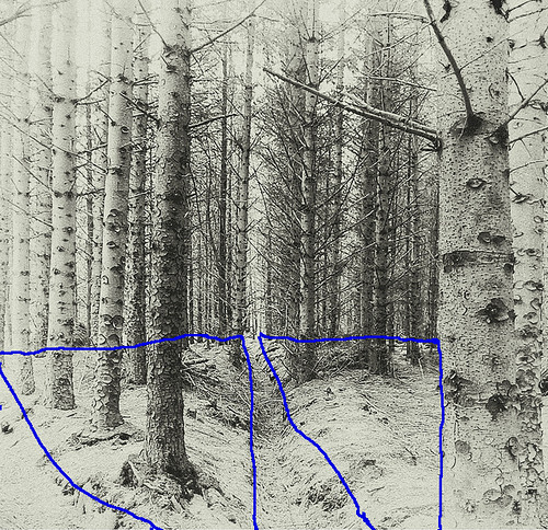
If B & W is to be about line, shape, tone and texture, then we more than check all the boxes. I think the whole thing rests on a very solid platform of two major triangles. I know he's not around on the site so much these days, but Peter Reid frequently illustrated how powerful triangles were in the construction of images (his posts will still be on here for anyone who wants to search). In this image these two triangles really jumped off the screen .........
I think they really 'bed' the image.
I suppose I could prattle on, but at the end of the day what really matters is the creative mind that had the vision. That counts for much more than all the technical stuff (although that helps to realise the beauty).
-
13th April 2012, 08:50 PM #4
Re: Into the woods.....
I am not geometrically minded Donald and just go with 'what looks right'
I will search with interest for Peter Reid's work and thank you for directing me
-
13th April 2012, 08:59 PM #5Moderator


- Join Date
- Feb 2009
- Location
- Glenfarg, Scotland
- Posts
- 21,402
- Real Name
- Just add 'MacKenzie'
Re: Into the woods.....
My apologies to him. It is Peter Ryan, not Reid. Don't know where I got Reid.
One place to start looking at Peter's ideas is here
-
13th April 2012, 11:29 PM #6

- Join Date
- Nov 2011
- Location
- Nebraska
- Posts
- 949
- Real Name
- Kathy
Re: Into the woods.....
Love, Love, Love this photo . . . it is so unique and very beautiful!!!
Kathy
-
13th April 2012, 11:44 PM #7
Re: Into the woods.....
That is a wonderful photograph. You've taken a "nice" image and creates an unusual and beautiful portrait. I agree with all the above compliments. Very well done!
Paul S
-
14th April 2012, 12:51 AM #8

- Join Date
- Mar 2010
- Location
- East Coast of Canada
- Posts
- 873
- Real Name
- Myra
Re: Into the woods.....
Sharon, that is absolutely lovely. My inner voice just said, "Wow" when it came up on the screen.
-
14th April 2012, 06:27 AM #9
Re: Into the woods.....
Said it before and must once again, I always enjoy a well done tree image. Superb.
-
14th April 2012, 10:36 AM #10
Re: Into the woods.....
Thank you Kathy , both Pauls and Jeff for those lovely comments.


 Reply With Quote

