 Helpful Posts: 0
Results 1 to 18 of 18
Thread: My attempt
-
1st July 2009, 02:52 AM #1
-
1st July 2009, 07:05 AM #2

- Join Date
- May 2009
- Location
- Southern California
- Posts
- 466
Re: My attempt
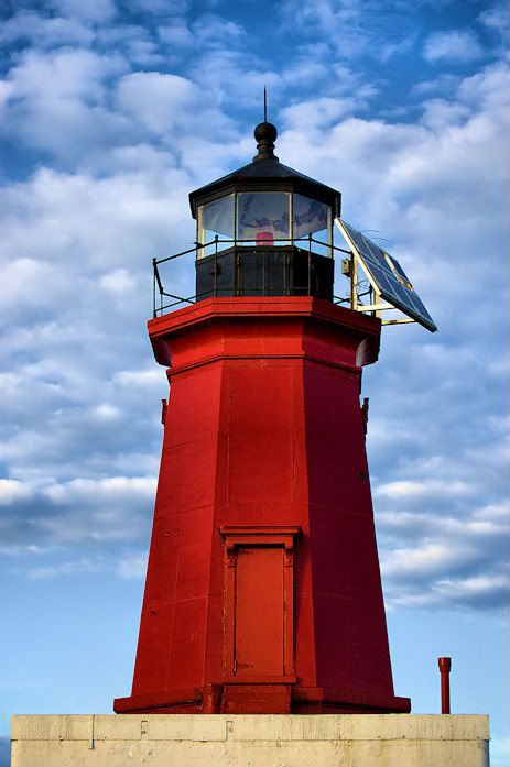
nice pic...
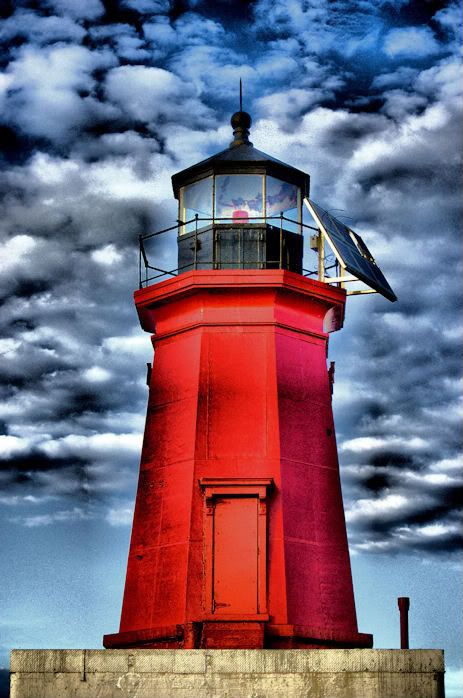
I am wondering if the dark objects in the windows are the reflection of the clouds on the glass? Dunno if a polerizer would get rid of it...its a shame the mounted a huge solar panel on it...

maybe try to get the pic composed a little different with the house off to one side or another with some of the surroundings showing? but i guess on what is around to show and how able u are to get different angles....I guess if its sitting on a little island surrounded by water there wouldnt be much u could do...
-
1st July 2009, 06:57 PM #3
Re: My attempt
Hi Kori,
Indeed, a decent shot, is it HDR? dare I ask
I agree with Kevin, it is a shame about the solar panel and I was thinking if you had stood just a fraction more to the left, it would have been a little easier to clone away. Why let reality spoil an image, eh?
Well done,
-
1st July 2009, 11:52 PM #4
Re: My attempt
Yes the solar panel sucks! thought about cloning it out...but it seemed like it might be tricky - still may try it though!
I will be going back soon and try to compose - with my tripod! - at another angle! Hoping to get more water in view also.
No it's not HDR - I was bored and grabbed the camera and went down to the pier. I forgot to grab my tripod, and I don't have bracketing on my camera so I have to manually adjust. I was trying to just take a "good" shot! I am happy it turned out ..... better than I thought it would. I don't have VR lens. I adjusted the contrast etc a bit until I liked the look.
Thanks guys!
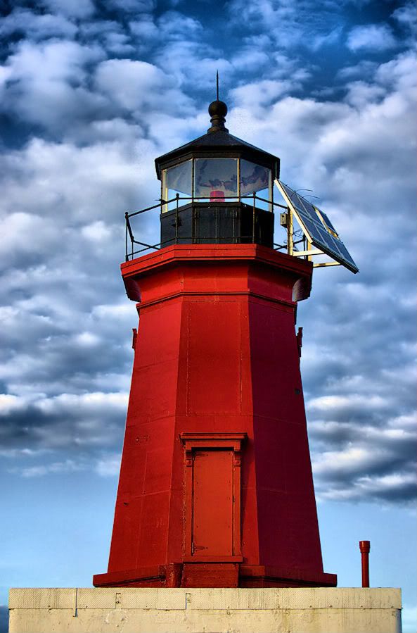
I also played around beyond this with adjustments and came out with this one, on accident - I had someone I know ask me if I finally dove into HDR....ha ha -

This is why photography is so much fun! I just need to learn a bit more and buy filters and stuff
-
2nd July 2009, 07:02 PM #5
Re: My attempt
First of all, great pic. I love lighthouses. Secondly: even though the solar panel "sucks", it's kind of amusing. It gives the composition the whole 21st century kind of look. Great job.
-
2nd July 2009, 07:43 PM #6
Re: My attempt
Thanks! I love lighthouses too! I like your take on the 21st century!

Kori
-
2nd July 2009, 07:44 PM #7

- Join Date
- Mar 2009
- Posts
- 2,522
Re: My attempt
The thing that is striking about the first image is that lovely red tone on the body of the lighthouse. The second image is over processed in an unflattering way. If you could retain settings for the lighthouse and burn the sky in a similar way to image 2 it would make a very striking image indeed. The comments about the solar panel are a bit odd to me since the photographer captures what he or she sees at that time (or what may be achieved later with some PP). If the panel was a problem to the eye behind the lens it would have never appeared on the forum.
Steve
-
2nd July 2009, 07:54 PM #8
Re: My attempt
I will have to play with this image ( # 1)a little to see what I can come up with. I know very little about processing,(still referring to my book most of the time). The 2nd image was, like mentioned, by accident, but I sort of like it none the less. I do like the first one much better though- that's why I posted it first!

The solar panel on there is one of those things that I have seen so many times, that I really didn't see it when I took the picture. It wasn't until I had it on my computer and cropped, that I thought - bummer. I may spend some time to see if I can clone it out - I like playing around, it's the only way to learn!
Thank you!
Kori
-
3rd July 2009, 03:13 AM #9
Re: My attempt
Good luck playing around with it, make sure and post it because I want to see what it looks like!
Respectfully,
Trey
-
3rd July 2009, 09:22 AM #10

- Join Date
- Jan 2009
- Location
- Sydney, Australia
- Posts
- 362
Re: My attempt
I like the first picture very much but not the second one that looks a bit strange. It seems to me that the first picture is not so easy to get as the contrast between the sky and lighthouse is usually high. This one is just right.
-
3rd July 2009, 09:27 AM #11
Re: My attempt
I'm curious what you want do do with it, because I shouldn't play with it too much. It's a nice composition (the solarpannel and the pole on the left does work for me to make it a bit more different from just a lighthouse in the middle of a picture) with beautifull and pure colours. #2 seemsa bit 'too much' to me as I already like number one.
But show us what you'llcom up with
-
3rd July 2009, 12:02 PM #12
Re: My attempt
Here is what I have come up so far. I left the solar planel alone. I did a little more work with the clouds/sky.
Please let me know what you think of this now.
Thanks guys for your comments on this! It's really helping me a lot!!!!!!

For an easier comparison I have posted the 1st one and the one I worked on.
(first one)

(2nd try)

Just a comment to the dark objects in the window, I think they are "in" the lighthouse, and not a reflection. I tried to clone out and object remover, but I'm not good at that and it looked "horrible"! So I left it alone. Anyone care to dabble with that who has more experience, feel free!
Kori
-
3rd July 2009, 01:03 PM #13

- Join Date
- Mar 2009
- Location
- Coventry, UK
- Posts
- 304
-
3rd July 2009, 01:07 PM #14
Re: My attempt
No I don't mind AT ALL!!!!
Nice job!!!! I really like it!
Thanks!!!!! One day I will get better at the PP stuff! I know I've come a long way since I started - September ish.... Patience and Practice!
Kori
-
3rd July 2009, 03:04 PM #15
-
3rd July 2009, 04:00 PM #16
-
3rd July 2009, 08:35 PM #17

- Join Date
- Mar 2009
- Posts
- 2,522
Re: My attempt
(2nd try)Spot onI just thought I would give a go . This is exactly how I saw it in my minds eye.
-
4th July 2009, 02:12 PM #18
Re: My attempt
I like my 2nd try better and I like the windows now with the "stuff" removed. I will have to try to do that again.... Nice "group" effort!

Kori


 Reply With Quote

