 Helpful Posts: 0
Results 1 to 9 of 9
-
21st April 2012, 01:03 PM #1
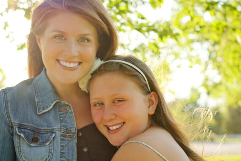
First family portrait (outside of my own....)
-
21st April 2012, 01:16 PM #2Moderator


- Join Date
- Feb 2009
- Location
- Glenfarg, Scotland
- Posts
- 21,402
- Real Name
- Just add 'MacKenzie'
Re: First family portrait (outside of my own....)
Most importantly, Kalyn, what do you think and what do your friends think?
-
21st April 2012, 03:54 PM #3
Re: First family portrait (outside of my own....)
They have lovely expressions, Kalyn, and look genuinely happy, connecting with the photographer (well done)
Watch out for the light next time, if doing back lighting: there is a hint of flare... easily sorted if you move out of the light path.
Good choice to use open shadows, as the light seems quite strong.
-
21st April 2012, 04:47 PM #4
Re: First family portrait (outside of my own....)
Unless, of course, that's the look you were going for. I personally like 'flared' portrait shots. There was a thread started here earlier this month talking about them. Some people like, some don't. I do. However, that being said, I'm not sure how it works for a family type portrait. For me, the flared look kind of gives the idea of being edgy, or surreal, almost an 'other-worldly' setting. Great for models, and sometimes (very sometimes), children. Not sure I'd like it for my family portrait though. But that's my personal opinion.
-
21st April 2012, 11:24 PM #5
Re: First family portrait (outside of my own....)
They absolutely loved it. They had not had a family portrait in over four years. I really think it captures their lovely personalities. Aesthetically, I think it's a bit dark in front. I have by no means mastered back lighting, but I love the earthy feel it gives a photo.
Of course we got traditional family shots... this was just the most unique to me, so I love trying to learn ways to make it better!
Thank you for your input!!Last edited by Kalyn; 21st April 2012 at 11:34 PM.
-
21st April 2012, 11:26 PM #6
-
22nd April 2012, 03:26 AM #7
Re: First family portrait (outside of my own....)
Hi Kalyn, which direction was the sun coming from? It kooks like they are in the shade but the sun is coming from behind them which will give the glared look. I like it though it can take a little emphasis off the subjects. Only other comment is the younger girl seems to be a bit sharper around the eyes than her mum. A slightly smaller F Stop may give them both sharp eye's which is always a big thing for portrait. Well done and keep at it, your friends will be very grateful.
-
22nd April 2012, 01:23 PM #8

- Join Date
- Mar 2012
- Location
- Ames, Iowa, USA
- Posts
- 197
- Real Name
- Jim
Re: First family portrait (outside of my own....)
You should attempt to get the light right as you begin the composition process. Position your models where the light is as uniform as possible, but shielding their eyes from glare. Notice where the light is coming from, then ask your models to face that way. You will see an immense difference in exposure when you get the light right.
Next, learn to hold your camera in the portrait position. I realize it is not intuitive, but this shot would have benefitted greatly from that format.
Next, (aperture has already been mentioned) ask the child to turn more toward the camera. What we have here is mostly the back of her shoulder, and you can still get that hugging feel even if the child is turned more toward the camera.
I presume this was a hand-held shot, and it's not bad, but with your camera on a tripod, you can concentrate more on composition, aperture, focus, etc, without a lot of extra movement on your part.
-
23rd April 2012, 04:17 PM #9
Re: First family portrait (outside of my own....)
Hi Kalyn,
I like this photo. I'm not sure the color balance is quite right though? Can you see that in the whites of the eyes? I'm not sure why, but mom's face looks pretty soft while daughter's face does not?
As pointed out, you did manage to capture a very natural and joyous moment between the two, which is by far the most important thing for this type of photo


 Reply With Quote
