Results 1 to 18 of 18
Thread: The Dark Side...mwhahaha!
-
31st May 2012, 07:50 PM #1
The Dark Side...mwhahaha!
-
31st May 2012, 08:01 PM #2
Re: The Dark Side...mwhahaha!
Beautiful images as always Sharon,
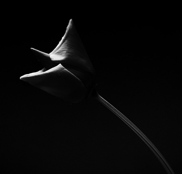
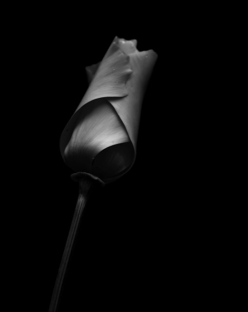
The soft curves of the flower set against the black looks fantastic.
Cheers Greg
-
31st May 2012, 08:13 PM #3
Re: The Dark Side...mwhahaha!
Thanks a lot Greg..appreciate it!
-
31st May 2012, 08:25 PM #4Moderator


- Join Date
- Feb 2009
- Location
- Glenfarg, Scotland
- Posts
- 21,402
- Real Name
- Just add 'MacKenzie'
Re: The Dark Side...mwhahaha!
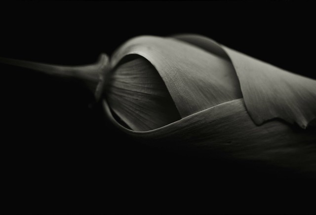
I've just written a response to another image in another thread in which I was 'oooing' and 'aahing' about glorious textures (in that case it was on water). But here we could be saying the exact same thing, but this time on the folded leaves of a plant. Sorry for sounding like a broken record (who's old enough to remember vinyl?), but we keep saying that B & W is about line, shape, tone and texture. For a perfect example, see above.
-
31st May 2012, 08:44 PM #5
Re: The Dark Side...mwhahaha!
You are very kind Donald.
...and that's my favourite too., It's like a loosely rolled cigar or an enfolding embrace and I know colour could not have conveyed that.
Funny though how many people think flowers NEED to be all about colour.
-
31st May 2012, 10:22 PM #6

- Join Date
- Dec 2011
- Posts
- 780
Re: The Dark Side...mwhahaha!
Wow your really giving SEP2 a hard workout and at a fast pace. How can we possibly keep up?
 Another awesome post, I never was much on flowers but your changing my mind quickly.
-
31st May 2012, 10:40 PM #7
Re: The Dark Side...mwhahaha!
Haaa..thanks Carl
Flowers are wonderful..innocent/wicked, subtle or colourful, structural or soft and frothy but they all have a distinct personality and you have colour, shape. texture and form to work with.
I don't think of them as flowers..I think of them as moods...or at least representative of such.So perhaps I approach them a little differently.
I am quite sure you will manage to keep up.
-
31st May 2012, 10:46 PM #8
Re: The Dark Side...mwhahaha!
Fantastic images Sharon...

-
31st May 2012, 11:33 PM #9
-
31st May 2012, 11:38 PM #10

- Join Date
- May 2012
- Location
- northern Virginia suburb of Washington, DC
- Posts
- 19,064
Re: The Dark Side...mwhahaha!
Wow! Double wow! These are so gorgeous in every way.
Sharon, your last one seems to have some very slight, subtle toning that isn't present in the first three. Right? If so, please explain.
-
1st June 2012, 04:58 AM #11
Re: The Dark Side...mwhahaha!
Hi Sharon, I keep looking at your posts and have noticed great improvement as time goes by. This time you have set a very high standard for yourself - no pressure - just keep going.
-
1st June 2012, 05:10 AM #12

- Join Date
- Dec 2011
- Location
- pilot rock oregon
- Posts
- 592
- Real Name
- Jack R Mann
Re: The Dark Side...mwhahaha!
WOW well done sharon.
-
1st June 2012, 05:47 AM #13
Re: The Dark Side...mwhahaha!
Nicely done Sharon, I like the tones you have achieved. The last being my favorite.
-
1st June 2012, 07:43 AM #14
Re: The Dark Side...mwhahaha!
Really like the light control you have.
Nice shoots, nice light control, textures ...
Regards.
-
1st June 2012, 05:10 PM #15
Re: The Dark Side...mwhahaha!
Thank you so much Clive, Jack ,Paul and franky. It is always nice to know I am progressing skills wise.

Hi Mark, you are absolutely correct there is a tint on the last one and the reason is really simple...it looked better that way!
I didn't plan to create a set with these and so each conversion was done seperately and intuitively instead of to a 'recipe' I can't seem to work any other way.
-
2nd June 2012, 04:27 AM #16
Re: The Dark Side...mwhahaha!
Nice work Sharon. Real art. Bruce
-
2nd June 2012, 01:24 PM #17
Re: The Dark Side...mwhahaha!
Thank you Bruce.

-
2nd June 2012, 05:06 PM #18

- Join Date
- Feb 2012
- Location
- North East England
- Posts
- 109
- Real Name
- George
Re: The Dark Side...mwhahaha!
Very very nice

 Helpful Posts:


 Reply With Quote
