 Helpful Posts: 0
Results 1 to 7 of 7
Thread: Stay a While
-
1st June 2012, 05:03 PM #1

- Join Date
- Dec 2011
- Location
- Surrey, BC, Canada
- Posts
- 301
- Real Name
- Blake

Stay a While
-
1st June 2012, 07:02 PM #2
Re: Stay a While
Hi Blake,
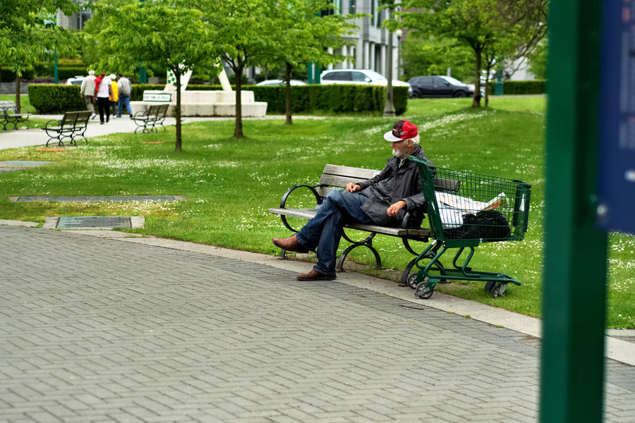
I think you need to crop out that obstacle on the right hand side and get closer into your subject to convey his story. maybe consider a mono image for more impact
Can I ask why you shot this at f/2.2 ?
-
2nd June 2012, 01:08 AM #3

- Join Date
- Dec 2011
- Location
- Surrey, BC, Canada
- Posts
- 301
- Real Name
- Blake

Re: Stay a While
I left the street lamp to try and give it some more depth. I shot at f/2.2 to give some more background separation. If I had shot with a small aperture the people and the statue in the background would have been much more in focus.
-
2nd June 2012, 06:17 PM #4
Re: Stay a While
Blake..to my eye it is very open on the left hand side and closed by that post on the right which leaves it imbalanced. If you really want to keep the post then straighten it up but I think it detracts from the picture.
I asked why you shot at 2.2 because I really wasn't sure you had. It doesn't seem to have seperated the focus anywhere near as much as I would have expected for that aperture on a 50mm lens which confuses me.
I assume this guy is being portrayed as homeless and lonesome with his belongings in a supermarket trolley but i could be wrong. the overall aspect is so bright and colourful that it isn't clear..he could just be taking a rest on his way home to the wife and kids.
I am sorry if I sound negative...really don't wish to but whatever this man's story is isn't coming across to me...for the reasons above and you did ask for critique.
However this is simply my own personal view and I have been wrong before.
I do love street photography and hope to see the rest of your work soon.
Cheers.
-
3rd June 2012, 06:37 AM #5Moderator


- Join Date
- Feb 2009
- Location
- Glenfarg, Scotland
- Posts
- 21,402
- Real Name
- Just add 'MacKenzie'
Re: Stay a While
Blake - If your aim with this was a social documentary image about the plight of poverty/homelessness/social deprivation, I would definitely be thinking about it in B & W. At the moment, as Sharon suggests, it is nice pleasant image of an old man sitting on a park bench.
I think it's one of those images where you, as the photographer, were there and 'felt' what it was like. We weren't and all we have to go on is what you've put into a little rectangle on a screen. That has to tell us the whole story.
I hope you don't mind (please say if you do and I'll remove it), but the best way of illustrating what I mean is to show it. I would have actually gone in tighter, to a 4:5 portrait crop. I think there's enough behind in that crop to make the point about the plight of the poor in our cities. But I can se the strength in keeping that group of people effectively walking away from him. That contains quite a message. So, on that basis ....................! This is a 5:4 crop

I don't think that post at the rigth was doing anything to contribute to the image
-
3rd June 2012, 07:00 AM #6
Re: Stay a While
I think that Donald got this photo right. The post was distracting - it had to go. Making the pic b/w gives me the impression that (imho) this is a photo that tells a serious story - that of homeless persons.
I was indecisive about keeping the group of people in the photo; however their postioning does tend to convey a message- one of isolation.
On the positive side your sense of conveying a story in this photo was good - the pic just needed tweaking.
Keep at it. Bruce
-
3rd June 2012, 03:35 PM #7

- Join Date
- Dec 2011
- Location
- Surrey, BC, Canada
- Posts
- 301
- Real Name
- Blake

Re: Stay a While
I've never thought of doing a 4:5 crop!
I guess you're right about the post, and you're definitely right about the B&W. You guys give such great advice here.
At least I'm trying new things Does anyone have advice about using foreground to add depth more effectively?


 Reply With Quote