 Helpful Posts: 0
Results 1 to 8 of 8
Thread: Salisbury Cathedral
-
20th June 2012, 07:22 PM #1

- Join Date
- Jun 2012
- Location
- Salisbury, uk
- Posts
- 95
- Real Name
- Paul Matthews
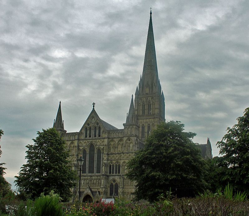
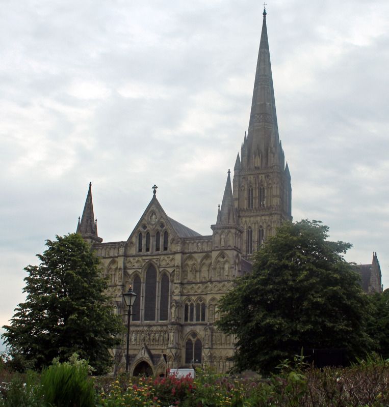
Salisbury Cathedral
-
20th June 2012, 07:52 PM #2
Re: Salisbury Cathedral
Paul,
I like the more dramatic cloud patterns of number 1, but the colours of number 2 seem more natural to me. For the composition, you have obviously cropped the original 3:2 (or 2:3) format images. If you have enough in the originals, and as you have shot the cathedral from an end viewpoint, I think the subject would suit a portrait oriented format, e.g. 3:4 or 5:7, with a little more space above the spire and the bottoms of the plants visible in the foreground. I also suggest that the image could be rotated slightly anticlockwise to make the tower and spire vertical.
Just my opinions. Cheers.
Philip
-
20th June 2012, 07:56 PM #3
Re: Salisbury Cathedral
I like the top photo best. It has a nice look to it. You might consider rotating the image slightly counter-clockwise as the cathedral appears to be leaning to the right.
-
20th June 2012, 07:59 PM #4

- Join Date
- Jun 2012
- Location
- Salisbury, uk
- Posts
- 95
- Real Name
- Paul Matthews
Re: Salisbury Cathedral
cheers guys. I'll try and rotate it slightly. As for the crop there is sadly a huge tree to the right that would take your eye off the cathedral which is why its cropped out. There is also a small white fence to the bottom left also cropped out which is why i couldnt make it a portrait style shot.
Thanks for the comments again though
-
20th June 2012, 08:03 PM #5
Re: Salisbury Cathedral
Paul I prefer the second. Could I suggest the following pp
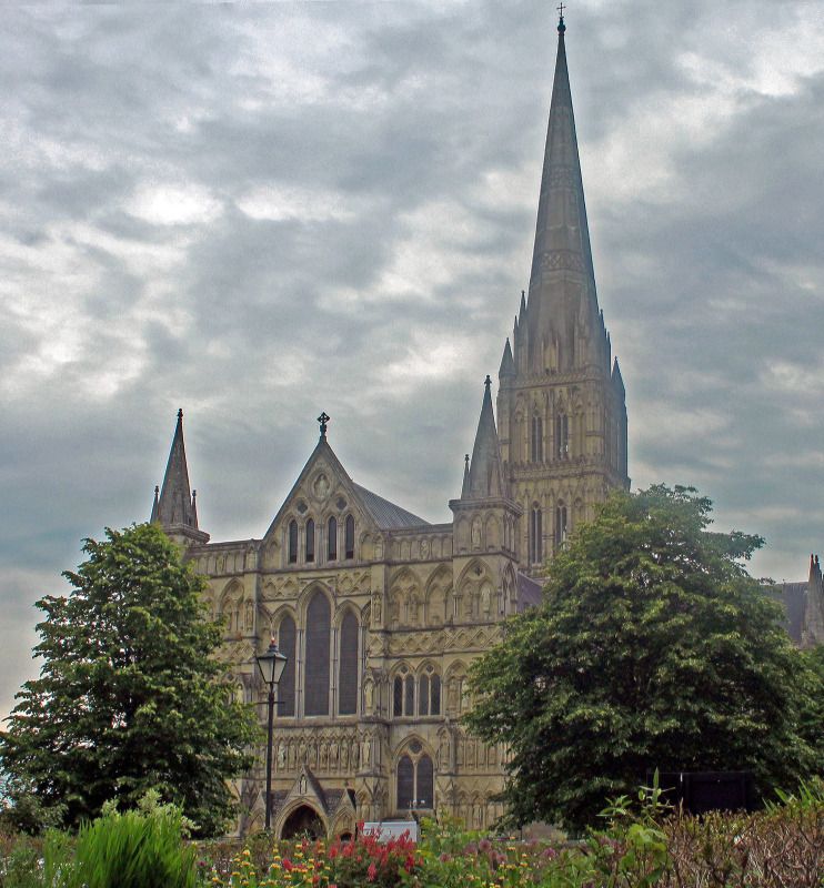
Reduce the highlights significantly to darken the sky and give it more texture (Shadows/Highlights adjustment in Elements)
Rotate as suggested
Add a little sharpening
Perhaps increase the colour saturation a little
Dave
-
20th June 2012, 08:19 PM #6

- Join Date
- Jun 2012
- Location
- Salisbury, uk
- Posts
- 95
- Real Name
- Paul Matthews
-
20th June 2012, 08:36 PM #7
Re: Salisbury Cathedral
Hay Paul
Nice image. Definite improvement on the original. Is the spire still lop sided? May I also suggest bringing out a little of the detail in the Cathedral with some dudicious dodge n burning. Also the top of the roof and spire seem to be taking on a little blue colour cast ?
Has a great 3 dimensional look !
Cheers
Phil
-
20th June 2012, 08:40 PM #8
Re: Salisbury Cathedral
Paul I think the edit does improve it however I think you've actually raised the shadows as well as reducing the highlights. The Shadows/Highlights adjustment opens up with a default setting of 25 on the shadows enhancement and you have to wind it down to zero if you don't want any shadow enhancement (which I dont think you need for this image). Winding this down should give richer colours on the cathedral.
Dave


 Reply With Quote
