 Helpful Posts: 0
Results 1 to 5 of 5
Thread: Churchyard
-
23rd June 2012, 09:27 PM #1

- Join Date
- Jun 2012
- Location
- Salisbury, uk
- Posts
- 95
- Real Name
- Paul Matthews
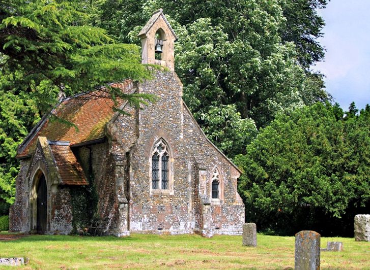
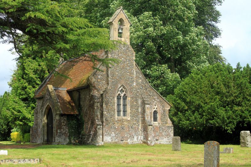
Churchyard
-
23rd June 2012, 09:46 PM #2
Re: Churchyard
Hi Paul,
I like the composition of No.1; but it does look a bit 'soft' to me. I think if it was mine, I would sharpen it to 130% @ a radius of 0.8
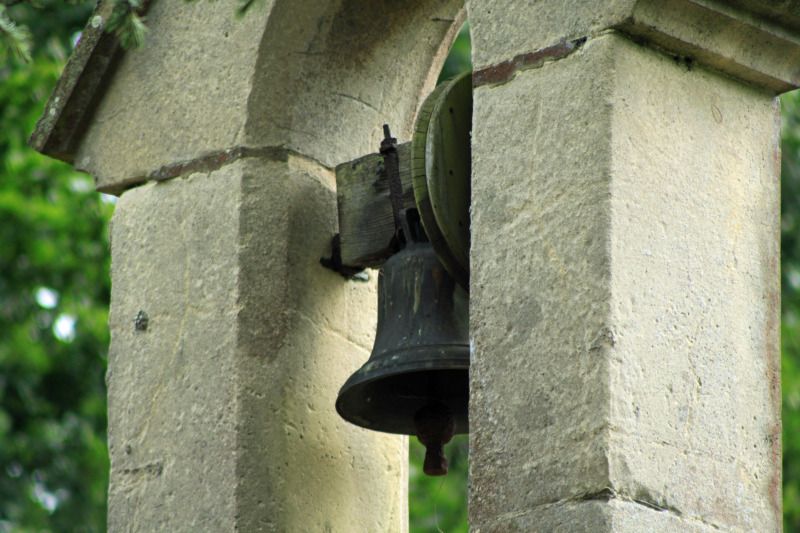
Number 2, doesn't ring my bell I'm afraid; if you will pardon the pun. I think it’s the angle combined with the tight crop, it just doesn’t grab me, sorry.
-
24th June 2012, 10:03 AM #3

- Join Date
- Aug 2008
- Location
- Ariege, France
- Posts
- 558
- Real Name
- Paul
Re: Churchyard
Paul,
number 1 is my preferred as well, a really nice little church. I might step back a tad to prevent that lower gravestone from falling off the bottom of the image but apart from that it's a pleasing composition. As John said though it is very soft and I would at least try to sharpen the church. The second is a little tight, especially that right hand edge and I think you either need to lose it altogether or allow a little more space. Even so personally I find the top a bit cramped and my head is desperately trying to complete that arch above the bell, I might revisit that bit and include the arch. Nice detail though which is probably worth re-shooting at various angles and distances.
-
24th June 2012, 10:14 AM #4
Re: Churchyard
Paul, I agree with John about number 2. Regarding the composition of number 1, the two areas of bright sky seem to me to be competing for attention, so I would probably crop out the left side. This would leave the bright sky on the right, which is similar to the direction of the light source in the scene. For me, the image would also benefit from a small adjustment of colour balance and a very slight clockwise rotation. The sky then needs toning down, and the contrast, saturation and sharpness tweaking to enhance the rest of the image. E.g. A quick edit of the jpeg -

Philip
-
24th June 2012, 10:31 AM #5

- Join Date
- Jun 2012
- Location
- Salisbury, uk
- Posts
- 95
- Real Name
- Paul Matthews
Re: Churchyard
I really like those subtle adjustments you have made there Phillip. I'll have to have a play and improve my pp abilities. Thanks for the tips and I'll pop back on Friday afternoon to try and get something different of the bell using the tips mentioned.


 Reply With Quote