Results 1 to 15 of 15
Thread: From Kerala.with love
-
30th August 2012, 02:43 PM #1
From Kerala.with love
Last edited by Wavelength; 30th August 2012 at 06:21 PM.
-
30th August 2012, 03:48 PM #2
Re: From Kerala.with love
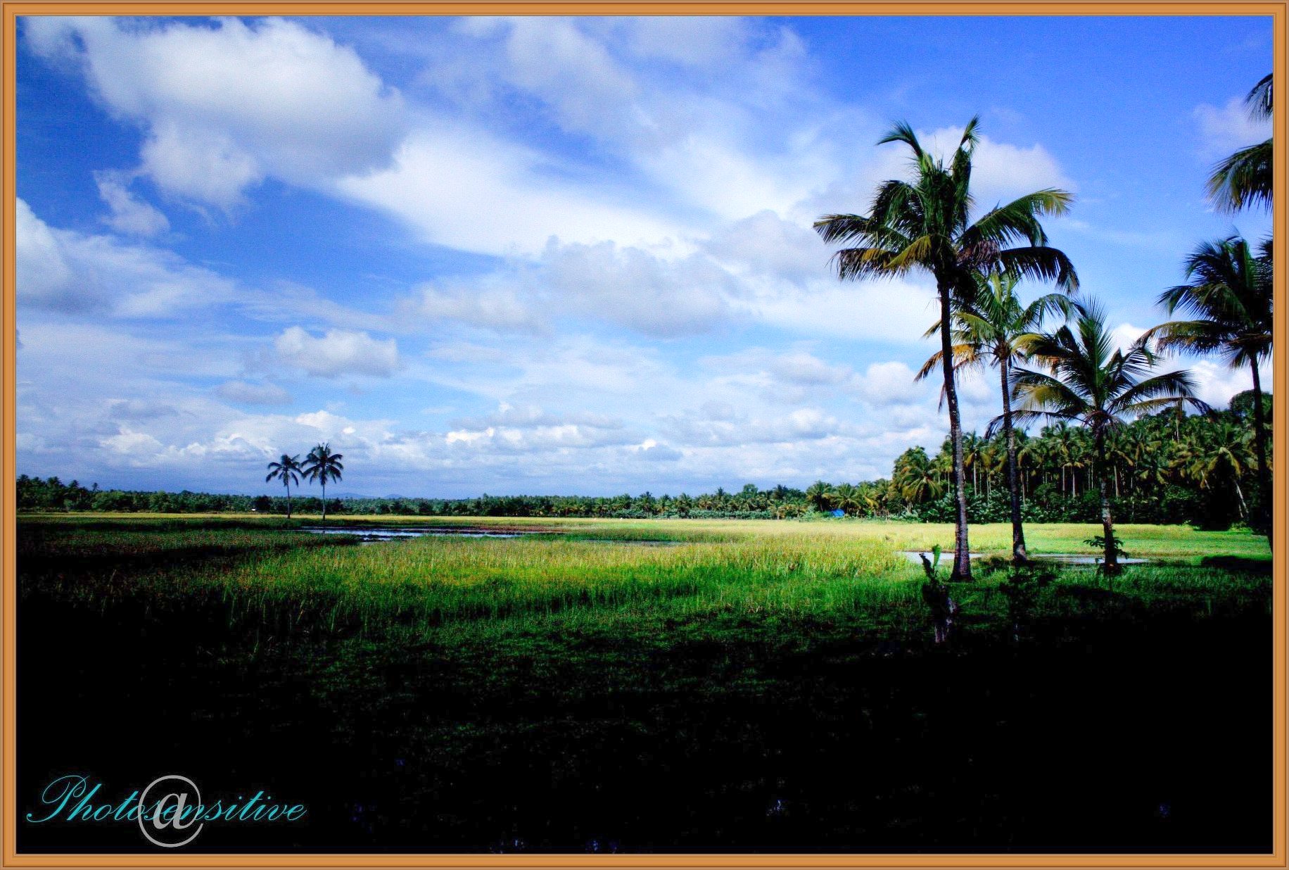
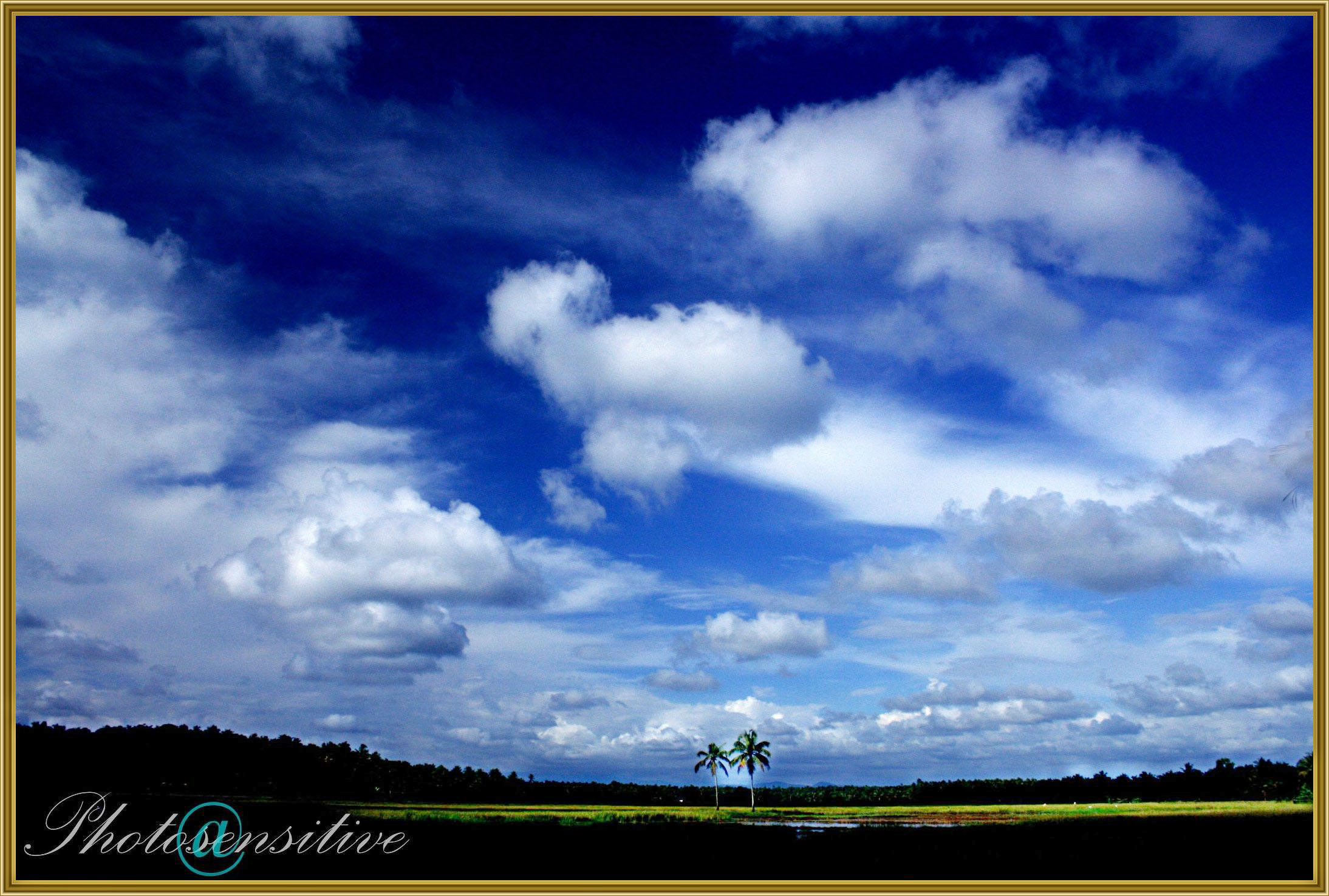
Colors are typical of nature but yet seem to contrast (in a good way) in this image because of their intensity. The "Photosensitive" logo creates a "inspirational" poster look to the presentation.
-
30th August 2012, 04:05 PM #3
Re: From Kerala.with love
Thank you very much Shadowman

-
30th August 2012, 06:19 PM #4
-
30th August 2012, 06:36 PM #5
Re: From Kerala.with love
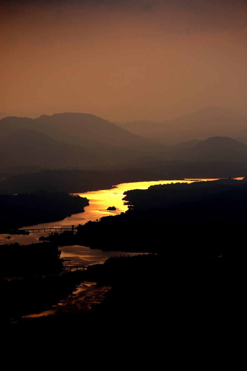
I prefer #2 - it is a wonderful image - much gentler on the eyes than the harsh contrasts of #1. If it were mine, I would crop it square, so that the river is entering (or leaving?) the scene at the bottom lefr hand corner, and so removing those lighter areas below the river from the composition. Just my opinions, of course.

Philip.
-
30th August 2012, 08:48 PM #6
-
31st August 2012, 05:33 PM #7
-
31st August 2012, 05:35 PM #8
-
31st August 2012, 05:41 PM #9
-
1st September 2012, 06:17 PM #10
-
1st September 2012, 06:56 PM #11

- Join Date
- Jul 2012
- Location
- I live a stone's throw away from Cuyahoga National Park (NE, Ohio)..
- Posts
- 1,247
Re: From Kerala.with love
Really love your 2nd image. I agree with some of the other comments on how to improve it. I was in Kerala about ten years ago and thoroughly enjoyed it.
Karm
-
2nd September 2012, 06:06 PM #12
Re: From Kerala.with love
Thank you very much Karm for your viewing and suggestions

-
2nd September 2012, 07:36 PM #13
-
3rd September 2012, 04:20 PM #14
-
5th September 2012, 07:34 PM #15

 Helpful Posts:

 Reply With Quote