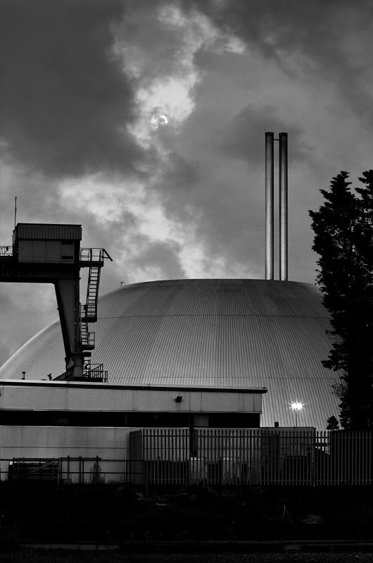
I wanted to get people's opinion on this shot. I like it and was pleased to show it to my girlfriend who then said it was hideous, I thought ok the subject matter is not to her liking but a couple of people have said that the composition is just bad and the colours depressing.
So are they right, is this a bad shot? If so what is it about the composition that's not nice? I thought it was quite nicely structured and I really like the light.
It was taken on my Canon 550d with a 70-300 IS lens at 70mm, tripod supported at F14 1/4s ISO400
 Helpful Posts: 0
Results 1 to 15 of 15
Thread: Docks Picture for C&C
-
30th August 2012, 06:08 PM #1
Docks Picture for C&C
-
30th August 2012, 06:46 PM #2
Re: Docks Picture for C&C
Hi, Richard;
I like the interplay of organic (clouds and trees) with the artificial, particularly the lines and geometric curves. Hope you don't mind but I tried to play with this a bit to bring that out:

Well just a quick run at it and it loses a lot that your photo has so I wouldn't say that it is 'better' (it isn't) but I think it might help clarify what is in the photo that you might be looking to bring out.
-
30th August 2012, 07:15 PM #3
Re: Docks Picture for C&C
Richard, without the title this image wouldn't have portrayed docks to me, but it seems that wasn't your reason for shooting. All I can suggest is that if you want it to be colour, it could do with a bit of brightening and saturation; otherwise if it is the light and structures that matter, might it work better in monochrome?
Philip
-
30th August 2012, 07:31 PM #4

- Join Date
- Jan 2009
- Location
- South Devon, UK
- Posts
- 14,547
Re: Docks Picture for C&C
Admittedly nothing to signify docks in this scene, Richard. But a well balanced moody industrial landscape all the same. Although probably not to everyone's taste.
By all means try monochrome. I fear that the dark areas may merge together but certainly worth a go if you can create plenty of contrast without blowing the sky highlights.
-
30th August 2012, 08:42 PM #5
Re: Docks Picture for C&C
Richard, at least your girlfriend is honest. I am wondering what it was you wanted the viewer to see. I don't really find a main object - maybe it is the domed building and the smoke stacks. The crane pulls the eye to the left, but the crane is not particularly interesting. Apparently, it was twilight because the lights are on and the bottom portion of the image is very dark. I keep looking for something in the dark area to make the image worthwhile, but I can't find anything. Sorry, but the image does not do anything for me. Don't hate me, please.

-
31st August 2012, 01:58 AM #6
Re: Docks Picture for C&C
Like others, it's not bad and it could use some lighting in parts but there's not much interest. I wouldn't call it hideous though. I do see lines starting from the crane leading to the top of the smoke stacks but there's no target. It just leaves into the clouds. Probably if there was something it lead to, there may have been some interest. I do see the moon but it's off the path and it's small. I noticed it only after going back to it looking for something. I tried but still it doesn't do it for me. Don't hate me either!

-
31st August 2012, 08:06 PM #7
Re: Docks Picture for C&C
Thanks for all the feedback.
John I think what you've done brings out the geometric forms that I was looking at when taking it and while they're quite strong I think as everyone says the strength doesn't do much without an obvious organisation.
Philip, I took it intending for it to be B&W but decided to keep it colour to see what people thought of the image naturally, this is the B&W version. Any thoughts?
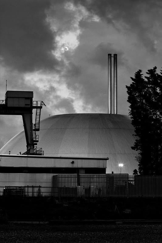
Geoff I didn't worry about merging the shade as the feedback suggests and I think that the many structural items aren't complementary.
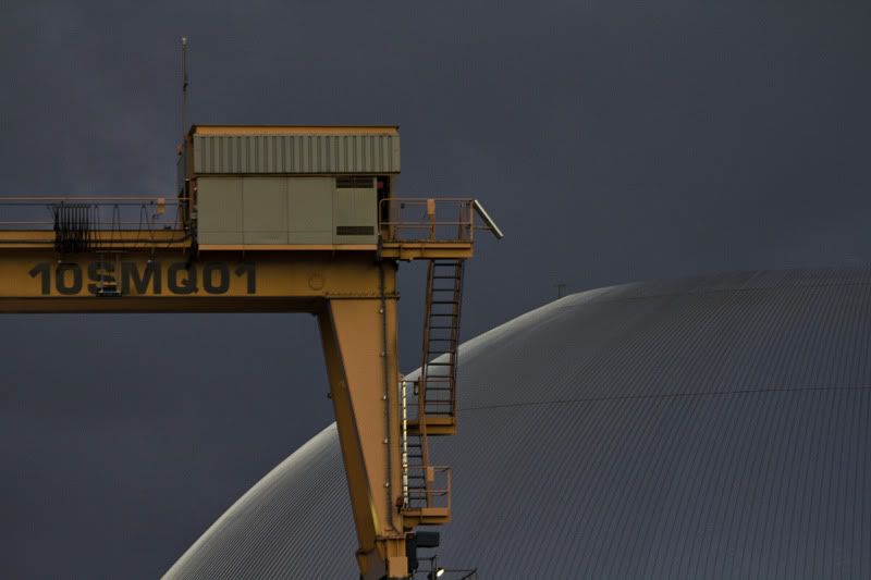
Also in retrospect the title is misleading, I went down to take photos of the docks in Southampton. The picture is of a gas storage facility by them. Ken the main subject is supposed to be the domed building as it is interesting and unusual, sadly I couldn't get close enough to get it uncluttered. When I got the other side of the crane the security guard told me not to take photos and I wasn't going to argue. I took another shot from the same position which I wasn't sure on either:
I don't hate anyone I'm keen to understand where my taste differs to other people
I did try to include the moon better but the cloud wasn't playing ball.
-
31st August 2012, 08:12 PM #8

- Join Date
- Jan 2009
- Location
- South Devon, UK
- Posts
- 14,547
Re: Docks Picture for C&C
With the B&W version, Richard, I think I would crop just a little tighter at the bottom and right side.
-
31st August 2012, 08:36 PM #9
-
1st September 2012, 02:09 AM #10
Re: Docks Picture for C&C
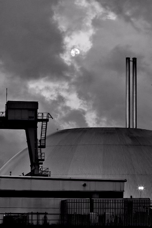
The B&W is better for this shot, Richard. I confess to not noticing the moon at first in the colour image so, when I was playing around converting it to B&W, I enhanced its brightness a bit to make it more obvious. It also seemed to me that cropping to remove the foreground and the tree added emphasis to the scale of the imposing dome, making it more obviously the dominant subject. (And it almost gives the image a "Dad, dad - the aliens have landed" look!
 )
)
Cheers.
Philip
-
1st September 2012, 09:32 AM #11
Re: Docks Picture for C&C
Thanks, I think I'm pretty comfortable with it now, sadly I won't get a better composition unless I trespass into an oil refinery or get a boat, so I'll leave it now, although I'd like to see what else can be done with the building sometime as the effect of the specular reflective surface with a low sun is quite interesting.
The real reason for going to the location was the view in the other direction, which I was quite pleased with:

Again C&C most welcome:
4 landscape shot vertical pano stitch with the same 70-300 lens @ 70mm
All at F4 with different focal points and around 1.5s shutter speed to retain some of the wave structure (ISO 200)
Post processed with photomerge and the final frame at the bottom manually aligned. I've sharpened it a bit, applied LCE and masked in a lower exposure version to recover the highlight detail on the boat. I applied a grad ND to brighten the foreground a bit and that's about it.
I'd quite like to print it (probably around 20" tall) anything else I should consider? Or any other thoughts for that matter.
-
1st September 2012, 11:09 AM #12

- Join Date
- Aug 2009
- Location
- Canada
- Posts
- 3,113
- Real Name
- Wendy
Re: Docks Picture for C&C
Hi Richard. I like this shot and do prefer it in B&W. I think there is too much going on in the original though. Have you thought of cropping just to the top of the building and perhaps even cropping the tree on the right. Sort of like what I've done below.there is some bad cloning on the bit of tree I left in , and there may be halos there but I'm just thinking of the crop right now.
I like the highlights on the stacks and the general mood and tone of this shot, which to me is kind of dark and ominous, the way I like industrial shots to look.
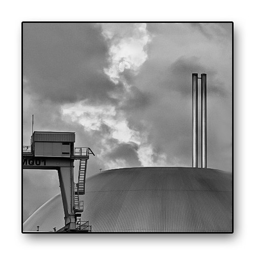
IMG_7815-2 by Wendy FS, on Flickr
I love what you've done with this one and think it would look super in B&W

Wendy
-
1st September 2012, 11:32 AM #13
Re: Docks Picture for C&C
John,
This is a great transformation into a real keeper. I would definitely use the crop Wendy has demonstrated, use the B&W conversion, and clone out the small projections into and off the dome. I think keeping the moon is essential for contrasting the natural vs man-made geometry.
Scott Kelby is always saying that we stop to take a shot because we have seen something , and it is our job to extract it. I think your transformation has done exactly that, and I am glad you didnt give up on it.
Kevin
-
1st September 2012, 12:19 PM #14
Re: Docks Picture for C&C
I think you're right there Kevin, there was definitely something worth shooting, I think I have an aversion to the tight compositions that I should get over. Lesson 1 from this is to get tighter compositions when shooting so I don't end up cropping to postage size photos!
As you said Wendy that shot was always intended to by B&W and thanks for the cropped version. This is my conversion of the other photo:

-
1st September 2012, 03:57 PM #15

- Join Date
- Aug 2009
- Location
- Canada
- Posts
- 3,113
- Real Name
- Wendy
Re: Docks Picture for C&C
Yup, I like it
 Something about this subject that I really like. The lines are great and the tones and lighting seem to lend themselves well to PP. By that I mean if you are not adverse to playing with reality a bit there are many looks that seem to work well. For instance here is another take on a B&W conversion of the close up.
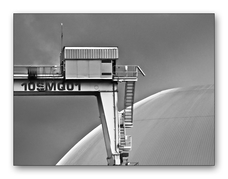
IMG_7825 by Wendy FS, on Flickr
Can't say I like it better or not it's just different processing which in turn sets a different mood. As usual I'm rambling so I'll quit now, but I do want to say great shot.
Wendy


 Reply With Quote