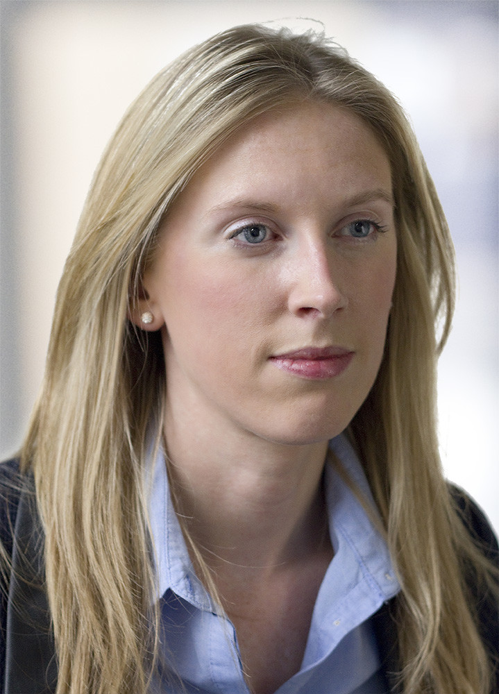
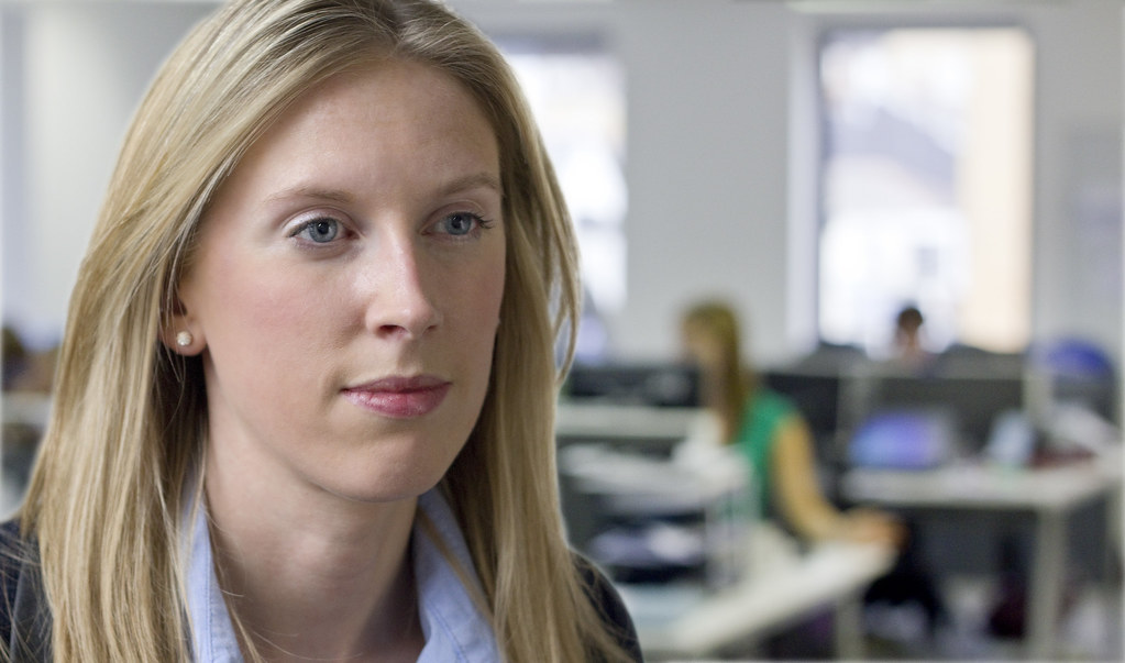
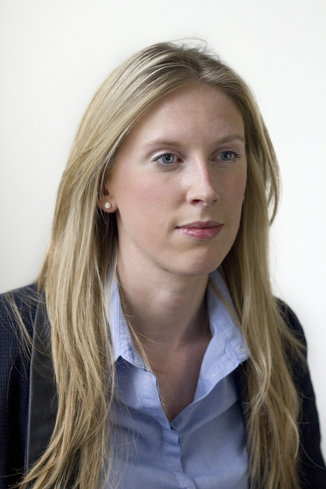
I took my first portrait yesterday, it is of a colleague who needed a shot for a corporate presentation and I wanted to get some feedback on it. Irritatingly though when I upload it it seems, on my computer at least, to lose the warm skin tones of the original leaving grey looking skin. I've messed around with colour spaces and uploaded it to a couple of sites with the same result and am a bit lost.
I would love some feedback on the photo itself as well:
Taken in a meeting room against a white wall (background later brightened in post processing) with the fluorescent lights switched off leaving it quite dark (~6pm UK). The main light is from a window in front and to the right of her and for the fill in a gold lastolite reflector close in on her right at body height (she is seated).
I used a grey card for exposure and white balance and the photo was shot at ISO 800 F3.2 1/100th on a canon ef 50mm f1.8, EOS 550D. Sadly I think I missed the focus point slightly, not sure how but presumably in reframing after focusing on her right eye.
I have sorted out a few blemishes in post processing, softened the skin slightly and used output sharpening, as well as slightly lightening the eyes and faking the catchlights.
I know it's not the most exciting portrait in the world being corporate branded but I want to learn any lessons before doing something more interesting.
Results 1 to 7 of 7
-
21st September 2012, 08:17 AM #1
My First Portrait (C&C and Help please)
-
21st September 2012, 09:28 AM #2
Re: My First Portrait (C&C and Help please)
Richard I think your photo do the job wonderful. Here are some suggestions:
You should try cropping tighter to emphasize the face and use a flatter light source for even lighting which is more appropriate for a woman's portrait. The main problem for me is that her left eye is darker and it seems a bit smaller.
-
21st September 2012, 10:48 AM #3
Re: My First Portrait (C&C and Help please)
The skin tones look fine on my monitor. I wonder if the background is to bright and making the skin tones appear darker than they are? I think a very pale (graduated?) light grey/blue background would help. Also a slight smile would be nice - seems to be no interaction with the photographer. Faked catch lights not over done - good. If you relax the subject can relax.
Bad news - if you are a good photographer you will seldom be completely happy with the result.
Good news - if you can figure out why you are not happy you will get even better.
-
21st September 2012, 11:14 AM #4
Re: My First Portrait (C&C and Help please)
I think the issue is I'm using an old version of safari that isn't colour managed so I end up seeing it very differently to when it was edited.
Paul I think you're right on the background and too that end I've replaced the background on a couple of versions. I also agree with the cropping suggestion, Miltos, which is reflected below the image above was framed SOOC, I couldn't go any closer as the subject is very camera shy and not happy about close ups.
I'm not sure why the left eye seems relatively smaller, it is slightly odd, perhaps because she's facing left and looking slightly right where the photo makes it look like she's looking straight ahead tricking the perspective perception?
On the interaction thing, have to agree. I was quite stuck though the brand rules for the photo require someone to look occupied and be looking away from the camera, combine this with a camera phobic subject and it wasn't going to be an engaging shot. I really wanted to use it to get some practice on the technical side.


-
21st September 2012, 07:58 PM #5

- Join Date
- Oct 2011
- Location
- Ontario, Canada
- Posts
- 189
- Real Name
- Helen Wood
Re: My First Portrait (C&C and Help please)
I think in this case you need to go for the tighter crop simply because of the fact that her blouse is bunching below and around the collar and some of her hair is a bit flyaway or lying back over her shoulder. For a corporate piclture I would nornally prefer the original as I think the business attire is important in setting the tone, but in this case it might give the impression that your colleague is a bit dishevelled. Guys - its not just about the lighting or PP

-
21st September 2012, 11:40 PM #6
Re: My First Portrait (C&C and Help please)
For corporate portraits, I like the subject looking into the camera. It seems like the subject makes a better connection with the viewing audience when looking at them.
Like my mother used to say - "Look people in the eye when communicating!"
I also suspect that turning the head slightly to the subject's right (to the left of the image) would have produced almost a Rembrant lighting effect.
-
22nd September 2012, 02:43 AM #7

- Join Date
- Jul 2011
- Location
- Lake Ambulalakaw, Mt. Pulag, Benguet
- Posts
- 1,026
- Real Name
- Victor Nimitz
Re: My First Portrait (C&C and Help please)
yes to HMW12 and rpcrowe. I guess it's like resumes. it should sell the subject. Who should look neat/fresh/bright smile, and facing the camera.

 Helpful Posts:

 Reply With Quote

