Results 1 to 16 of 16
Thread: Another try at landscapes
-
29th September 2012, 10:27 PM #1

- Join Date
- Apr 2011
- Location
- Ontario (mostly)
- Posts
- 6,667
- Real Name
- Bobo
Another try at landscapes
-
29th September 2012, 10:34 PM #2

- Join Date
- May 2012
- Location
- northern Virginia suburb of Washington, DC
- Posts
- 19,064
Re: Another try at landscapes
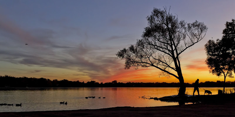
You really nailed the second one. The silhouette of the man and his dog take it to a level that would not have been possible without them.
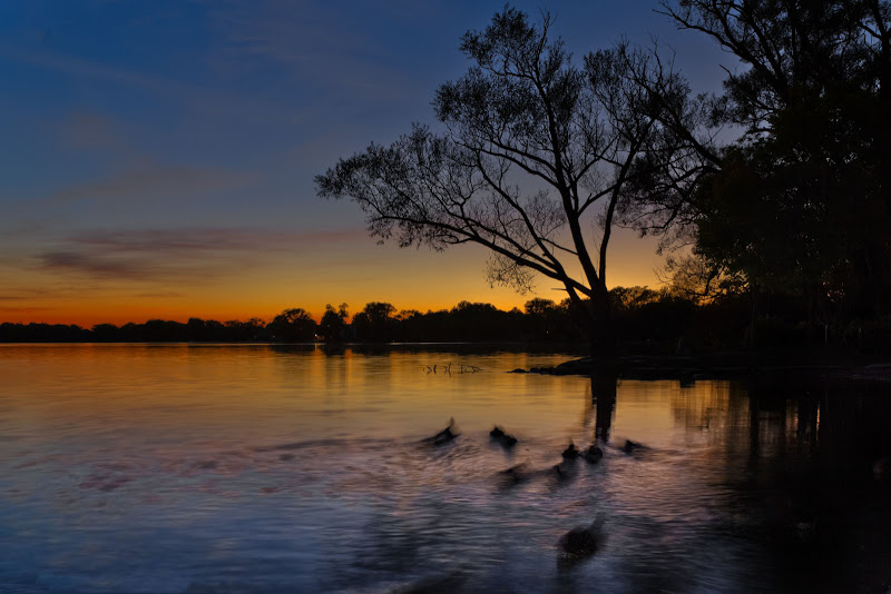
For me, the problem with the first one is that the ducks should either be sharper or more blurry.
-
29th September 2012, 10:41 PM #3
Re: Another try at landscapes
I agree with Mike. The second one is great. I tend to favor a wide ratio for landscapes. To me they just look more natural that way so I would crop the sky just above (but not too close) the top of the tree to get a wider image.
-
29th September 2012, 10:41 PM #4

- Join Date
- Jan 2009
- Location
- South Devon, UK
- Posts
- 14,649
Re: Another try at landscapes
Both work for me, Bobo. Because the foreground elements are somewhat 'placid' you can get away with them being just shadows and concentrate on the sky colours.
-
29th September 2012, 10:43 PM #5

- Join Date
- Dec 2011
- Posts
- 780
Re: Another try at landscapes
Both great looking photo's to me Bobo, I really like #2 though it keeps me looking!
-
29th September 2012, 11:07 PM #6

- Join Date
- Sep 2012
- Location
- San Antonio, Texas
- Posts
- 1,749
- Real Name
- Sergio
Re: Another try at landscapes
Bobo, I too like them both. Keep going; you are getting more and more versatile.
Serge
-
29th September 2012, 11:53 PM #7
Re: Another try at landscapes
Second for me as well Bobo. Very nice.
-
30th September 2012, 06:08 AM #8

- Join Date
- Apr 2011
- Location
- Ontario (mostly)
- Posts
- 6,667
- Real Name
- Bobo
Re: Another try at landscapes
Thanks Mike, Frank, Geoff, Carl, Serge, Paul. I really appreciate the feedback.
Mike - you wanted blurred or sharper. Sir, your wish is my command.
3.

4. Could have made this wide but wanted to keep the stronger ripple action and the blurry tree reflection.

Frank - you wanted wider. Actually the shot was much wider and taller and #2 was just my usual 12x8 crop. Here is a redo.
2a. Question now is - is it too wide?

2b.

-
30th September 2012, 06:21 AM #9Moderator


- Join Date
- Feb 2009
- Location
- Glenfarg, Scotland
- Posts
- 21,402
- Real Name
- Just add 'MacKenzie'
Re: Another try at landscapes
Nope. But there's a plane in the sky that's got to go.
Compositionally and in an ideal world, I wouldn't have had that little group of ducks at the extreme left edge. But if you'd gone earlier or later for the shot, you wouldn't have got the man and the dog as they are. Who was it that said never work with animals or kids?
But back to the original question - "Posting to see if I am getting it, getting closer, or still not getting it.", I think we can now exclude the last option from the list. Start doing this sort of thing on a regular basis and you can tick option 1.
-
30th September 2012, 06:49 AM #10

- Join Date
- Apr 2011
- Location
- Ontario (mostly)
- Posts
- 6,667
- Real Name
- Bobo
Re: Another try at landscapes
Thanks Donald for the confidence booster. Will certainly do it more often.
Regarding #2 - the ducks on the left and the plane were reasons for the original crop as I was too lazy to clone them out.
Man and dog - I was not even aware of him until hearing a splash and seeing the dog leap into the water. Was getting way too frustrated with something else (that other post) so switched to the 17-50. Probably missed a couple of the jumps. Luckily caught them just as they were leaving.
-
30th September 2012, 11:13 AM #11

- Join Date
- May 2012
- Location
- northern Virginia suburb of Washington, DC
- Posts
- 19,064
-
30th September 2012, 11:15 AM #12
Re: Another try at landscapes
Very nice Bobo, you give me ideas and inspiration to move beyond the birds I photograph.
-
30th September 2012, 01:41 PM #13
Re: Another try at landscapes
I am i love with your first crop of #2. Love the man and his dog and the colors are really beautiful. More landscapes, please.

-
30th September 2012, 02:24 PM #14
Re: Another try at landscapes
I prefer the wide crop due to the fantastic color gradient of the sky but they are all great Bobo!
-
30th September 2012, 02:33 PM #15
Re: Another try at landscapes
Hi Bobo, I find that looking for a landscape crop can be somewhat challenging when there are a number of elements in the image to consider. Sometimes I play with a number of different crops to get the elements to play nicely together.
I am guessing that 2b is close to the full width of the original so I'd start there.
Close your eyes, count to ten then open your eyes. Quickly determine the first thing you notice in the image.
Red is an attention getter so my vision goes to the tree that is right smack in the middle of the red. A very pleasing shaped tree at that! The man and dog would be more prominent if they were not silhouetted so here the size of the tree makes it slightly more prominent than the man and dog.
Right Side Crop Position: In this image, my eye starts at the red sky, expands to the full tree and takes in the man and dog as the primary subject. The result is that my eye is being drawn to the right and is looking to see where the man and dog are going. The tall right hand tree directs my vision up and into the corner of the image with nowhere to go. I feel that your choice of crop on the right in 2a was a better than 2b as it redirects the eye back to the left rather than up into the corner.
I would probably play with moving the crop as far right as possible without exposing the tall bare branch sticking up above the height of first tree. Adding a bit more to the right in 2a gives the man more breathing room but still redirects the vision back to the left along the lake line. The unnatural shape of the box is in competition with the rest of the image so if you feel comfortable with removing it I think (as in the airplane) that would reduce a source of tension in the scene.
Left Side Crop Position: There are several things that can help position the left side crop. The first is where horizontally in the scene do you want the subject? That can depend on the shape of the subject, the flow of action or vision in the scene, and what is on either side of the subject that would provide a good sense of balance.
In this image the position of the right side is fairly well determined and without the dramatic red sky on the left we have a lot of latitude. This leaves the center of the image and how far from the center should the primary focal point of the subject should be. In my vision, the center of the subject is just about at the trunk of the first tree.
If we use 2a as a guide for where the right side crop will go, the tree trunk is about 75% of the way across the screen from the left. We usually use either the Rule of Thirds or the Golden Ratio as a starting guideline and go from there. In this case, that should place the subject somewhere between 56% and 66% of the way from the left. That would put the starting point for the left side crop slightly left of where you cropped in your first posting of image 2.
Top and Bottom Crop Position: Now that we have starting point for the left and right, we can look at top and bottom. We have a strong horizontal line in the horizon so it provides a natural Rule of Thirds/Golden Ratio starting point. If we set the horizon at just about the 65% point from the top what do we get? It looks like we would lose a little bit of empty sky but retain most of the foreground.
Typical Landscape Ratios: Being as we have the right and left crop positions reasonable close for a starting point, I would use the blank space at the top (sky) and bottom (foreground) to make the landscape ratio work, usually somewhere between 16:9 and 2:1.
Assuming that we are not slaves to any 'rules', we could use the cropping tool at these points and see how we like the look of the scene, being very willing to change the crop to make the composition more appealing.
In the end, there is a lot of room for personal preference but taking the time to think about how the elements of the scene fit together and apply basic guidelines as a starting point can make the result more pleasing to you. Just don't expect that it will please everyone!Last edited by FrankMi; 30th September 2012 at 03:12 PM.
-
1st October 2012, 05:35 AM #16

- Join Date
- Apr 2011
- Location
- Ontario (mostly)
- Posts
- 6,667
- Real Name
- Bobo
Re: Another try at landscapes
Sorry about the late response. Brain addled, eyes blurry, tough tough day, and not going to get much rest either as off very early for the 16 hours flight.
Thanks Mike, Joe, Terri, Miltos for you kind words.
A really big thanks to Frank for the detailed dissection and "rules" on how to look at cropping. Have copied this to my how-to folder for future reference.
Anyway see you guys in a couple of days, hopefully with some great landscapes (fat chance but always hopeful ).
).

 Helpful Posts:


 Reply With Quote
