Hi,
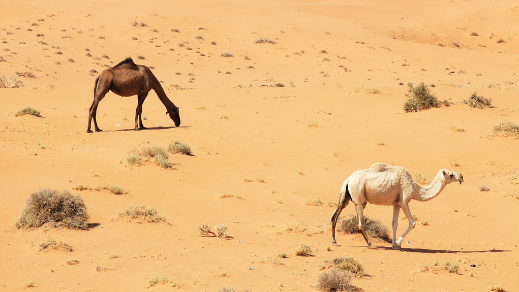
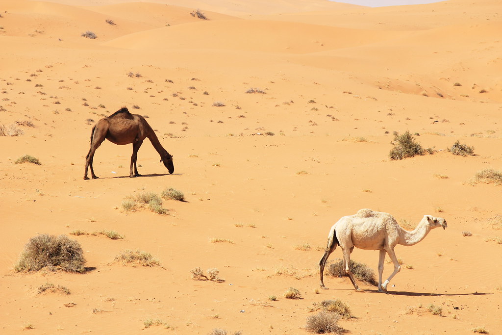
It`s a common view here (Desert, Camels) and there is no much colors to see, but i think you may be interested.
Camels by khussein2011, on Flickr
 Helpful Posts: 0
Results 1 to 4 of 4
Thread: Black&White
-
30th September 2012, 09:33 AM #1
Black&White
-
30th September 2012, 01:50 PM #2Moderator


- Join Date
- Feb 2009
- Location
- Glenfarg, Scotland
- Posts
- 21,402
- Real Name
- Just add 'MacKenzie'
Re: Black&White
Khalid
I think the great appeal of this is the almost monotone appearance ....... except for that bit of sky at the top!
I wondered if we need to see so much at the top of the frame, i.e. background? If it was cropped to a 16:9 ratio using the existing bottom and sides, I think you get both camels more closely placed in accordance with the 'rule-of-thirds' and you create quite a pleasing and strong (I think) diagonal line from the top left to the bottom right of the frame that doesn't quite bisect the camels equally, but does cross over both of them.
The best way of illustrating this is to show an example. I hope you do not mind me making this copy.

-
30th September 2012, 03:43 PM #3
Re: Black&White
Khalid it's a great image which with Donald's modification is even better!
I like the contrast of the tones of the animals and the placement on the diagonal of the frame really accentuates that.
-
30th September 2012, 04:40 PM #4
Re: Black&White
Hi,
Its looks much more better now thank you Donald .
Thank you Miltos for comment .


 Reply With Quote