Results 1 to 10 of 10
Thread: Pose
-
12th November 2012, 11:26 PM #1
-
13th November 2012, 12:42 AM #2
Re: Pose
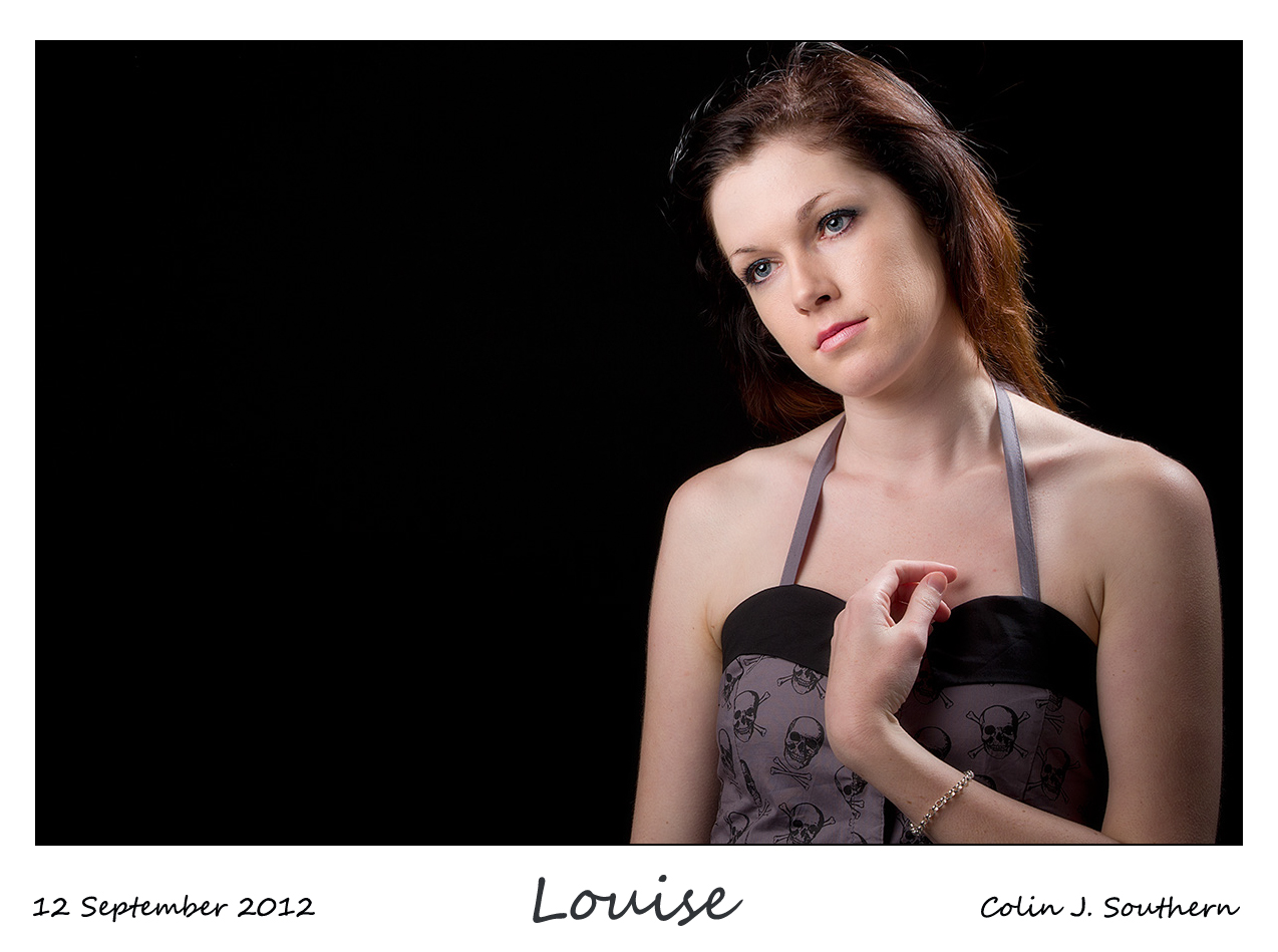
Hi Bruce. What an exceptionally beautiful lady. Unfortunately I personally don't think youve captured her very well in this image. The light is a little hard for my taste and a diffuser between the light source and subject would have softened it and taken the shine off the skin.
I think the crop is a little tight and to much of the hair has been lost.
This kind of pose in my opinion doesnt work with this kind of light and the dark line across the lower 3rd of the background looks wrong.
Did you pose this shot or capture the moment?
Powell that's my thoughts, but I'm sure the portrait peeps will be along shortly to put me right!
-
14th November 2012, 12:17 AM #3
Re: Pose
Mark, thanks for the comments. The photo was not posed. I believe the young lady was not even aware that the pic was taken.
This was at a group event so I did not have the control over this pic that would have been ideal. This was planned as a candid shot. Bruce
-
14th November 2012, 12:29 AM #4

- Join Date
- Dec 2008
- Location
- New Zealand
- Posts
- 17,660
- Real Name
- Have a guess :)
Re: Pose
Hi Bruce,
It's a nice capture, but to my eye, the balance of it is all wrong; in essence you've got space above the head - but little below the chin - so the net result is that the eyes are waaaaay too low in the frame. You've also got a lot of almost negative space by virtue of the black hair dominating the right hand side of the frame thus giving the lady very little "space" to look in to. There's also severe skin shine that really neads to be dealt to in post-production.
Hope you don't mind but because the image had good resolution to play with, I've given it an alternative presentation for you - it's still not the crop I'd prefer, but it's all I had to work with on 2 of the 4 sides of the image.

-
14th November 2012, 04:37 AM #5

- Join Date
- Feb 2012
- Posts
- 396
Re: Pose
I agree with the above comments. It is a good attempt but doesn't quite come off for me. I know exactly what you mean about having no control. Sadly I have a pile of street photos/candids that would have been great if the subject had just done/not done something differently. It is part of the challenge of candids.
My one suggestion to supplement the above comments is the eyes. You don't need actual eye contact but you do need to be able to see the eyes to make some sort of connection with the subject. If you can't see the eyes, because the subject is looking away, then you can compensate by pulling back and capturing whatever/who ever they are looking at.
-
14th November 2012, 01:06 PM #6

- Join Date
- May 2012
- Location
- northern Virginia suburb of Washington, DC
- Posts
- 19,064
Re: Pose
Colin treated the shine on the skin nicely but this probably could have been handled nicely at the time of capture using a polarizer.
-
14th November 2012, 07:17 PM #7

- Join Date
- Dec 2008
- Location
- New Zealand
- Posts
- 17,660
- Real Name
- Have a guess :)
Re: Pose
True, but polarisers can also give colour shifts in skin tones which is why the likes of Joe McNally (the ultimate "get it right in camera" guy) makes a point of avoiding them for portraiture.
My biggest suggestion for that shot would have been to shoot it horizontally, and leave about a heads worth of space on the left hand side of the frame to give me some cropping options.
Personally, I think that space is important. eg if all the negative space were cut out of this image, I don't think it would work well.

Last edited by Colin Southern; 14th November 2012 at 07:24 PM.
-
14th November 2012, 11:38 PM #8

- Join Date
- May 2012
- Location
- northern Virginia suburb of Washington, DC
- Posts
- 19,064
-
15th November 2012, 12:05 AM #9

- Join Date
- Dec 2008
- Location
- New Zealand
- Posts
- 17,660
- Real Name
- Have a guess :)
-
15th November 2012, 01:55 AM #10

- Join Date
- Jul 2012
- Location
- Chicago, IL, USA
- Posts
- 803
- Real Name
- Gretchen
Re: Pose
I like the first shot. First because I am really impressed at how well you captured her hair. Velveting and irridescent in a way. I have a hard enough time figuring out how to capture my solid color dogs. Many people of Afrikan descent have such wonderful texture and sheen in their hair, I want to reach out and touch it. (it's actually a "white people" joke --"Yes, it's really my hair, you don't have to touch it!"). Anyway, I feel the same way about this picture. I want to reach into the picture and feel her hair.
The larger crop shows a nice contrast to her lovely complexion and the closed eyes (for me) make the shot even that much more alluring.
I think you made a nice composition here. Unusual portrait, but it works for me.

 Helpful Posts:

 Reply With Quote

