 Helpful Posts: 0
Results 1 to 7 of 7
-
19th November 2012, 05:18 AM #1
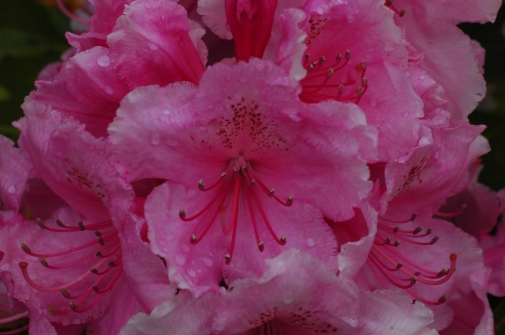
An attempt at PP - comments welcome
-
19th November 2012, 07:13 AM #2Moderator


- Join Date
- Feb 2009
- Location
- Glenfarg, Scotland
- Posts
- 21,402
- Real Name
- Just add 'MacKenzie'
Re: An attempt at PP - comments welcome
Certainly not. So far as the tripod is concerned, then it should be right up there on the list of needs. If you know that you want to master the skill of stacking images, the go for it.
As for the images posted. Obviously you were the only one there and it's you who knew how you wanted the final version to appear. Based on what we see as the original it feels that you've pushed it quite a lot on post-processing. But, if these were the colours you saw when you pressed the shutter, then fine.
EDIT - If you haven't seen it already, there's a good discussion about stacking going on at the same time as this thread is active. It's over here.Last edited by Donald; 19th November 2012 at 07:56 AM.
-
19th November 2012, 08:40 AM #3
Re: An attempt at PP - comments welcome
Yes, that thread got me going on stacking.
Thank you for the comments, I think it has gone too far, some of it seems to have washed out a bit.
But I haven't really got a clue what I am doing!
Just experimenting.
-
19th November 2012, 07:31 PM #4

- Join Date
- Jan 2009
- Location
- South Devon, UK
- Posts
- 14,572
Re: An attempt at PP - comments welcome
The original appears to have potential; and does need a little brightness added. But I think you have probably overdone the saturation with your edit.
I would probably have used a little bit of Curves adjustment and little, if anything, else.
Sometimes when I find that simply using Curves is pushing the colour/saturation a little bit too far, I do the adjustment on a layer and set the layer blend mode to Luminosity so only the brightness gets affected.
But that idea does assume that you have suitable software and a bit of previous experience.
-
19th November 2012, 07:34 PM #5
-
19th November 2012, 07:49 PM #6
-
19th November 2012, 07:52 PM #7


 Reply With Quote
