 Helpful Posts: 0
Results 1 to 15 of 15
Thread: Foggy today
-
26th November 2012, 01:32 AM #1
-
26th November 2012, 02:01 AM #2

- Join Date
- Apr 2011
- Location
- Ontario (mostly)
- Posts
- 6,667
- Real Name
- Bobo
Re: Foggy today
All lovely shots. I particularly like #3 because of the man and dog in the distance.
Is there any reason to leave in the 4 bright spots on the path at mid-bottom?
-
26th November 2012, 02:07 AM #3
Re: Foggy today
Only that I was being lazy....hmmm.
 I will clean those up. Thanks.
-
26th November 2012, 02:24 AM #4
Re: Foggy today
I tried to decide which of the images I prefer. But I like all three - each has a different feel to it.
P.S. We had bright blue skies this morning across the water up here but our time will come!
-
26th November 2012, 02:41 AM #5

- Join Date
- Aug 2009
- Posts
- 2,342
- Real Name
- Steve
Re: Foggy today
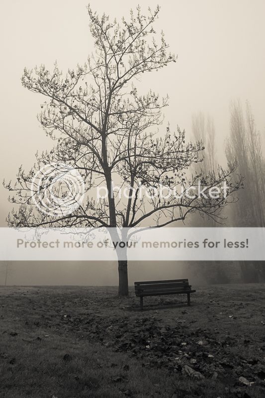
Nice shots paul. I like the man in the third one, but i really like the lighting in the first one best. (and like it best of the 3) I think the first would look awesome in a sepia tint .
-
26th November 2012, 03:11 AM #6
Re: Foggy today
Thanks Bruce, careful what you wish for. lol
Thanks Steve, I may have to try that.
-
26th November 2012, 03:31 AM #7
-
26th November 2012, 03:55 AM #8

- Join Date
- Aug 2009
- Posts
- 2,342
- Real Name
- Steve
-
26th November 2012, 04:26 AM #9
Re: Foggy today
LOL Guess mine was a little red although still sepia.
 I think I like yours better although I do not dislike mine.
  I must go back and see what I did.
Last edited by jeeperman; 26th November 2012 at 04:42 AM.
-
26th November 2012, 08:19 AM #10Moderator


- Join Date
- Feb 2009
- Location
- Glenfarg, Scotland
- Posts
- 21,402
- Real Name
- Just add 'MacKenzie'
Re: Foggy today
I'm never very keen to get into these 'that one is better than this one' type of debate, but for me the three images in the first post provide a good exercise in studying composition and make some comparisons.
For me (and others may disagree) the first one (that is then further processed later in the thread) stands head and shoulders above the other two. The reason I say that is because i think it is a beautifully balanced image. The bench and the tree are in the right place in the frame and in the right places relative to each other. I also think the lines of the edges of the walkway work wonderfully in that they provide strong direction in terms of taking us into the picture
The second one is more unablanced to my eye. For me there is nothing in the lower part of the image that balances the very dominant tree. Also, I feel the bench is in that image almost by accident - because it happened to be at the bottom of that tree.
Again, in the third one it's just a question of how the whole image balances up. I acknowledge what others have said about the man and the dog, but I feel the bench is too near the bottom of the frame and that in this frame much more than in the first one, that area of grass at the bottom right is just empty space whereas in the first one, the same bit of grass place a much more balancing role.
I think that first is a a real high-quality image. I don't know about the toning. I like it in its original state. But if I hadn't seen that and all I saw was the toned version, I'd have liked it.
-
26th November 2012, 08:35 AM #11
Re: Foggy today
Thank you for your input Donald, as someone whom makes B&W images I admire it is very helpful to hear your thoughts. I feel the same way about the second image. I also see your points on the others.
-
27th November 2012, 12:58 AM #12
Re: Foggy today
Paul, I prefer the "red" sepia rather than the "green" sepia. I asked my wife to look at each one and she (independently) came to the same conclusion -- although I suppose this might be the result of my monitor.
-
27th November 2012, 01:07 AM #13
Re: Foggy today
I absolutely love the first image. When I first looked it was...Wow. It was so pleasing to look at and study. I didn't know why until I read Donald's post, then I understood the balance of the bench and tree made it so pleasing. I would treasure it and have a print of it on my wall. Beautiful work Paul.
-
27th November 2012, 01:26 AM #14
Re: Foggy today
Thank you Bruce, I thought I saw a little green in Steves after I came back to it a few minutes ago, just before reading your post. I like both of the toned images ok but the first one has the feel I wanted and intended and is still my pick. Thank you, the input is always helpful to hear everyones thoughts.
Thank you, Joe. I am happy you like it. I like the subtle and smooth texture of the fog on/around the tree. Just what I was hoping for. Thanks again.
-
27th November 2012, 01:32 AM #15

- Join Date
- Jan 2011
- Location
- Tennessee
- Posts
- 1,732
- Real Name
- james
Re: Foggy today
Truly a great series. The first picture is good enough, that the tint red or green does not hurt it in any way.


 Reply With Quote

