Results 1 to 12 of 12
-
29th November 2012, 01:35 PM #1
Colours of winter ( Anstruther) 3 pics
-
29th November 2012, 01:46 PM #2
Re: Colours of winter ( Anstruther) 3 pics
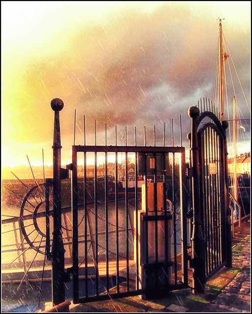
I like the window in image one. So much so that i would crop out most of the wall to the left and let the window have more of the final image.
Two is great. Nice and subtle.
In the third; I would have avoided the vignette effect and let the hard sharp light on the hay extend to the edges. The light edges draw my eye too much. I really like the way the puddles in the field are emphasized by their subtle splash of color in the almost monotone environment. I would also consider cropping really close to the steeple to reduce the light sky as an element.
-
29th November 2012, 03:34 PM #3
Re: Colours of winter ( Anstruther) 3 pics
Thank you for considered comments Trevor.
I know some people are not keen on vignettes but I thought it helped to convey the frosry feeling of the field...Late gathering the hay in this year.
The first one is such an abstract that I like the bold, dark angles of frame around the window but I will take your suggestions on board and re-visit the images with them in mind.
Thanks again.
-
29th November 2012, 05:06 PM #4
Re: Colours of winter ( Anstruther) 3 pics
Of the 3 I like the first one best. I think it conveys 'winter' better than the others. I might be tempted to straighten the vertical lines but otherwise I like it as is. Just my ¢¢ (or is that 2p?).

-
29th November 2012, 05:57 PM #5
Re: Colours of winter ( Anstruther) 3 pics
I have to buck the trend here and say #1 does absolutely nothing for me... that's just me though.
However, #2 I swear looks like it could be a movie poster. I love the painterly look to it. Everything is in balance. I honestly can't think of a single thing I would change with it. Absolutely stunning work!
#3 is another winner for me too. Again with the painterly look, and the perfect balance. Usually I dislike dramatic vignettes like that, but in this case, I think it is spot on and actually think it completes the image perfectly.
Absolutely beautiful!
- Bill
-
29th November 2012, 06:17 PM #6
Re: Colours of winter ( Anstruther) 3 pics
Thank you so much Steve and Bill.
It's really refreshing to get such different views on shots.
-
29th November 2012, 08:26 PM #7Moderator


- Join Date
- Feb 2009
- Location
- Glenfarg, Scotland
- Posts
- 21,402
- Real Name
- Just add 'MacKenzie'
Re: Colours of winter ( Anstruther) 3 pics
There are lots of photographers out there who absolutely insist that white vignetting should be banned and those who use it cast into the fires of hell forever. The argument is that the whole idea of vignetting is to darken up the edges so that the viewer's attention is directed into the image and not out to the edges.
Well ................!
I'd suggest that this is the example that proves the theory wrong (oh boy, that should start a debate!). I think this is a gorgeous image, with the excellent composition being complemented by that light vignette
-
29th November 2012, 08:42 PM #8
Re: Colours of winter ( Anstruther) 3 pics
I also like the window best, and while the dark on the left doesn't bother me (I think it would look odd if that was cropped out actually) I am bothered that the vertical lines are slightly askew.
-
29th November 2012, 09:00 PM #9
Re: Colours of winter ( Anstruther) 3 pics
-
29th November 2012, 09:12 PM #10
Re: Colours of winter ( Anstruther) 3 pics
I like the third the most. I've seen good use of white vignettes mostly in winter shots, where it does push attention to the center, but it seems fine here--not at all distracting. And in other respects, it is a very striking image.
I am the odd one out, but the second image does nothing for me because of the saturation. if that were pulled back to more natural levels, the image might be striking, but I am having a hard time envisioning it.
-
29th November 2012, 09:52 PM #11
-
29th November 2012, 10:04 PM #12
Re: Colours of winter ( Anstruther) 3 pics
ha ha ha !


 Helpful Posts:


 Reply With Quote
