Results 1 to 8 of 8
Thread: Back to the racing
-
21st January 2013, 11:02 AM #1
-
21st January 2013, 04:06 PM #2
Re: Back to the racing
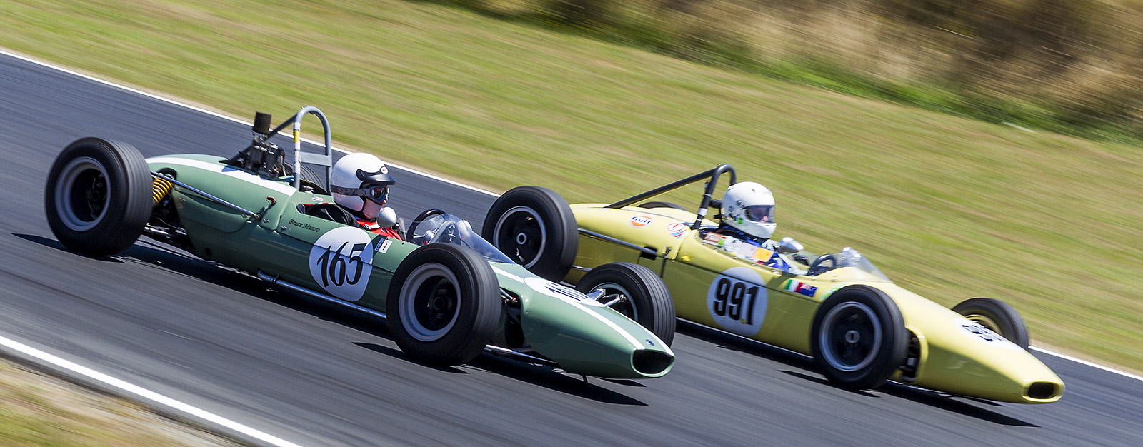
I like the shots a lot and you nailed the pans quite well. I am not sure, however, if I like the tilted framing with the cars seemingly traveling downhill. Unless, of course, they were actually traveling downhill...
Of course, I think that I have a prejudice against tilted framing in virtually all shots in which this technique is used. Lots of folks like it, so please take my above comment with a large grain of salt!
-
21st January 2013, 09:40 PM #3Moderator


- Join Date
- Feb 2009
- Location
- Glenfarg, Scotland
- Posts
- 21,402
- Real Name
- Just add 'MacKenzie'
Re: Back to the racing
Where are the icebergs?
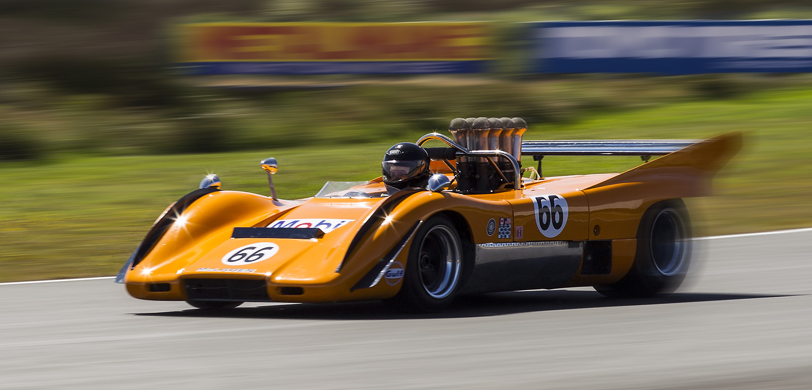
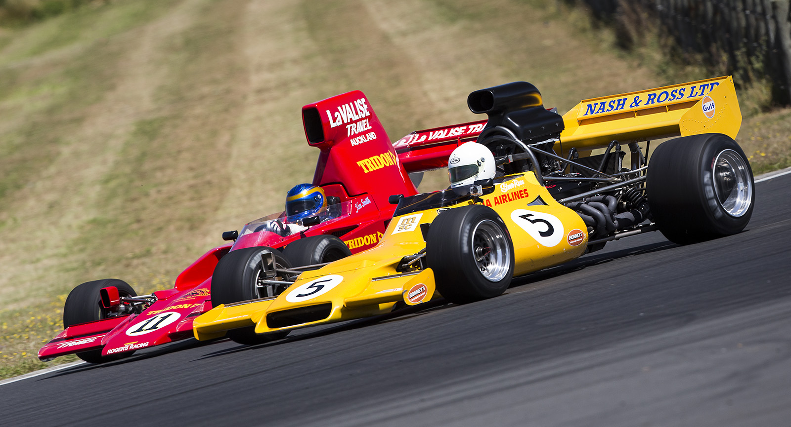
Not only superb examples of panning in action, but also excellent colour in each of them. Lesson - It's not just about being good a photographing cars travelling at speed. it's also about creating an image that has the the key elements of good photography (composition, exposure, good colour/tone).Last edited by Donald; 21st January 2013 at 09:47 PM.
-
22nd January 2013, 12:09 AM #4
-
22nd January 2013, 12:10 AM #5
Re: Back to the racing
Nice series, Mark. Very well handled.
-
22nd January 2013, 01:19 AM #6

- Join Date
- May 2012
- Location
- northern Virginia suburb of Washington, DC
- Posts
- 19,064
Re: Back to the racing
There is some serious moire taking place in some of the smaller versions, so I hope everyone is reviewing the images in the Lytebox.
All of them are just terrific, but I have to mention the third one. The color-coordinated signs in the background are great. Though I don't regularly review photos of racing cars, I don't remember seeing part of the car showing motion and part of it not, apparently due to the angle. So, I like that a lot. Notice also that the driver is so sharp that you can easily see his facial features.
Very well done!
-
22nd January 2013, 07:09 AM #7
Re: Back to the racing
Mike
Thanks for the comments. The third image is basically created in cs6. I always go from the starting point of a good primary image. I used the content aware move feature of cs6 to get the signs in the right place. They were way outside my original crop. Duplicate the layer. Apply a motion blur of about 120 pixels in the same direction of the pan/car. Apply a black layer mask to hide the blur. Use a pressure sensitive tablet to apply different levels of transparency to the mask to create the illusion of tremendous speed. I will add that the original image was taken at 160th and I was only about 30 feet from the car as it whizzed by on the main straight, so there was already a significant amount of motion blur. By applying a very low transparency to the back end of the car you can create a feeling of acceleration.
Mark
-
22nd January 2013, 12:20 PM #8

- Join Date
- May 2012
- Location
- northern Virginia suburb of Washington, DC
- Posts
- 19,064
Re: Back to the racing
Thanks for the explanation, Mark. Very helpful!
Now that I have reviewed the photo with the understanding of what you did and why you did it, it seems to me that the motion blur should have also been applied to the car's shadow and the vertical uprights of the stabilizer on the rear of the car (I think it's called a stabilizer). Perhaps to the horizontal parts of the stabilizer and rear of the body also. Right or wrong?Last edited by Mike Buckley; 22nd January 2013 at 12:25 PM.

 Helpful Posts:


 Reply With Quote
