
 Helpful Posts:
 I'm wondering does it make god or bad impact to tilt the horizont?
Results 1 to 14 of 14
Thread: Diagonal horizon - good or bad?
-
26th January 2013, 07:18 PM #1

- Join Date
- Dec 2012
- Location
- Varkaus, Finland
- Posts
- 18
- Real Name
- Timo Heinonen
Diagonal horizon - good or bad?
-
26th January 2013, 08:17 PM #2

- Join Date
- Jul 2011
- Location
- Ontario, Canada
- Posts
- 1,300
- Real Name
- Andrew
Re: Diagonal horizon - good or bad?
Hi Timo - I personally like this type of image, (I know there will be many on here who disagree with me), however, I will clarify, I do tend to find it makes for more of a journalistic type photo than a piece of art.
Either way, I personally like it.
-
26th January 2013, 08:23 PM #3
- Join Date
- Nov 2009
- Location
- Provence, France
- Posts
- 993
- Real Name
- Remco
Re: Diagonal horizon - good or bad?
Personally, I'm not always fond of the effect, but I find a strong tilt more acceptable than a tiny one:
the strong tilt is clearly intended, the horizon that's just a few degrees off looks sloppy (to me!).
-
26th January 2013, 08:29 PM #4

- Join Date
- Aug 2011
- Location
- Wick, Caithness, Scotland.
- Posts
- 2,609
- Real Name
- Sharon
Re: Diagonal horizon - good or bad?
Agree with Remco...if you are going to tilt at all..tilt big!

-
26th January 2013, 08:41 PM #5

- Join Date
- Sep 2011
- Location
- Athens, Greece
- Posts
- 719
- Real Name
- Miltos
Re: Diagonal horizon - good or bad?
Good or bad? Let's say interesting.
Also agree with Remco and Sharon.
-
26th January 2013, 08:57 PM #6

- Join Date
- May 2012
- Location
- Macae - RJ, Brazil
- Posts
- 673
- Real Name
- Antonio Luz
Re: Diagonal horizon - good or bad?
Timo,
It depends on the situation. Normally, a horizon with some (little) tilt is caused by a lack of perception of the photographer, or because it was a snapshot and the photographer does not have much time to take the picture (as in photojournalism). A purposely (very) inclined horizon is used to dramatize a scene, giving a sense of movement or spontaneity.
In the case of your photo, I find it beautiful, but I think it would look better if the horizon was not inclined.
Antonio.Last edited by Panama Hat & Camera; 26th January 2013 at 09:39 PM.
-
27th January 2013, 07:15 AM #7
- Join Date
- Dec 2012
- Location
- Varkaus, Finland
- Posts
- 18
- Real Name
- Timo Heinonen
Re: Diagonal horizon - good or bad?
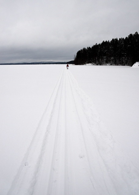
Thank's for feedback. I realized what I'm aiming at. I wanted to dramatize or underscore perspective and the long trail the hiker has ahead. Here the straight horizon version of the same pic:

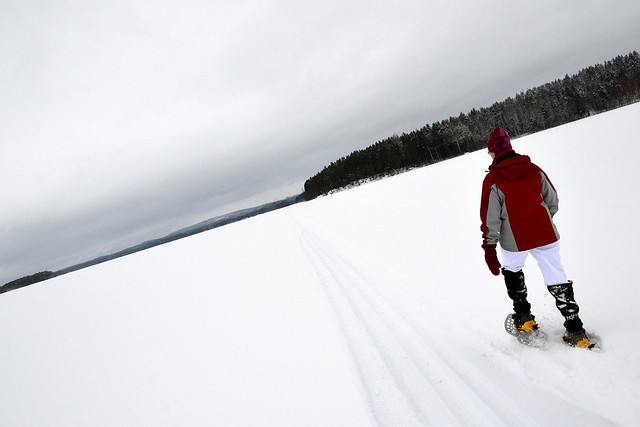
and here a portrait version of the same situation and dramatically tilted horizon:

-
27th January 2013, 08:28 AM #8

- Join Date
- Apr 2011
- Location
- Lille, France
- Posts
- 82
- Real Name
- Allen Conway
Re: Diagonal horizon - good or bad?
I don't like the 2nd one at all - the person in the photo looks like he has been imprisoned in a small (transparent) box. There is no space and without the space the photo loses all interest. What is there to look at? The rear of a man in a grey and red top with white trousers that are not the same white as the snow with an avalanche of trees about to happen on the right?
In the 1st there is the sense of space, of emptiness. The figure of the man may not detach himself enough, perhaps, from that space, his head arriving unfortunately just where the line of trees runs across the bleak horizon. Nevertheless...
-
27th January 2013, 11:41 AM #9
- Join Date
- Aug 2010
- Location
- Stockholm, Sweden (and sometimes Santiago de Cuba)
- Posts
- 1,088
- Real Name
- Urban Domeij
Re: Diagonal horizon - good or bad?
Sometimes I envy the Finnish for their genderless third person pronoun...
Hi Timo,
I think that you are looking for the diagonals compositionally, and that the dilemma could be solved rather easily by another approach. If you step a bit to the side, to compose the picture in a way that the track will hit a corner of the image, you may well get that sense of distance even without twisting the horizon.
Then another thing for isolating your person walking. I think you definitely need to get a higher position, maybe rising the camera overhead and looking at a tilting screen if you have such a camera, so that the vast distance becomes emphasised by isolation of the person from the shoreline. You might note, particularly in the shots where you have got a bit further on the trail, that the juxtaposition of garments with the shoreline trees in a way destroys the feeling of vastness. The images where the shore is more distant display relations between our small size and nature's vastness better, and gives stronger compositional elements by a cleaner white snow field as the bottom for the track to run over its diagonal.
I too have been pondering this theme, and I think the major thing is to get yourself off at the side of the track to get it to run diagonally over the image frame. Then to make a person small, a higher camera position that isolates her from the forest, even though taking it at a reasonably close distance to emphasise the distance that has to be covered. And of course drama can be added by leaning the horizon. If you keep the horizon level, your diagonally running track might point to somewhere in the middle of the composition, while turning it to the side may make them strong diagonal lines opposed to the twisted horizon.
-
27th January 2013, 12:02 PM #10

- Join Date
- Sep 2009
- Location
- Burton on Trent, UK
- Posts
- 4,788
- Real Name
- Steve
Re: Diagonal horizon - good or bad?
The top one is great; I saw somewhere that diagonals represent action, horizontals stability and verticals authority or power. Works here.
-
27th January 2013, 12:39 PM #11
- Join Date
- Dec 2012
- Location
- Varkaus, Finland
- Posts
- 18
- Real Name
- Timo Heinonen
Re: Diagonal horizon - good or bad?
Sorry, didn't mention the person is "she". Originally Posted by Inkanyezi

Thank´s for thorough reply. I have some more pics of the same situation but not that kind. Instead I have a quite opposite composition: I mean symmetrical instead of diagonal trail. I myself don't like it so mutch but show it enyway here:
-
27th January 2013, 03:58 PM #12
- Join Date
- Dec 2012
- Location
- Varkaus, Finland
- Posts
- 18
- Real Name
- Timo Heinonen
Re: Diagonal horizon - good or bad?
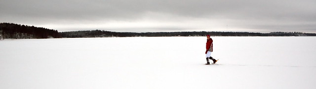
Thanks for good tips. Here one composition more, where I tried to emphasis the horizontals stability and also the long lonely trail. Originally Posted by arith
-
27th January 2013, 04:22 PM #13Moderator

- Join Date
- May 2008
- Location
- Windsor, Berks, UK
- Posts
- 16,774
- Real Name
- Dave Humphries :)
Re: Diagonal horizon - good or bad?
Hi Timo,
I liked the first one of the series, the level version doesn't work so well, perhaps a little better if you crop off the left edeg to where the distant tree line is thin-est. You've done this in #3 and #4.
In almost every case you have her head 'touching' the dark tree line, was this deliberate?
Someone else mentioned separating them, far easy done when shooting; e.g. from higher (or closer) for #5, or taking a bit sooner in #4.
Just a thought,
-
27th January 2013, 04:38 PM #14

- Join Date
- Jul 2008
- Location
- Southern California, USA
- Posts
- 17,409
- Real Name
- Richard
Re: Diagonal horizon - good or bad?
I generally don't like tilted norizons but agree that some are acceptable than others. I like the first example better than the other tilts.
What I really dislike though, is a wedding album filled with tilted images...
However, perception is a personal thing. I like the Photoshop CS6 oil paintng filter and many other photographers don't!

 Reply With Quote