Results 1 to 20 of 116
Thread: Flightless Angels... (Series)
-
3rd February 2013, 09:08 AM #1
Flightless Angels... (Series)
-
3rd February 2013, 02:55 PM #2

- Join Date
- May 2012
- Location
- northern Virginia suburb of Washington, DC
- Posts
- 19,064
Re: Flightless Angels... (Series)
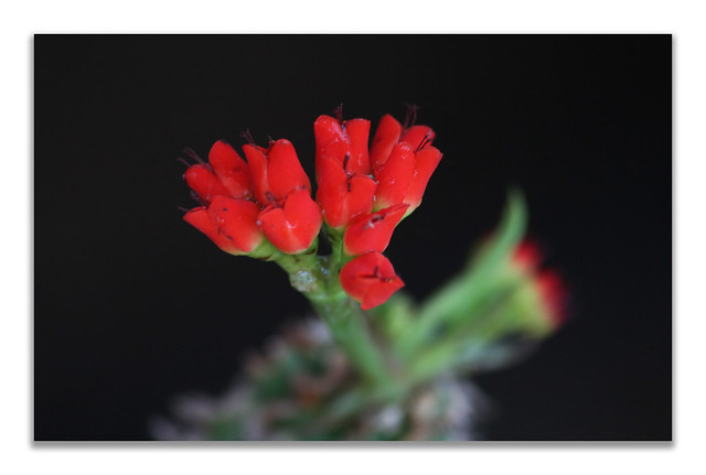
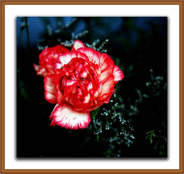
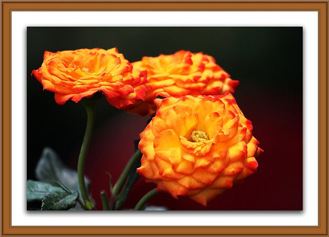
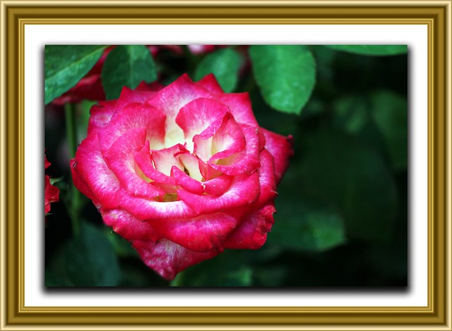
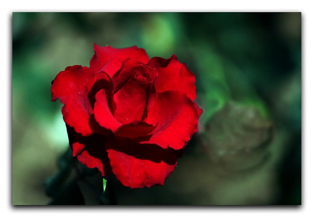
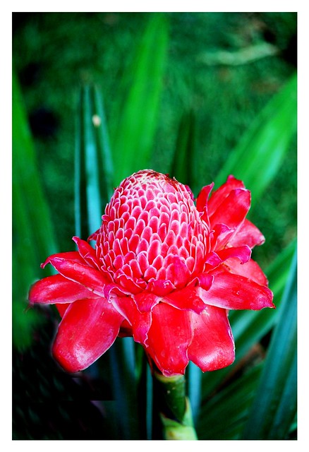
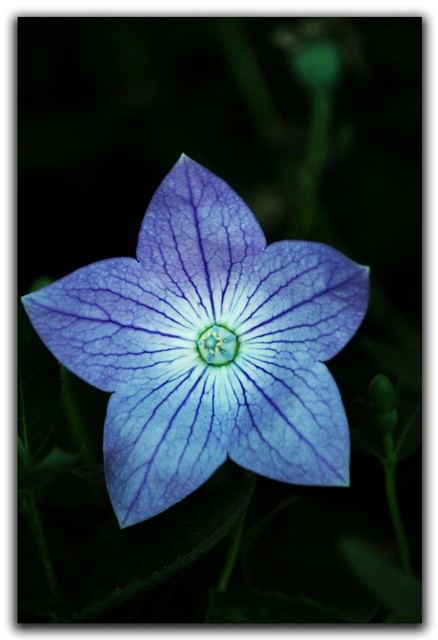
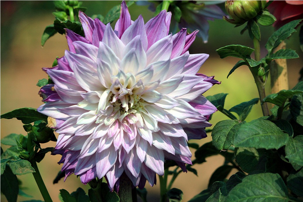
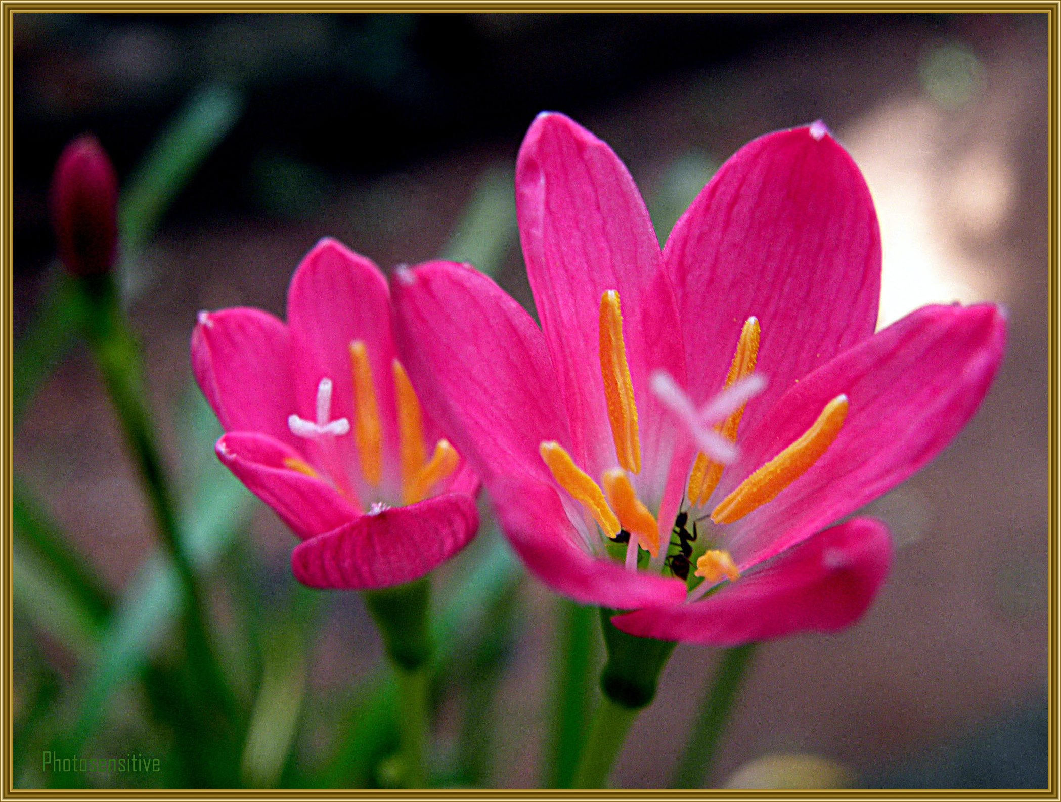
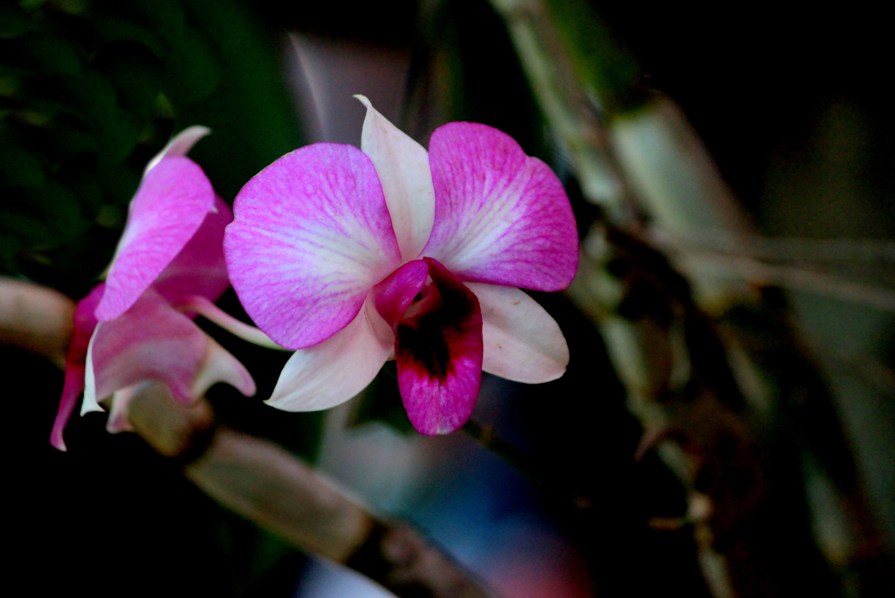
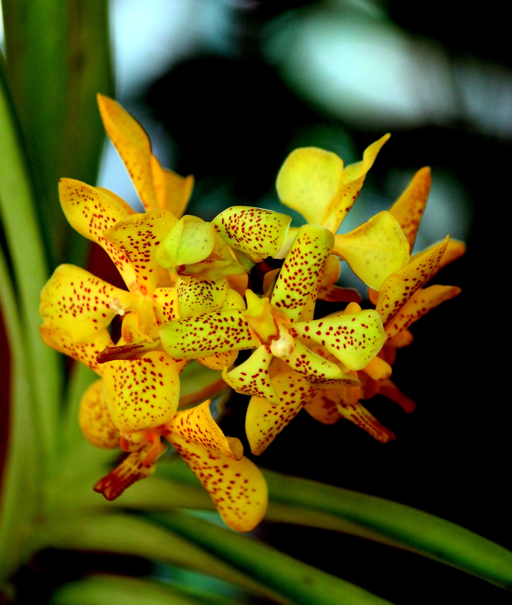
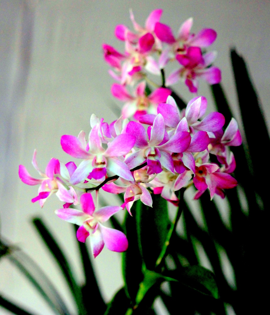
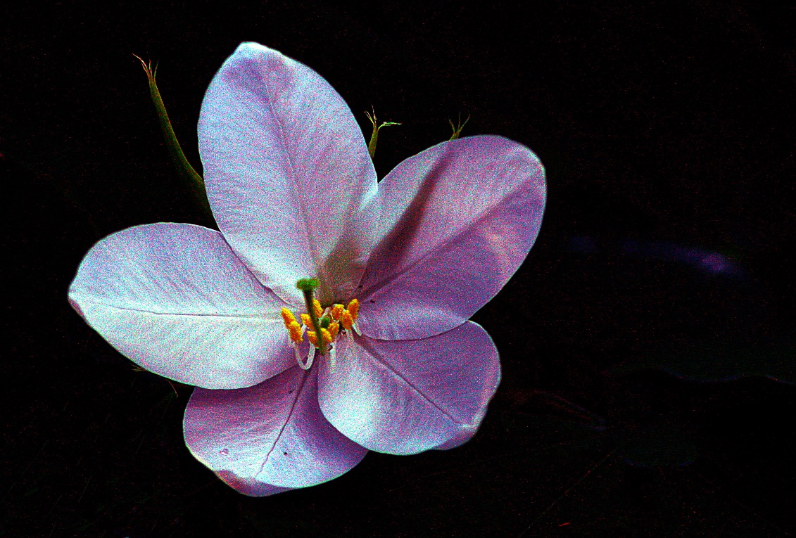
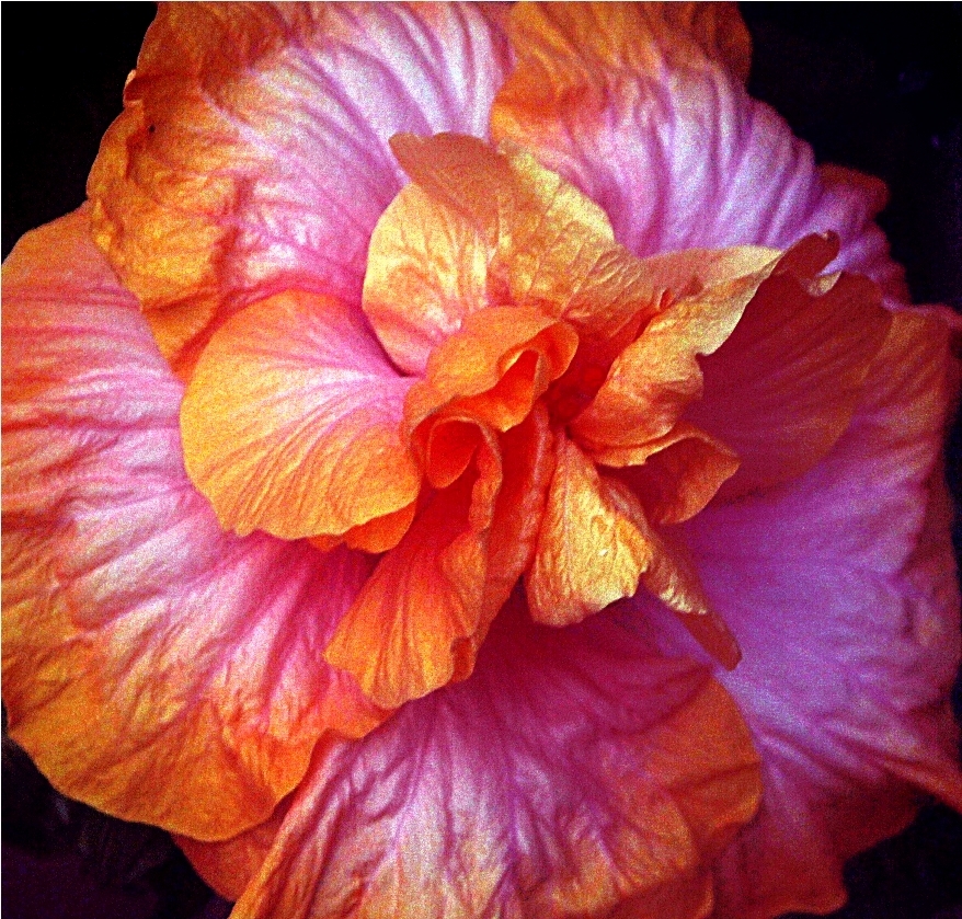
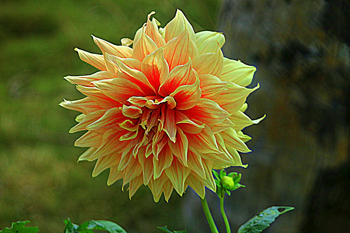
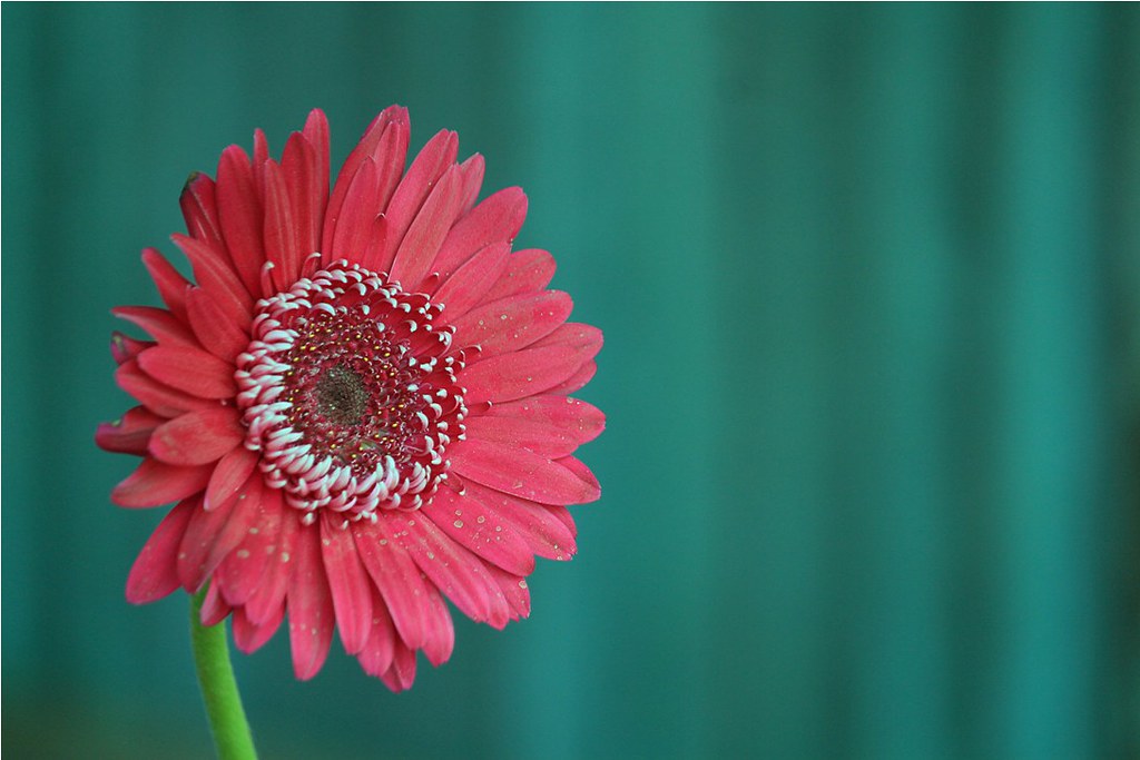
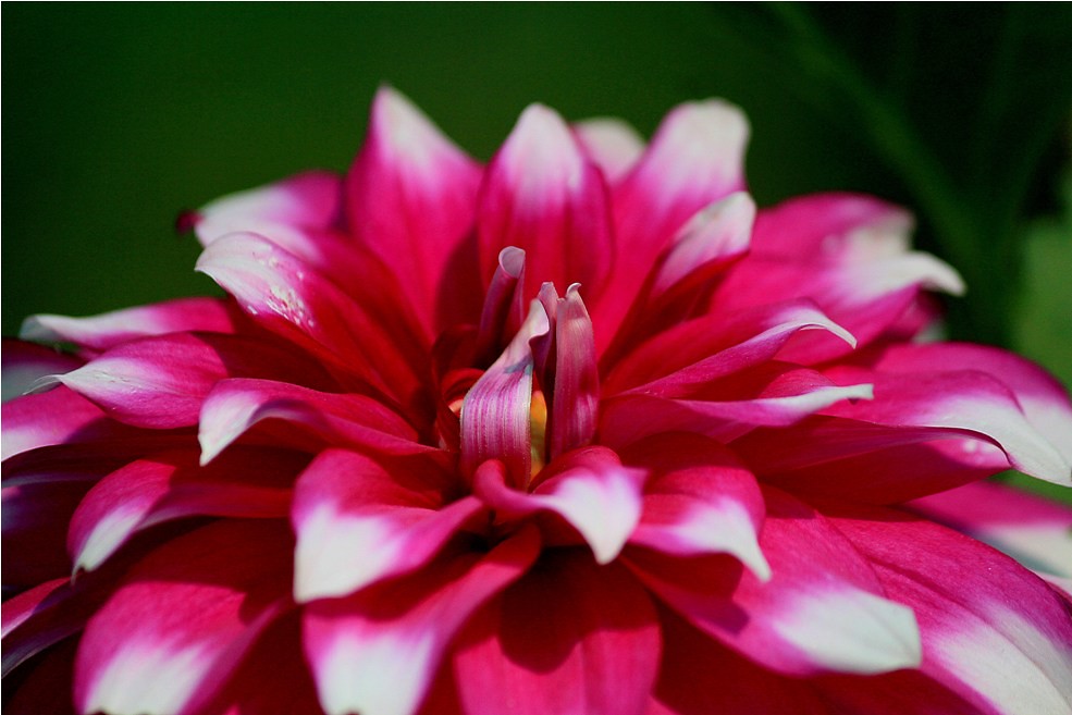
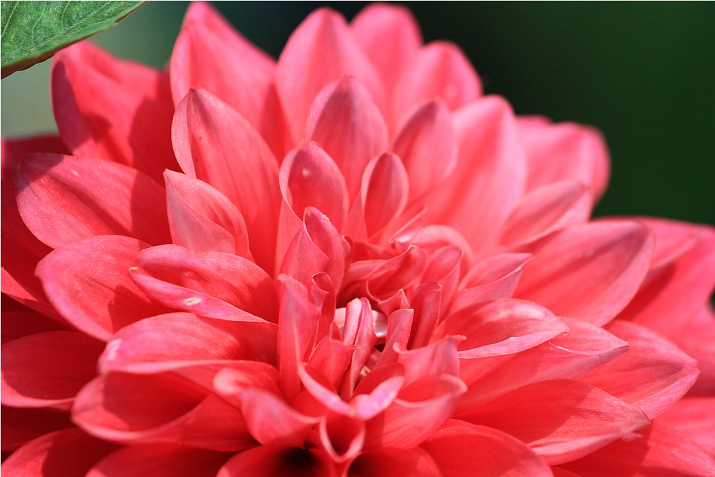
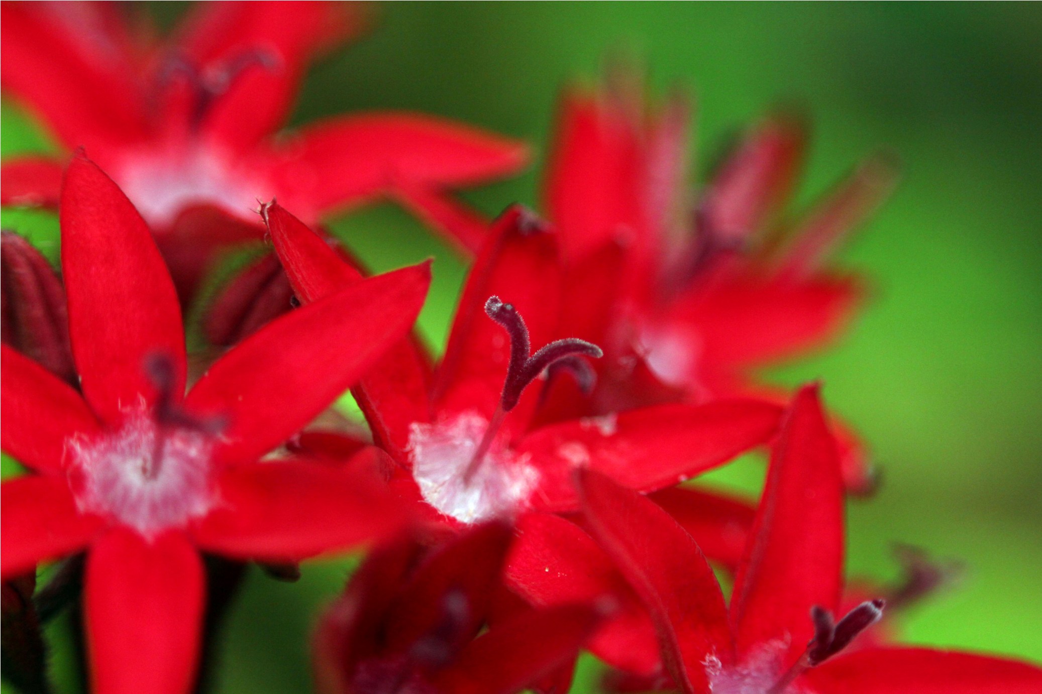
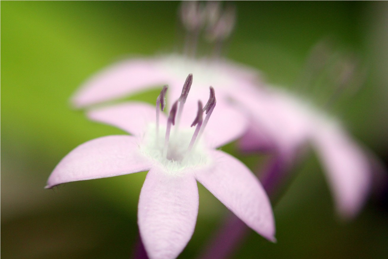
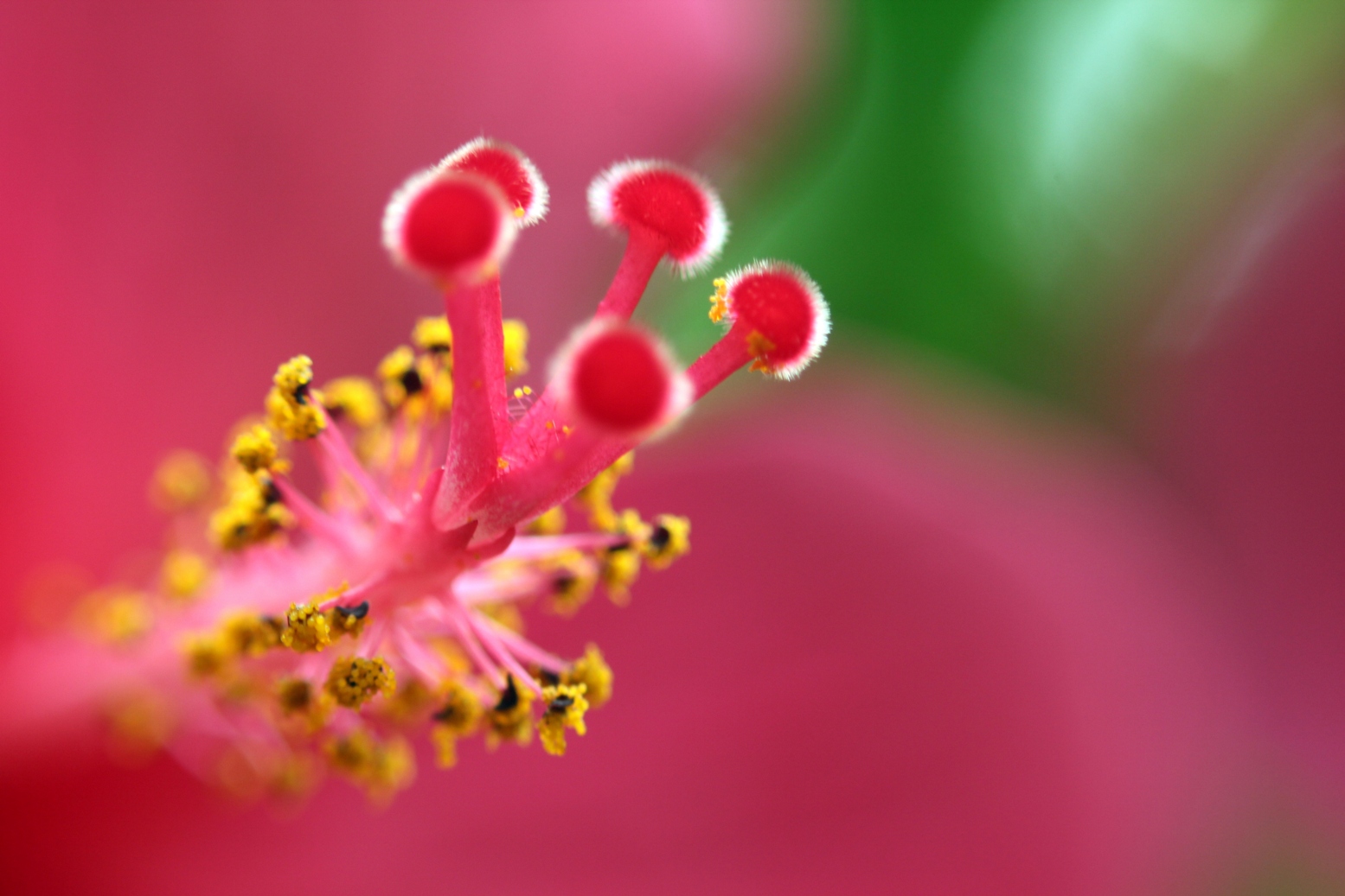
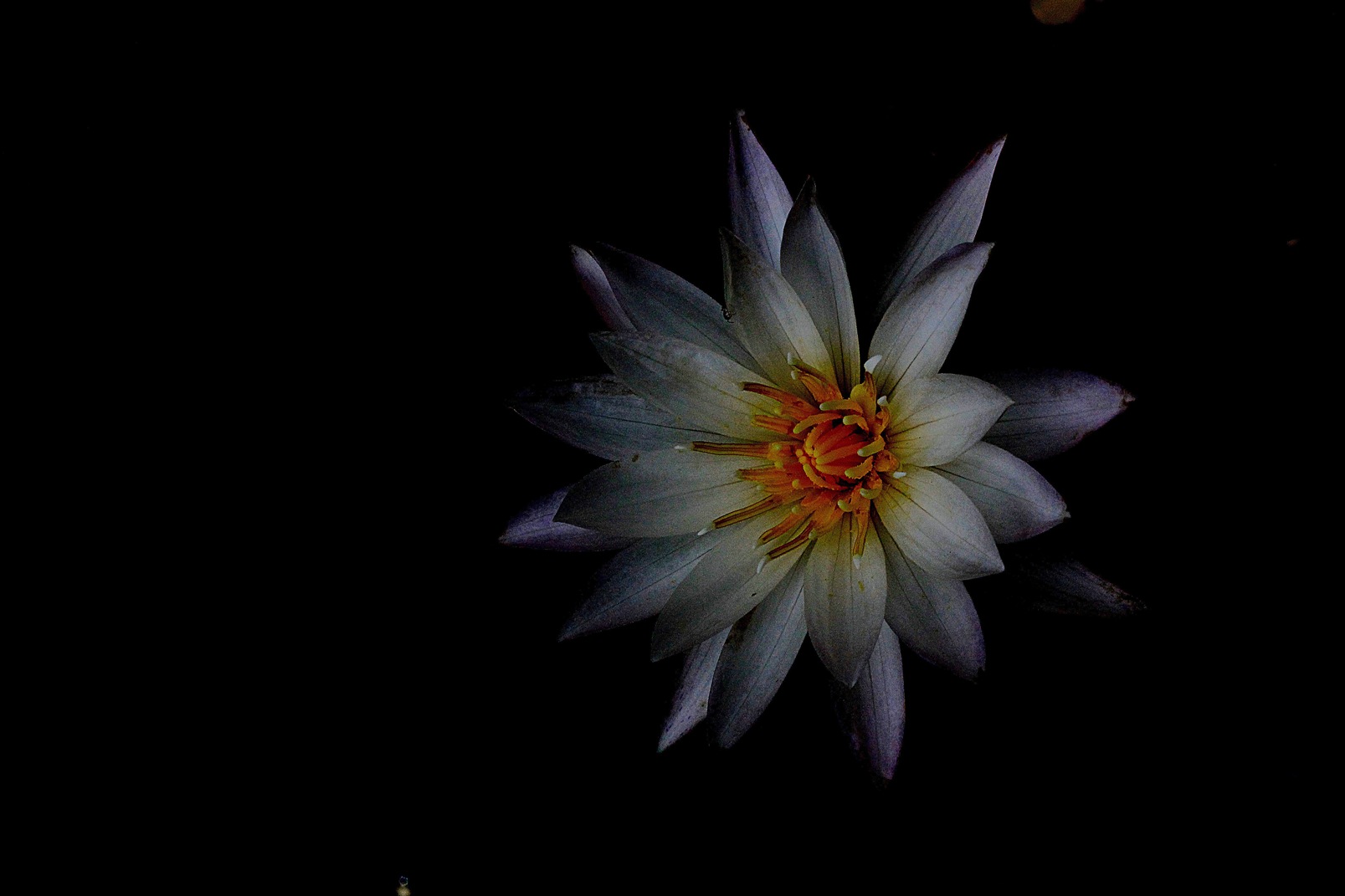
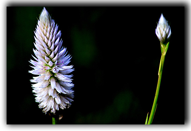
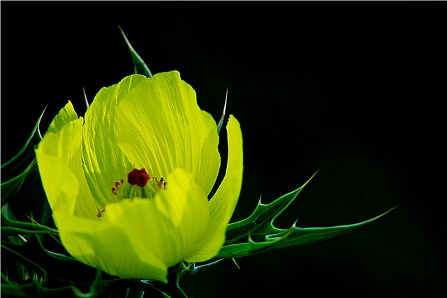
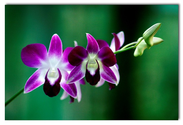
A wonderful series of dramatic presentations! I like all of them though #4 is my favorite. #2 is my least favorite because I would prefer less space between the two flowers.
-
3rd February 2013, 03:12 PM #3
Re: Flightless Angels... (Series)
O, Thank you very much Mike; These words give me much inspiration

-
3rd February 2013, 05:55 PM #4
Re: Flightless Angels... (Series)
Lovely, I like all of them. As Mike wrote if the flower bud and stem were closer to the main flower in the second I think it would work better. In Photoshop you might try cloning it closer. Do you happen to know the name of the fourth flower?
-
3rd February 2013, 06:00 PM #5

- Join Date
- Jul 2012
- Location
- Hackensack, NJ
- Posts
- 228
- Real Name
- George
Re: Flightless Angels... (Series)
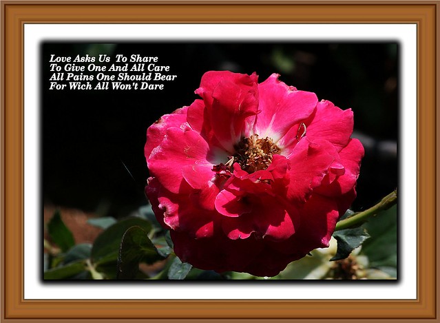
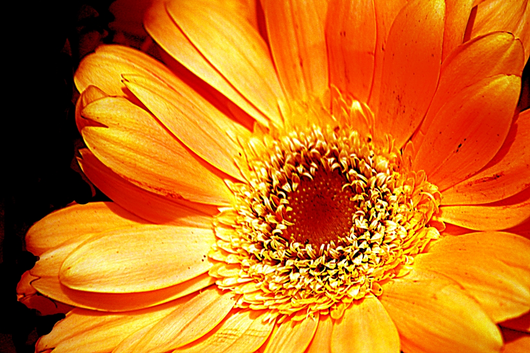
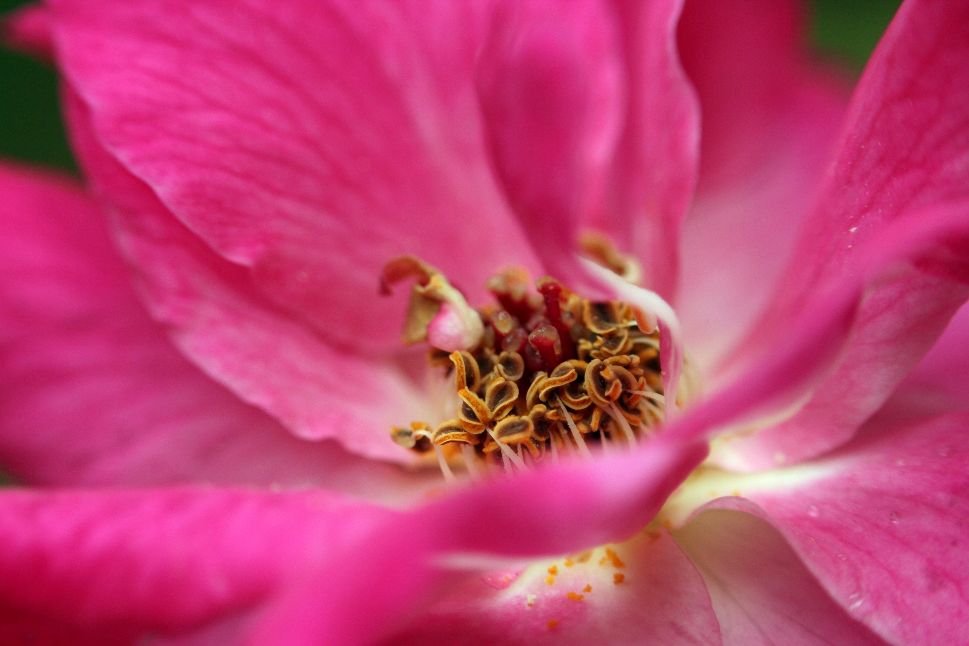
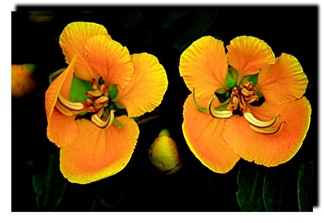
All are excellent. The third may use some more space to the right for balance.
-
4th February 2013, 07:12 PM #6
Re: Flightless Angels... (Series)
-
4th February 2013, 07:14 PM #7
-
4th February 2013, 07:26 PM #8
-
4th February 2013, 07:39 PM #9
Re: Flightless Angels... (Series)
#9's great. Flower macro, while beautiful, can get repetitive quickly. 9 breaks the mold very well. While there's no clear focal point, the intense colors and abundant details are superb.
-
5th February 2013, 05:38 AM #10
Re: Flightless Angels... (Series)
Thank you very much Lex; i fully agree the chance of such a subject going prosaic with repetition is very high; so i will take care to add some specialty, or select mostly select such ones....
Regards
-
5th February 2013, 08:31 PM #11
-
6th February 2013, 07:59 PM #12
-
7th February 2013, 05:34 PM #13
-
8th February 2013, 03:20 AM #14

- Join Date
- Jan 2011
- Location
- Tennessee
- Posts
- 1,732
- Real Name
- james
Re: Flightless Angels... (Series)
While all these are extremely well done I peresonally like 11 and the first 22 best.
-
11th February 2013, 05:57 PM #15
Re: Flightless Angels... (Series)
Thank you very much jamn

-
13th February 2013, 04:47 PM #16
-
12th September 2013, 06:48 AM #17
-
15th September 2013, 06:26 PM #18
-
16th September 2013, 12:39 PM #19
-
17th September 2013, 12:02 AM #20

- Join Date
- Jan 2011
- Location
- Tennessee
- Posts
- 1,732
- Real Name
- james
Re: Flightless Angels... (Series)
This series has kept my attention Nandakumar!

 Helpful Posts:


 Reply With Quote
