
 Helpful Posts:
 I have resolved to take a tenuous new step in the wild journey of photography. A local gallery is hosting an exhibition with an open call for photos. I'm putting together a CD with my image choices (will add them to this thread if anyone's interested) for judging. If any of my shots are selected, I have to provide prints. The main stumbling block is that I'm not sure my current printmaking process is up to snuff for an exhibition with actual, career, fine-art photogs judging, and presumably, a more-erudite-than-usual public audience. Part of my concern is that my work tends to be extremely colorful, which doesn't seem like a good match for the judges' tastes, given their past selections. Nevertheless, I'm keen to try.
Presently, I use a Canon Pixma Pro9500 mkII inkjet with HP Advanced Photo paper (high gloss) up to 13x19. Unfortunately I don't know of a good way to present one of my prints for review here, but does that combination sound sufficient for a photo exhibition? I don't know why it wouldn't be, since I've already sold a small handful of prints, but would you recommend a professional printing service with a more advanced process? Would better paper (possibly a different gloss level) help bring me up to speed? Would I be better off with Canon-made papers the printer's calibrated for? Any general advice for exhibition printmaking?
Cheers in advance for any information.
Results 1 to 10 of 10
Thread: Printmaking for art exhibitions.
-
14th March 2013, 03:52 PM #1


- Join Date
- Jun 2012
- Location
- Detroit, Michigan
- Posts
- 1,009
- Real Name
- Lex
Printmaking for art exhibitions.
-
14th March 2013, 04:54 PM #2

- Join Date
- Dec 2011
- Location
- New England
- Posts
- 8,937
- Real Name
- Dan
Re: Printmaking for art exhibitions.
Lex,
I don't consider myself a real expert about this, but I have some experience that might help.
First, I think the real issue is how you print, and on what paper, not your printer. I have a Pixma Pro 9000II (cheaper than yours but with dye-based inks). I have photos that I have printed and photos from a very good lab (Bay Photo) framed on my walls, and I doubt you would be able to tell which is which.
I don't know the particular paper you are using, but I personally don't care for glossy prints for exhibition. It's all a matter of taste, but when I want crisp detail, I much prefer a luster or satin paper to glossy. My default for that now is Moab Lasal Exhibition Luster, which is a very white luster paper.
I suggest you buy yourself a paper sampler box from either Moab, Red River, or both. That will give you at very little cost the ability to try a wide variety of papers to see what you like. Be sure to download their ICC profiles for your printer, and make sure that software rather than the printer has control of colors.
Dan
-
14th March 2013, 05:02 PM #3
- Join Date
- Jun 2012
- Location
- Detroit, Michigan
- Posts
- 1,009
- Real Name
- Lex
Re: Printmaking for art exhibitions.
A paper sampler pack sounds like an excellent starting point. I'm not a massive glossy fan either, mainly because of how sensitive to lighting the print becomes. I didn't realize I could load non-factory color profiles, which makes me wonder if one exists for my current HP paper. If so, I've probably been leaving quality on the table. Originally Posted by DanK

-
14th March 2013, 05:25 PM #4

- Join Date
- Oct 2011
- Location
- Cornwall
- Posts
- 1,861
- Real Name
- Mark
Re: Printmaking for art exhibitions.
Hi lex,
I went through this very same thing in September last year, in the end i had them printed by a local lab on a luster Kodak paper and they looked superb and all of them sold. I am now learning to do my own printing on an epson 3880 and its a bit of a learning curve that im still trying to navigate. Here's what iv'e learned so far for what its worth!
Your monitor needs to be calibrated and preferably an IPS panel, monitors tend to look brighter and have contrast than your print and i have struggled like hell to get whats on my screen the same as whats on my print. In the end i invested in an NEC panel which solved most of these problems.
you must have the correct ICC profile for both your paper and ink combination if you want consistent results, otherwise when you print the same image on different papers the colour saturation will likely be different. Most good paper manufacturers will provide free profiles for their papers and your printer combo, if they dont then dont buy the paper! The paper supplier i use (which is no good to you because they are UK based) will even do personalized profiles for me for free on their papers, i just print out a test strip, send it to them and they Analise it and send me a profile.
So i ordered sample packs of all of their papers, downloaded the generic profiles from them for my printer and their paper combos and any papers i liked and bought in quantity, I sent them a test strip and had a personal profile for my printer done.
if you are going to do your own printing, this is the sort of route you need to look at as far as my experience has shown so far!!
hope that helps
-
14th March 2013, 07:07 PM #5
- Join Date
- Jun 2012
- Location
- Detroit, Michigan
- Posts
- 1,009
- Real Name
- Lex
Re: Printmaking for art exhibitions.
It does, thanks. Now I just need to figure out how if I have a chance in hell presenting my uniformly colorful work to a judge whose entire portfolio is black & white. Originally Posted by Mark von Kanel

-
14th March 2013, 07:20 PM #6
- Join Date
- Oct 2011
- Location
- Cornwall
- Posts
- 1,861
- Real Name
- Mark
Re: Printmaking for art exhibitions.
HI lex, dont get to eaten up, in making your colorful work what you think the judge will like, your work is an expression of you not the judge! he will either like it or he wont but the important thing is that you get the exposure so that others may get to like you. so put the work out in a way that pleases you and loved ones.
are you going to post one up here then?
-
14th March 2013, 07:53 PM #7
- Join Date
- Jun 2012
- Location
- Detroit, Michigan
- Posts
- 1,009
- Real Name
- Lex
Re: Printmaking for art exhibitions.
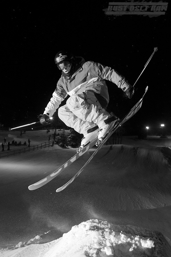
Nope. Four. Originally Posted by Mark von Kanel
I can only submit three, so this will get pared down. The exhibit's theme is "time," and my rationale for each photo precedes it.
- Rusted elevator clutch discs. Their appearance required a long rest with no disturbances. .

- A fire dancer. A long shot records the flame's path, invisible to the naked eye.

- A skier mid-flight. The pose cannot be maintained or entirely predicted, leaving the photog to pray for the right instant.
- Foundry tower at Landschaftspark Duisburg-Nord, Germany. A very long shot (37 seconds) reveals a quality of light imperceptible without a camera.

I'll probably lose the skier shot. We'll see, still mulling it over. Input welcome!
-
14th March 2013, 08:41 PM #8
- Join Date
- Oct 2011
- Location
- Cornwall
- Posts
- 1,861
- Real Name
- Mark
Re: Printmaking for art exhibitions.
AHHH you letting the judges preference with B&W influence your choice, given the theme id go for no 1 but my clear favorite is no 3. these are all great shots worthy of a first prize, just go with you gut!
Oh and PLEASE lose the watermark! it makes all work look very crass in my opinion
-
14th March 2013, 08:43 PM #9
- Join Date
- Dec 2011
- Location
- Cobourg, Ontario, Canada
- Posts
- 2,509
- Real Name
- Allan Short
Re: Printmaking for art exhibitions.
Lex here is my thoughts, pick 3 at most 4 images, look hard at them what is wrong with it, when images are judged it can be the little things that gets it unaccepted for display. Foundry Tower left hand side a green flair, lose it and I would lose about 2/3 of sky. The fire dancer again left hand side a bright white area that draws my eye, lose it or get another image. Skier like it however head and hood of jacket disappear into background. Clutch like, also like Detroit Dry Dock Engine image, and 2 images before the one with life springs eternal beneath it also like that one.
Now printing, images with strong bold colours where you want them to pop, I would myself use one of my favorites Epson Exhibation Fibre which is a very bright white. The other images where I want a deep rich saturation I would use a Rag stock, most times I use Epson Hot Press Bright, or if a very special image Hahnemuhle Photo Rag 308 which is quite expensive.
Look at a standard size in the 12" x 18" range, a tight matt up to image or 1/4" border between image and matt, Plain white matt, plain simple black frame so as not to take away for the image. Usually most matts are about 3 inches in width from image edge to frame.
As for the judge do not worry about if they do B&W, if you submit B&W they may judge them on their own standards, so with colour it may be more on other factors such as composition, and techinque both of how it was taken and finished. That is why I pointed out the green flare and the the white spot to a judge that is sloppness.
Also I am pretty sure you would not do this, but many do LOSE THE WATERMARK, nothing takes away from an image more than that. If I were a judge and any image had a watermark I do not care how small or light in the image it would not make it through the first round.
Those are just my thoughts on the subject.
Cheers:
Allan
-
15th March 2013, 01:18 PM #10
- Join Date
- Jun 2012
- Location
- Detroit, Michigan
- Posts
- 1,009
- Real Name
- Lex
Re: Printmaking for art exhibitions.
Submitted images will not be watermarked. The only reason some of these have 'em is because I grabbed them from my Facebook to submit at work (I've had image theft issues). I agree, they're obnoxious, but it seems to deter thieves.
The only reason I'm concerned about the judge's predispositions is that I'd rather not waste a $35 application fee. However, I have to start somewhere, and you gents are absolutely right about not letting possible rejection get to me. But I'm not going to get optimistic about my chances. That way, if I win, it's a pleasant surprise.
These will all get some edits before submission, and I'll definitely take everyone's suggestions into account. Need to crank 'em out by the time the post office closes tomorrow to make the submission deadline, but that shouldn't be a problem. Fortunately, I have quite a bit more time to select and master the right paper (assuming I'm selected). The judges have clarified that frames must be black, and mats are not permitted.
Allan, can you link to the images from Rust Belt Raw that caught your eye? I'm afraid I don't quite follow your descriptions of their locations, but I'm always interested in the shots that catch people's eyes. I do need to burn down that blog and get my own site up and running. Impossible for me to take myself seriously when posting to a Tumblr.")

 Reply With Quote