
These are just a record shots as to practice my compo.
#01
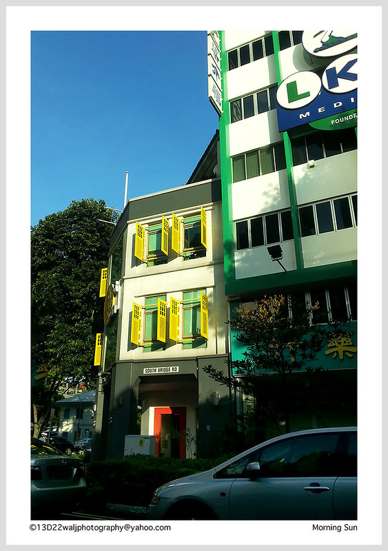
#02
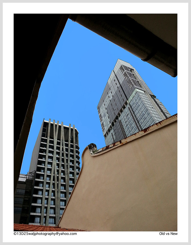
#03
#04
#05
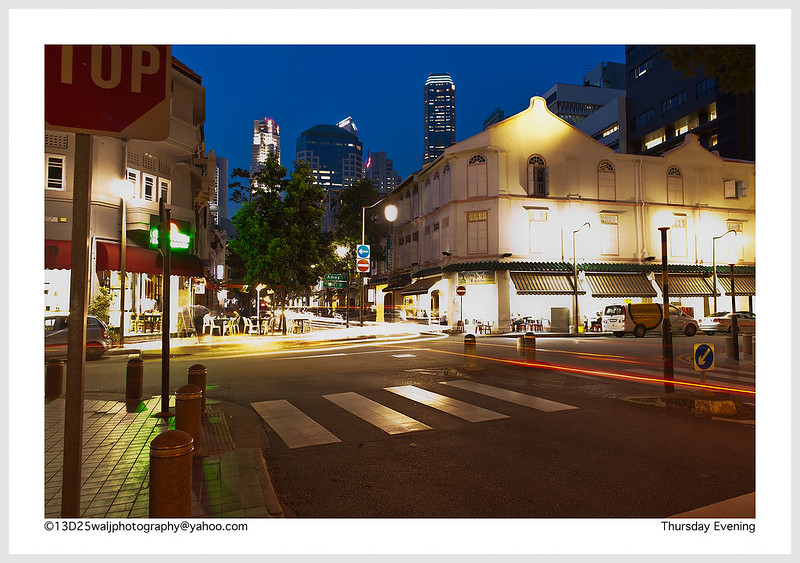
#06
Thanks for viewing. Your c&c would be helpful and appreciated.
 Helpful Posts: 0
Results 1 to 5 of 5
Thread: Practicing my comp..
-
27th April 2013, 12:36 PM #1


- Join Date
- Jan 2013
- Location
- Woodlands, Singapore
- Posts
- 280
- Real Name
- Walad Jam
Practicing my comp..
Last edited by Walj; 27th April 2013 at 12:55 PM.
-
27th April 2013, 06:02 PM #2

- Join Date
- Jul 2012
- Location
- Knoxville TN, USA
- Posts
- 266
- Real Name
- Cliff McCartney
Re: Practicing my comp..
Hi Walad,
I love #1 and #4. All the leading lines in #1 are fantastic. I also love all the warm light under the umbrella and at the bottom of the building on the left. In #4, vhe vivid blue sky lightens enough toward the bottom of the frame to make a great silhouette of the building. The only thing I'd change in #1 is to lighten up the blown out umbrella support. My eye keeps going to it, and I think it's a little distracting.
#2 is good, but I'd try to make the sky more blue, and I'd also try to recover as much detail under that overhang as I could. It's a bit dark for my taste.
I would crop #3 - a lot - from the top right diagonally down. I think there's too much of the building on the right, and the lettering is a bit distracting. To me, the interesting part of the image is the building on the left.
On #4, I think I'd crop out about half the sky, and also clone out the lights on the bottom part of the building.
#5 doesn't do anything for me. I'm not sure what the subject is, and the big tan wall is distracting to me.
#6 is a great image, but the sidewalk in the center and the building on the right are blown out a bit. I'd try to burn those areas a bit. Also, I'm not sure of the stop sign. I'd like to see the image without it.
Well done!Last edited by cliffmccartney; 27th April 2013 at 06:08 PM.
-
27th April 2013, 08:16 PM #3
- Join Date
- Apr 2013
- Location
- Prescott, AZ, US
- Posts
- 18
- Real Name
- Carol
Re: Practicing my comp..
I like #1. I really like the line of lights in the tall building, but it takes me to the eaves of the other building. I am wondering what you saw as the main focus of the image. My eye is really drawn to the eaves and the umbrella.
I think the tall building is stunning against the blue sky.
-
28th April 2013, 10:13 AM #4
- Join Date
- Jan 2013
- Location
- Woodlands, Singapore
- Posts
- 280
- Real Name
- Walad Jam
Re: Practicing my comp..
Hi Cliff, Originally Posted by cliffmccartney

Wow! I love this.. Thanks for viewing and your valuable comments / feedback. I really appreciate it very much. Will try to improve my pp in near future. Thanks again..
-
28th April 2013, 10:15 AM #5
- Join Date
- Jan 2013
- Location
- Woodlands, Singapore
- Posts
- 280
- Real Name
- Walad Jam
Re: Practicing my comp..
Hi Carol, Originally Posted by retired2AZ
You too.. I appreciate it! Thanks for viewing and your feedback.


 Reply With Quote