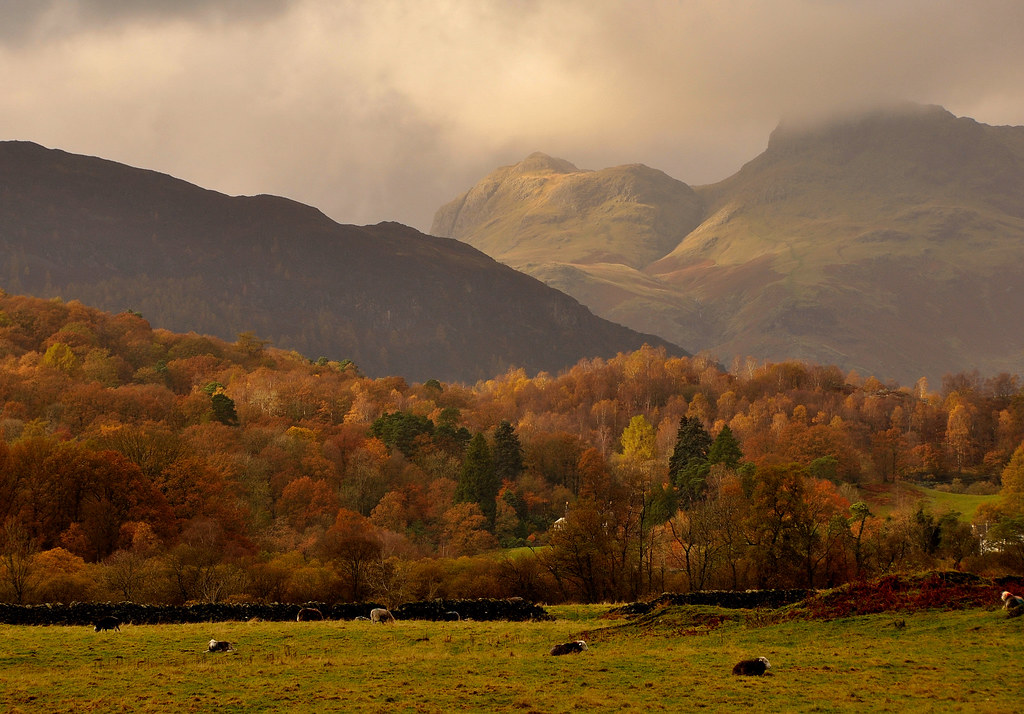
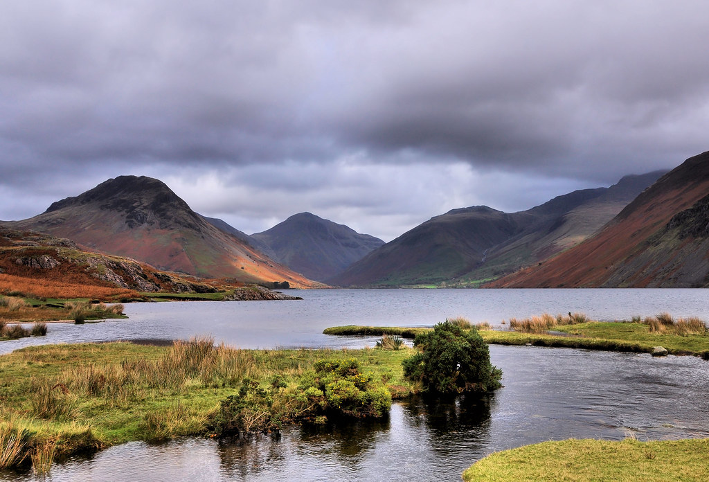
A weeks holiday in the Lake District in the 1st week in November did not result in much of a suntan.
When the rain did decide to ease briefly whilst walking I would whip out the camera from under my coat and get a few snapshots, no time to play with settings but rely on what I thought would be right for the conditions on the day, fortunately a couple of shots came out to my liking.
 Helpful Posts: 0
Results 1 to 20 of 21
Thread: The English Lake District
-
29th November 2009, 07:07 AM #1

- Join Date
- Mar 2009
- Location
- Coventry, UK
- Posts
- 304
The English Lake District
-
29th November 2009, 07:20 AM #2
-
29th November 2009, 09:08 AM #3Moderator


- Join Date
- Feb 2009
- Location
- Glenfarg, Scotland
- Posts
- 21,402
- Real Name
- Just add 'MacKenzie'
Re: The English Lake District
Keith
All good, but the colours in the first one just take it up a level. Love it. What do you think about cropping the bottom just so that the sheep lying down are taken out? This would move the drystane wall to very near the bottom, but I think it throws even more attention onto the trees, the mountain and the sky.
-
29th November 2009, 09:45 AM #4

- Join Date
- Mar 2009
- Location
- Coventry, UK
- Posts
- 304
-
29th November 2009, 09:48 AM #5

- Join Date
- Mar 2009
- Location
- Coventry, UK
- Posts
- 304
-
29th November 2009, 10:43 AM #6Moderator


- Join Date
- Feb 2009
- Location
- Glenfarg, Scotland
- Posts
- 21,402
- Real Name
- Just add 'MacKenzie'
Re: The English Lake District
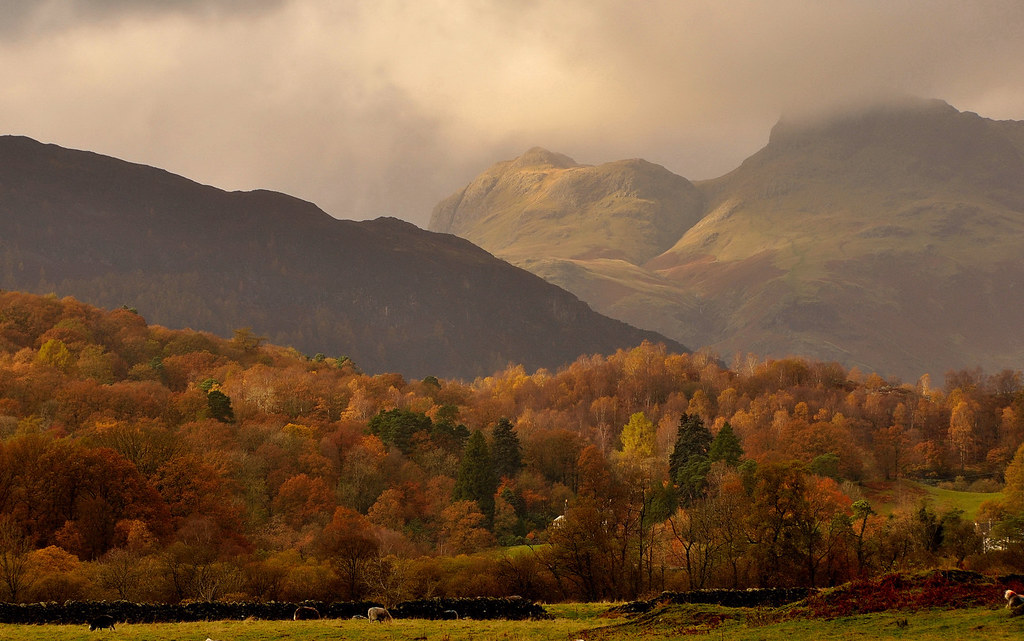
KeithDoes this cropped version seem to improve the image?
I think so. Others may disagree. I think this is just brilliant.
I also think it would be very tempting to do more with/to the sky, but I think you've got it right. And the light on the hill is sublime.
-
29th November 2009, 11:40 AM #7
Re: The English Lake District
I like the last one; fantastic. Was you on a bridge?
-
29th November 2009, 12:47 PM #8

- Join Date
- Feb 2009
- Posts
- 82
Re: The English Lake District
Beautiful scenery and light trump pretty much everything else. These make me want to go there and see it for myself.
Will
-
29th November 2009, 01:23 PM #9

- Join Date
- Mar 2009
- Location
- Coventry, UK
- Posts
- 304
-
29th November 2009, 01:28 PM #10

- Join Date
- Dec 2008
- Location
- New Zealand
- Posts
- 17,660
- Real Name
- Have a guess :)
-
29th November 2009, 01:28 PM #11

- Join Date
- Mar 2009
- Location
- Coventry, UK
- Posts
- 304
-
29th November 2009, 08:47 PM #12

- Join Date
- Jan 2009
- Location
- South Devon, UK
- Posts
- 14,736
Re: The English Lake District
It is difficult to get really good autumn scenes but these definitely work for me.
-
30th November 2009, 04:55 PM #13

- Join Date
- Mar 2009
- Location
- Coventry, UK
- Posts
- 304
-
30th November 2009, 04:56 PM #14

- Join Date
- Mar 2009
- Location
- Coventry, UK
- Posts
- 304
-
30th November 2009, 07:19 PM #15
Re: The English Lake District
Hi Keith,
I really like all three, as full screen in browser (f11) they look great.
The only one I would suggest any changes to is the first one, I prefer the cropped version, but this has left two white bits right on the bottom edge of frame and additionally, the sheep/cow now in bottom right corner distracts me. I would clone out, or tone down the luminance significantly, of all three things.
But I'm being quite nit-picky here, they are still great shots.
Cheers,
-
30th November 2009, 08:11 PM #16

- Join Date
- Mar 2009
- Posts
- 2,522
Re: The English Lake District
The best season to visit. In summer there is far too much designer gortex, dayglo distraction and lycra (not bad on the lasses but I have never been a fan of Max Wall so the gents so inclined should keep it for the bedroom). Its like a mural in a suburban gym. A brisk November walk from the old DG to the Wasdale Head Inn via Russet Ghyll in a pair of nailed wellies and a full pouch of Golden Virginia in your Barbour jacket pocket is Cumbrian bliss.A weeks holiday in the Lake District in the 1st week in November
Your third image has a really nice depth to it and draws you into the scene. The other two are not my cup of tea but I do sympathise with the conditions you are shooting in. I gave up taking photographs of mountains years ago. I just could not capture what I felt when I was out there
Steve
-
1st December 2009, 04:38 PM #17

- Join Date
- Mar 2009
- Location
- Coventry, UK
- Posts
- 304
-
1st December 2009, 04:49 PM #18

- Join Date
- Mar 2009
- Location
- Coventry, UK
- Posts
- 304
Re: The English Lake District
Thanks for you views Steve, my favourite happens to be No.1 so I guess its all subjective.
As to your quote re the waxed jacket, wellies and the tobacco, I did not see too many of them around except when 'cruising' around those little walled lanes, I was amazed how many walkers were about in November in mid week, does it ever go quiet in that area?
I certainly don't have the legs for lycra!!!
Keith
-
1st December 2009, 08:40 PM #19

- Join Date
- Mar 2009
- Posts
- 2,522
Re: The English Lake District
Keith,does it ever go quiet in that area?
If you require anything close to solitude these days in the central lakes you need to got up on the tops as early as possible. I used to start climbing after midnight with a view to reaching the summits just before dawn. I have climbed all he major peaks that way and some lesser ones. Camp in the fells and move on early. Always tell someone where you are going if you are ever tempted to do this. The weather can close in fast. The other alternative is steer well clear of the central Lake District and stick to the fells on the periphery but not in mid summer.
Steve
-
2nd December 2009, 08:43 AM #20

- Join Date
- Oct 2009
- Location
- Auckland NZ
- Posts
- 47
Re: The English Lake District
Love those autumn colours. Every time we.ve visited had been sept. thru to early Nov. and luckily pretty good weather every time.
Cropping really is in the eye of the beholder eg I think I prefer even more cropping of #1 to right in the tree line just above the stone wall. Or if some of the field wanted to be left in shoot from closer to the ground so while there is more of the foreground in, it has more "depth" Does that make sense?
The southern landscape expert may enlighten/correct me.
Howard


 Reply With Quote


