Results 1 to 10 of 10
Thread: Portraits. what to improve?
-
13th June 2013, 01:57 PM #1New Member

- Join Date
- Jun 2013
- Posts
- 3
Portraits. what to improve?
-
13th June 2013, 07:37 PM #2
Re: Portraits. what to improve?
IMHO these photographs are really good.
Bruce
-
13th June 2013, 08:39 PM #3
Re: Portraits. what to improve?
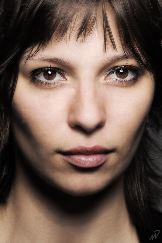
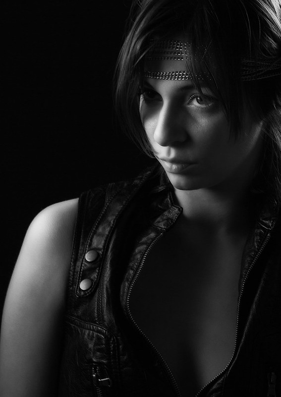
Each has their own merits and your variation in technique will appeal to some and not others. If you present this as a portfolio I am sure potential customers will tell you what they like and don't like. Good stuff, love the eyes in 3, 4, and 5.
-
13th June 2013, 11:23 PM #4

- Join Date
- Jul 2011
- Location
- Lake Ambulalakaw, Mt. Pulag, Benguet
- Posts
- 1,026
- Real Name
- Victor Nimitz
Re: Portraits. what to improve?
Hey, coool shots.
Just that seems there's too much eye-whites in #3 & 4.
Otherwise, all of them rocks.
just me.......Last edited by nimitzbenedicto; 14th June 2013 at 12:41 AM.
-
13th June 2013, 11:39 PM #5
Re: Portraits. what to improve?
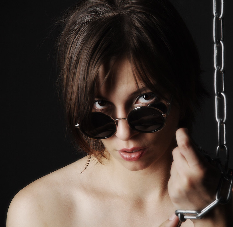
Beautifully composed and processed. I probably would have gotten the models to centre their eyes more in shots 2, 3 & possibly 4.
There are some minor issues with shadows and contouring that I might have cleaned up a bit in post.
-
14th June 2013, 08:34 AM #6New Member

- Join Date
- Jun 2013
- Posts
- 3
Re: Portraits. what to improve?
thanks for all your opinions.
yup kinda too much white in eyes.
may i ask for more details please?There are some minor issues with shadows and contouring that I might have cleaned up a bit in post.
-
14th June 2013, 09:06 AM #7

- Join Date
- May 2012
- Location
- Johannesburg South Africa
- Posts
- 2,547
- Real Name
- Andre Burger
Re: Portraits. what to improve?
Vey good! Well done!

My only concern is getting the skin tone right with accurate WB.
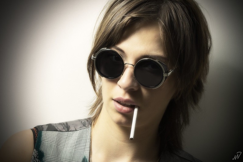
The lady in #1 could have a serious liver problem, judging by the colour of her skin.
-
15th June 2013, 09:57 PM #8
Re: Portraits. what to improve?
These are some very small niggley things I picked up. Your work is so good, that the very, very minor things might be looked at, depending on how far you want to go in post.
Image 1 – I would do some minor hair cleanup perhaps. I find that the stray hair camera left a bit distracting and while I were in there, I’d take care of a few strays at the top camera right as well. I assume you did the slightly green colour cast on purpose.
Image 2- I find the fuzzy hair near the top of her head at camera left a bit distracting. I might also clean up the single strand coming down her forehead. There are a couple of places on her index finger that I might clean up to. There is a dark line just above her bottom knuckle and bit of a strange shadow on her middle knuckle as well.
I don't know if I really like the way we see a tiny bit of her teeth or not. I might go both ways to see what looks best (with / without).
Image 3 - the shadow on the left side of her nose looks a bit strange. I would probably lighten that a tiny bit. I’d probably take care of that stray hair on her forehead too.
Image 4 - I don’t like what the shadow is doing under her lower lip. It looks a bit strange; again a bit of lightening there should help. Looking just to the right of her lips towards her cheek, there is a bit of a strange shadow under her cheek; I would be tempted to blend that a bit too; both of those together make it look like she has a bit of a bruised mouth. Again, there are a few stray hairs that could be cleaned up.
Image 5 – The middle part of her nose is a bit indistinct and I would probably add a bit of shadow detail here just to tighten things up a tiny bit. I would probably get rid of the bottom camera right eyelash that sticks out a bit.
Image 6 - I’d clean up the fuzzy hair at the top of her head camera left and might just tone down the bright spot on the camera right eye a tiny bit.
.Last edited by Manfred M; 15th June 2013 at 10:14 PM.
-
17th June 2013, 07:55 AM #9New Member

- Join Date
- Jun 2013
- Posts
- 3
Re: Portraits. what to improve?
GrumpyDiver thank you.
will try not to make same mistakes in the future. so much to think about >.<
-
17th June 2013, 09:10 AM #10

- Join Date
- Nov 2012
- Location
- Australia (East Coast)
- Posts
- 4,524
- Real Name
- Greg
Re: Portraits. what to improve?
#5 - I'd get rid of the cord /wire (whatever) in her hair on the right (about level with her mouth). Also, there is a line on her bottom lip - looks like she hasn't applied the lipstick all the way to the edge of the lip. Whatever it is, I would blend it in with the lower skin on the rest of the lip.

 Helpful Posts:



 Reply With Quote

