 Helpful Posts: 0
Results 1 to 7 of 7
Thread: Old Country Store (b/w)
-
9th August 2013, 01:45 AM #1
Old Country Store (b/w)
-
9th August 2013, 06:30 AM #2Moderator


- Join Date
- Feb 2009
- Location
- Glenfarg, Scotland
- Posts
- 21,402
- Real Name
- Just add 'MacKenzie'
Re: Old Country Store (b/w)
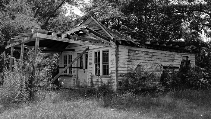
I wondered if it needs so much grass in the foreground, or whether a crop of some of that to lower the building in the frame and make it into more of a pano, would work?
I was also feeling the urge to apply a healthy dose of Local Contrast Enhancement (LCE) to the building to try and make it 'pop' out a bit from its surroundings and give it better definition.
-
9th August 2013, 06:41 AM #3
Re: Old Country Store (b/w)
Hi Bruce
I was about to reply then saw Donald's remarks. I too was going to suggest some Local Contrast Enhancement on the building, as well as possibly a vignette that gets lighter at the corners (not sure if there's a technical term for that).
Dave
-
9th August 2013, 06:43 AM #4
-
9th August 2013, 07:44 AM #5Moderator


- Join Date
- Feb 2009
- Location
- Glenfarg, Scotland
- Posts
- 21,402
- Real Name
- Just add 'MacKenzie'
Re: Old Country Store (b/w)
Compositionally, I think it is very much better (but others may disagree).
I'd go further with the LCE. Hope you don't mind (please say if you do), but to illustrate what I mean .........

I applied LCE using the Wavelet Sharpen tool on the GIMP (I don't use Photoshop). I then put on a black layer mask and, with a white paintbrush, just painted the LCE back on to the building alone. It's subtle but, I think, noticeable.
-
9th August 2013, 08:06 AM #6

- Join Date
- Jun 2013
- Location
- North West of England
- Posts
- 7,178
- Real Name
- John
Re: Old Country Store (b/w)
Needed the contrast enhancement. It brings out the dereliction of the building more which I guess was the object of recording it. Sad isn't it? Someone once loved that place.
-
9th August 2013, 12:18 PM #7
Re: Old Country Store (b/w)
Last edited by Donald; 9th August 2013 at 12:22 PM. Reason: Took Bruce's reply outwith quotation tags


 Reply With Quote

