Results 1 to 11 of 11
Thread: Geometries and Symmetries
-
4th September 2013, 11:35 AM #1
Geometries and Symmetries
-
4th September 2013, 08:18 PM #2

- Join Date
- Jul 2012
- Location
- I live a stone's throw away from Cuyahoga National Park (NE, Ohio)..
- Posts
- 1,247
Re: Geometries and Symmetries
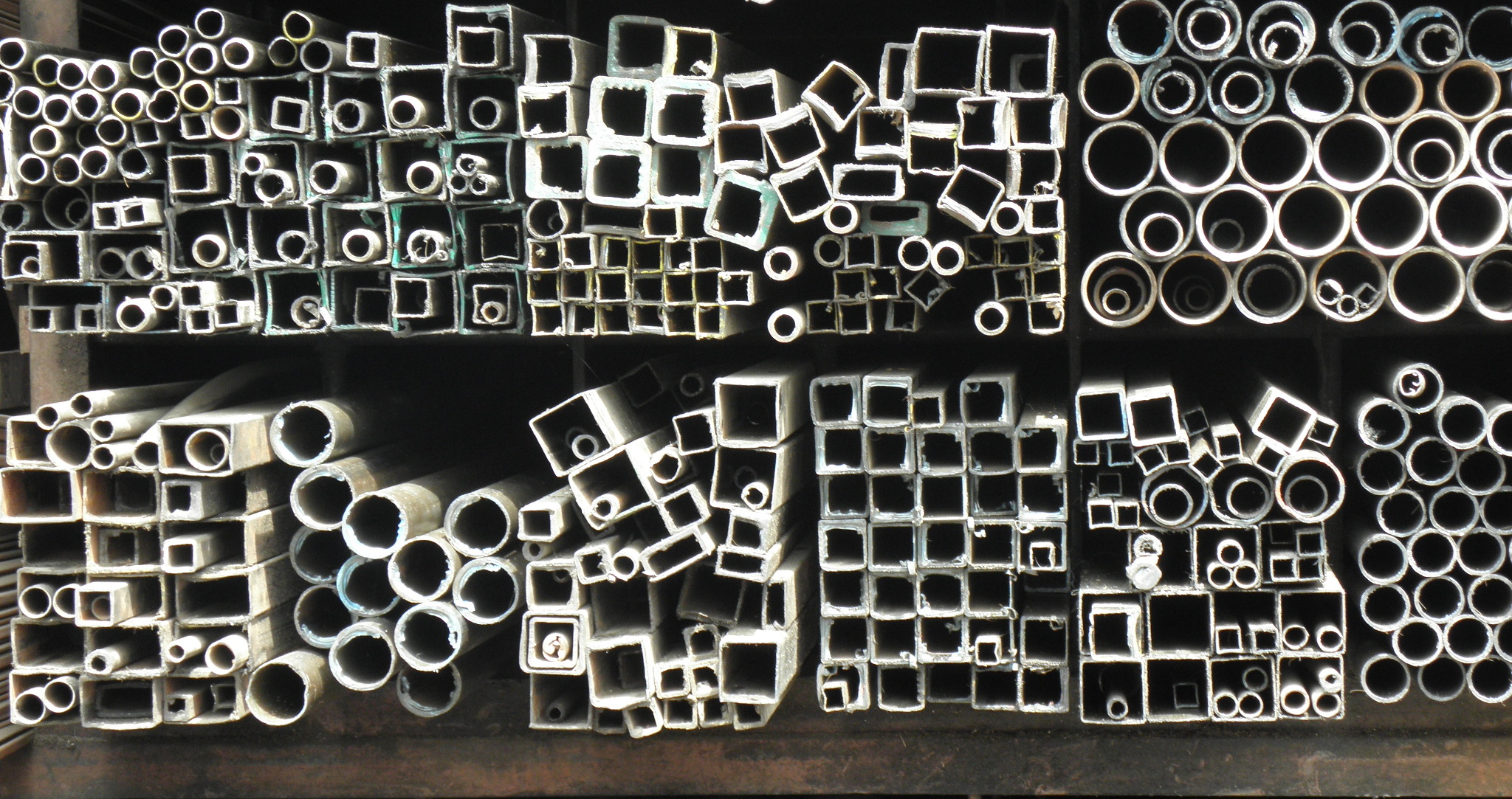
Hi. Love the idea behind your image. I think the very top and bottom distract from your theme. Here's just a suggestion: create a crop (try both a rectangle and a square) and move it around your image to see if there are neat geometric patterns within your overall picture. I see one immediately that might be interesting: the top (full view) shelf has one section made up of jumbled squares and circles. This alone might make an interesting image.
karm
-
4th September 2013, 09:32 PM #3

- Join Date
- May 2012
- Location
- northern Virginia suburb of Washington, DC
- Posts
- 19,064
Re: Geometries and Symmetries
I agree with Karm on everything about your concept and execution. It would be well worth the trouble to return to the site. Everything works for me pretty much as is except the bottom right storage area is particularly troublesome because it doesn't display any geometric shapes. As Karm mentioned, there may be many compositions within this composition.
-
5th September 2013, 04:08 AM #4
Re: Geometries and Symmetries
Yep, Karm, and Mike nailed it. Fantastic idea/concept, just a little lacking in execution. The top is by far more distracting to me than the bottom, since it's barely visible it almost seems as if you just forgot to crop it out. Mike brings up a good point about the bottom right not being filled with shapes, and I agree.
The only other thing that bothers me is that you seem to have been standing to the right of centre to get this shot. I think it would be more appealing if it were taken head on. But that may just be me.
I would be interested to see if you revisit this site/image.
-
5th September 2013, 05:56 PM #5
-
5th September 2013, 06:05 PM #6
Re: Geometries and Symmetries
It's better but I would cut a little more down at level of the pipes.
-
5th September 2013, 07:17 PM #7

- Join Date
- Jul 2012
- Location
- I live a stone's throw away from Cuyahoga National Park (NE, Ohio)..
- Posts
- 1,247
Re: Geometries and Symmetries
Hi. I think this is better. This is just my opinion: I think what you're attempting works best when the image is not recognizable. I still see two storage shelfs. Get in closer to the circles and squares. Make it into more of an abstract image. There's cool things in this image to mine. You just have to dig down a bit deeper.
karm
-
5th September 2013, 10:15 PM #8

- Join Date
- May 2012
- Location
- northern Virginia suburb of Washington, DC
- Posts
- 19,064
Re: Geometries and Symmetries
I like this revised version considerably more. I like the way you cropped the top and bottom. I would prefer that you crop the left side to eliminate the vertical post, thus leaving mostly the white geometric shapes. I would also prefer that you digitally remove the white dot in the center of the top edge of the frame.
For this type of shot, I tend to make it either as symmetrical as possible or as asymmetrical as possible. The perspective of this photo is somewhere in the middle of that range, leaving me to wonder whether you were trying to make it symmetrical or asymmetrical. Making it symmetrical would have required positioning the camera so that the angle of everything to the left and right of center and the angle of everything above and below the center are the same. That's not quite the case in your photo. Though the left side is angled a bit more than the right side, it's not so much more that I think the angled left side is intentional or especially attractive.
While I agree with Karm when trying to emphasize the abstract nature of the subject, I also think equally pleasing images can be made that emphasize the realism of the subject. Sometimes including other objects in the scene, such as shelving in this case, helps bring out the realism. In a nutshell, decide in advance what kind of image you want -- realism or abstract -- and then compose accordingly.
-
6th September 2013, 03:06 PM #9
Re: Geometries and Symmetries
Thank you Jean , Karm and Mike for your wonderful ideas and opinions; i will take care of them
Regards
-
6th September 2013, 06:35 PM #10

- Join Date
- Mar 2012
- Location
- Oregon, USA
- Posts
- 212
- Real Name
- Arlen
Re: Geometries and Symmetries
I think it's a compelling concept Nandakumar, and you're making progress at turning it into something special. The other guys have offered most of the advice I would have given, so I won't repeat any of that. I would suggest that at some point, when you're satisfied with the composition and adjustments, that you take a look at a conversion to black and white and see how you like it. Strong graphic elements like the ones here often look very striking in monochrome.
-
7th September 2013, 05:34 PM #11
Re: Geometries and Symmetries
Thank you very much Arlen for your nice and wise suggestion; i will keep that in mind
Regards

 Helpful Posts:


 Reply With Quote

