Results 1 to 20 of 51
Thread: My Nature Series......
-
12th September 2013, 03:42 PM #1
-
12th September 2013, 08:12 PM #2

- Join Date
- Jan 2009
- Location
- South Devon, UK
- Posts
- 14,560
Re: My Nature Series......
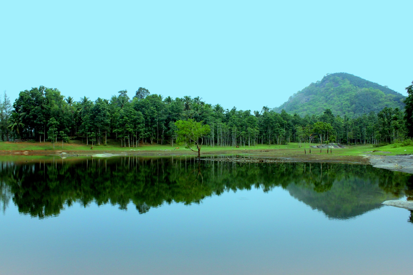
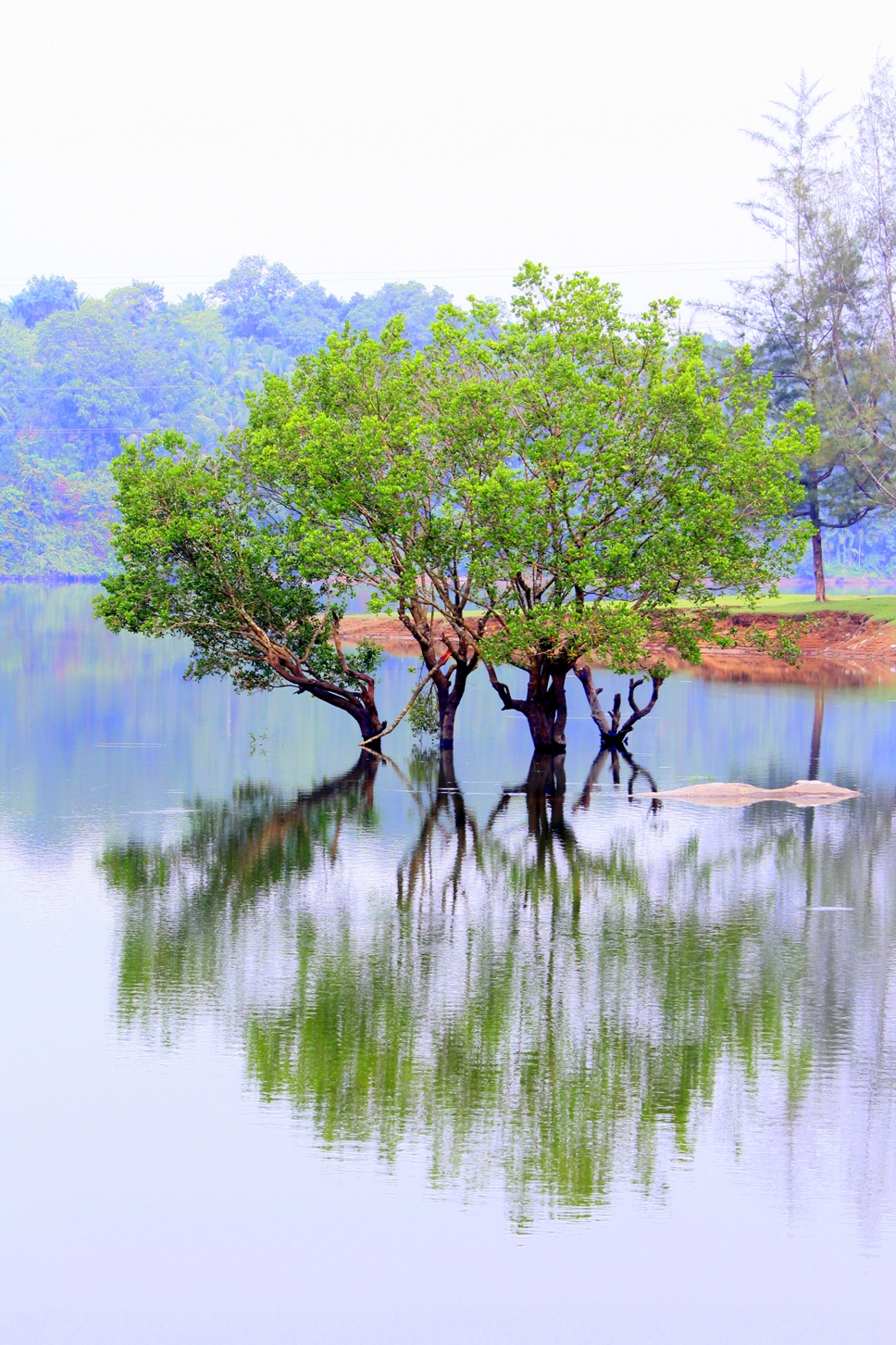
The main subject is rather centrally placed, but there is sufficient variation in the background to overcome that potential problem. So it works fine for me.
-
13th September 2013, 01:20 AM #3

- Join Date
- Nov 2011
- Location
- Charlottesville, Virginia, USA
- Posts
- 13
- Real Name
- Rollin
Re: My Nature Series......
The foreground of the image looks good. I perceive a problem with the background. The atmospheric haze on the trees and the bright white sky draw the viewers eye to these bright areas and create a distraction from the foreground detail. I am not sure what software you may be using for image processing, but if you have Lightroom you may try to add a gradient filter from the top of the image so that the center of the gradient spread is at the tree waterline in the background. I would adjust the Exposure and/or Contrast within the gradient to help resolve the issue.
-
13th September 2013, 04:59 AM #4
-
13th September 2013, 05:02 AM #5
-
13th September 2013, 05:49 AM #6
Re: My Nature Series......
Nandakumar, nice subject. My suggestions:
exif data indicates 84mm focal length. I'd move farther away and use as long a focal length as I have available (think telephoto lens). This will extract the main subject from the scene and reduce the background clutter, creating a softer and less distracting background and making the main trees pop out.
If possible I'd physically move myself and camera to the right to separate the subject from the overlapping tree and landmass to the right.
I'd go back for a shot at sunrise or sunset for better lighting.
Just my thoughts.
-
13th September 2013, 04:03 PM #7
Re: My Nature Series......
Thank you very much Matt; very nice ideas

-
13th September 2013, 04:52 PM #8
-
13th September 2013, 05:18 PM #9Moderator


- Join Date
- Feb 2009
- Location
- Glenfarg, Scotland
- Posts
- 21,402
- Real Name
- Just add 'MacKenzie'
Re: My Nature Series......
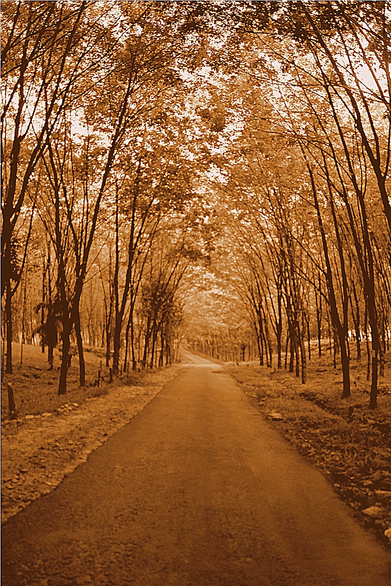
I do like the B & W image very much. For me this shows the strength of B & W over colour (for appropriate subjects). The B & W allows us to focus on the lines, shapes and textures in a way that is not possible with the colour image, in my opinion.
A very, very nice image.
-
14th September 2013, 05:16 PM #10
-
15th September 2013, 05:51 PM #11
-
16th September 2013, 12:31 PM #12
-
17th September 2013, 03:25 PM #13
-
17th September 2013, 04:25 PM #14
Re: My Nature Series......
Lovely... #2 the B&W is my favourite and I usually prefer colour.

-
17th September 2013, 04:28 PM #15
Re: My Nature Series......
Thank you very much Christina

-
17th September 2013, 04:35 PM #16
Re: My Nature Series......
Regarding the first image. I like it quite a bit but, perhaps a closer crop, avoiding some of the sky and water (that doesn't show the reflection) as well as elimination some of the sides might focus more attention on the tree and reflection. In this example, using Photoshop, I increased vibrance and saturation a bit, reduced brightness and increased contrast a bit...

I then reduced the brightness selectively in NIK Viveza for the sky and the water; leaving the foliage as it was...

These tries are not necessarily better than your image, just different and it shows how two photographers may look at the same image differently...
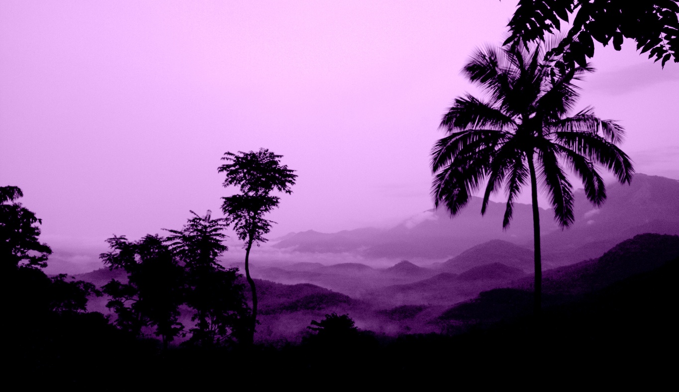
BTW: I absolutely love image #5!Last edited by rpcrowe; 17th September 2013 at 04:42 PM.
-
17th September 2013, 05:04 PM #17
Re: My Nature Series......
Thank you very much Richard; your edits are really awesome

-
17th September 2013, 05:46 PM #18
Re: My Nature Series......
a lovely nature series Nandakumar, no 2 , the B&W is my favourite, it is really very pleasing to look at, the colour version as well. I love the drop shadow frame, it enhances an already great image, imho. well captured !
-
18th September 2013, 04:25 PM #19
Re: My Nature Series......
Thank you very much Dawn, for your kind words

-
19th September 2013, 04:42 PM #20

 Helpful Posts:

 Reply With Quote

