Results 1 to 14 of 14
Thread: The look
-
12th September 2013, 07:20 PM #1
-
12th September 2013, 08:43 PM #2

- Join Date
- Jun 2013
- Location
- North West of England
- Posts
- 7,178
- Real Name
- John
Re: The look
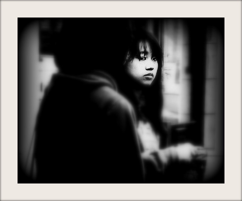
Clever, very clever Sharon and it works. My only suggestion would be to lose the highlight on the LHS. For me, it would increase the impact considerably. Like the gritty processing as well.
-
12th September 2013, 09:29 PM #3

- Join Date
- May 2012
- Location
- northern Virginia suburb of Washington, DC
- Posts
- 19,064
Re: The look
I agree with everything John mentioned. I would also tone down the light area on the right side of the background to ensure that its brightest tones are not as bright as the brightest tones on the woman's face. You can double check that by opening the Curve tool and holding the mouse over each area while watching the Curve graph.
-
12th September 2013, 09:36 PM #4
Re: The look
Thanks guys... I see your point.

-
12th September 2013, 10:47 PM #5

- Join Date
- Nov 2012
- Location
- Australia (East Coast)
- Posts
- 4,524
- Real Name
- Greg
Re: The look
Very moody, Sharon.
I agree with Mike and John: tone down the brighter areas on left and right sides.
-
12th September 2013, 10:49 PM #6
-
12th September 2013, 11:39 PM #7
Re: The look
Interesting (my word of the month) photo.
Bruce
-
13th September 2013, 12:07 AM #8
Re: The look
I adore this photo... The light and shadows are exquisite... Interesting composition that grabs my attention and eye immediately. Aptly titled!
I don't know how you create your images but they are Art to me....
-
13th September 2013, 01:11 AM #9
Re: The look
A bit of a difference from your normal style Sharon and I have to say I like it, that's not saying I do not like your others.
I wonder what she's thinking?
-
13th September 2013, 02:03 AM #10

- Join Date
- Nov 2011
- Location
- Charlottesville, Virginia, USA
- Posts
- 13
- Real Name
- Rollin
Re: The look
Great subject. As is the case with most of my posts, my comments relate to composition. The bright area on the left hand side of the image creates a distraction. Perhaps a portrait crop through about 1/2 of the foreground person could resolve this. This would place the lady in the left third of the image and create a space to the right where her gaze and hand are pointing, thus engaging the viewer more strongly.
-
13th September 2013, 02:26 AM #11
Re: The look
Different to what I usual expect when peeking at your photographs. Rollin's crop is an alternative more traditional composition but I do enjoy the space you have provided even if the crop is a little less usual. The space seems to enhance the dismissive detachment in the woman's expression.
-
15th September 2013, 02:17 AM #12
Re: The look
Perfect. don't change a thing
-
16th September 2013, 11:14 AM #13
Re: The look
Nice one ...
-
16th September 2013, 01:59 PM #14
Re: The look
Lovely photograph!

 Helpful Posts:

 Reply With Quote
