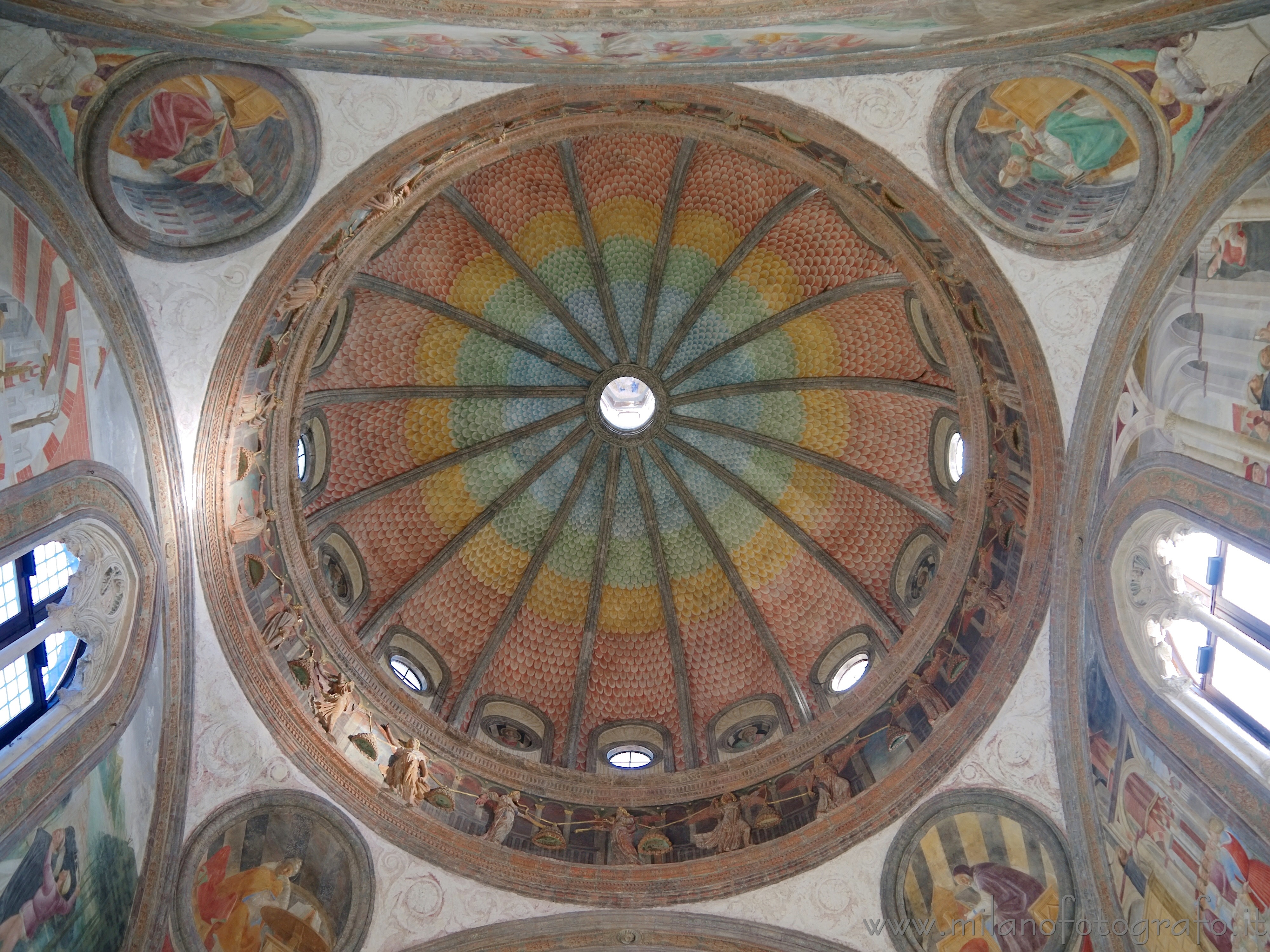
The dome of the Portinari Chapel inside the Basilica of Sant Eustorgio in Milan (Italy). Exif info and full size image on the page http://www.milanofotografo.it/englis...0e%20monuments
Results 1 to 15 of 15
-
11th January 2014, 09:32 AM #1

- Join Date
- Jan 2014
- Location
- Milan, Italy
- Posts
- 119
- Real Name
- Enrico Engelmann
Portinari Chapel in Milan (Italy)
-
11th January 2014, 01:26 PM #2

- Join Date
- Dec 2012
- Location
- Alaska
- Posts
- 7,604
- Real Name
- Dan
Re: Portinari Chapel in Milan (Italy)
Beautiful building. The photo seems a bit over exposed. A bit of PP to reduce exposure and/or increase contrast and saturation would make it "pop".
-
11th January 2014, 01:41 PM #3

- Join Date
- Jan 2014
- Location
- Milan, Italy
- Posts
- 119
- Real Name
- Enrico Engelmann
Re: Portinari Chapel in Milan (Italy)
The problem is that, because of the light coming directly from one side, there are in the pictures some parts which are burnt out (although the picture is already the fusion of two pictures separated by 1.5 stops).
If I darken it, the burnt out parts would become too visible.Last edited by eengelmann; 11th January 2014 at 03:15 PM.
-
11th January 2014, 03:41 PM #4
Re: Portinari Chapel in Milan (Italy)
Hi, wonderful shot of a great ceiling.
Looking at this shot, I thought it might be a candidate for PP in NIK Viveza. I globally increased structure (wonderful tool) quite a bit, reduced brightness and increased contrast. I also put a control point over the brighter area of the roundel at about 9:00 o'clock and reduced the brightness.
I also placed a control point on the bright window at about 3:30 and reduced the brightness. I then placed a second control point on the blue cross frames of the window and reduced the brightness of these also.
I am sure that all of this could be accomplished using Photoshop or some other editing program but, it is a lot quicker for me to work with Viveza control points than working with adjustment masks.
I saved the image as a PSD document and then reopened it in camera RAW, then increased the clarity and vibrance, finally saving it as a JPEG document.
Here is my version of your beautiful shot...

I could have worked on this a bit more but, I think that you get the general idea...
BTW: I like your watermark and need to add watermarks to my rescue dog images so that when these images are used on other sites, our rescue organization gets the credit for both dog and photo.
Could you explain to me please, how you did that watermark? Thank you!Last edited by rpcrowe; 11th January 2014 at 04:48 PM.
-
11th January 2014, 06:23 PM #5

- Join Date
- Jan 2014
- Location
- Milan, Italy
- Posts
- 119
- Real Name
- Enrico Engelmann
Re: Portinari Chapel in Milan (Italy)
I must confess you that I don't like your version like as my one! The fact is that your version is farer from reality than my one. The real chapel had indeed a special atmosphere, with the color sort of soft and delicate. The room was full of light and made all the elements of the building like floating in the air, in particular when looking up into the dome! The dark border between the scales of the dome didn't exist in reality!
As far as possible I try to let my pictures be as realistic as possible, even when it would be possible to edit them to make them more pleasent for the eye.
But, nevertheless, I'm honored that you decided that my picture was worth your time!
Viveza is completely new to me. I use Faststone for the last color and contrast optimization, and also for adding the watermark. The character is Bernhard Fashion BT.
Recently I have discovered that for rotating the images Irfan View is even better, since it make possible rotations with a precision up to 0.01 degrees!
-
11th January 2014, 06:44 PM #6
Re: Portinari Chapel in Milan (Italy)
Each individual has his or her likes and dislikes regarding editing. I certainly respect your opinion regarding the post processing of this image...
Thanks for the hint regarding the font that you are using as your watermark...
-
11th January 2014, 06:46 PM #7
-
11th January 2014, 06:58 PM #8
Re: Portinari Chapel in Milan (Italy)
Beautiful ceiling, but yes, this is definitly not an easy shot, given the dynamic range from the light coming in through the windows. You mention a 1.5 stop differenece between the two images you merged; when in reality, you are looking at a dynamic range an order of magnitude greater. I had a similar shot of Ste Chapelle, in Paris back some years ago when I was just getting back into serious photography. If I were to do it again, I would bracket over a far wider number of stops (i.e. properly expose the windows, as well as the dome) before blending the images together.
The overall image is rather flat, so I'm not sure if this is a result of the blending technique or has some other underlying cause. It is a common issue with HDR images and when I use that technique, I generally make a curve adjustment, as well as working on local contrast via the clarity slider in Camera Raw. Any of the frescos I've seen have a lot more "pop", but I have not seen this one, so can't be 100% certain.
I also suspect there is motion blur in the image, as it seems a bit soft. Shutter speeds of 1/13s - 1/5s on with a 28mm focal length using a mFT sensor (even with OIS) seems to be pushing your luck a bit too far.
-
11th January 2014, 07:56 PM #9

- Join Date
- Jan 2014
- Location
- Milan, Italy
- Posts
- 119
- Real Name
- Enrico Engelmann
Re: Portinari Chapel in Milan (Italy)
The image is I think not blurred, the camera was on the ground, not handheld. The full size image is here

The flatness depends I think also from the direction of the light. If you look on the other pictures of the chapel on the page http://www.milanofotografo.it/englis...ano.aspx?ID=47 you see that it is less pronounced.
For the moment my algorythm (http://www.milanofotografo.it/englishFotografiaHDR.aspx) permits me to fuse only two images. And with two images already two stops are a little bit too much (as it happens when I use my other camera, the Fuji s100fs). But in the future I will certainly add the possibility to fuse three pictures!
-
11th January 2014, 09:27 PM #10
Re: Portinari Chapel in Milan (Italy)
Hi eengelmann (it would be nice if you updated your profile to give us a real name to call you by). I think your image properly captures the tone of the ceiling. These medieval ceilings are not usually saturated. You have shown us what you saw, which I like.
Dave
-
11th January 2014, 10:13 PM #11
Re: Portinari Chapel in Milan (Italy)
Look at the two round paintings at the top of your image on your website in full-size view, on the left and right side. These look rather soft to me. Perhaps not motion blur, but a focus / depth of field issue. If you focused at or near the top of the dome and shot at f/3.5 with a 28mm (56mm FF equivilent) focal length, this could be the reason for the softness.
If you have written your own algorithm for blending the images and your registration is not 100% on, this could be another reason for the softness. I recently found a similar issue with a panorama I was stitching together in Photoshop CC and the image came out a lot softer than the images that were processed together.
-
11th January 2014, 11:26 PM #12

- Join Date
- May 2011
- Location
- Burton upon Trent Staffordshire
- Posts
- 191
Re: Portinari Chapel in Milan (Italy)
Enrico
I think it's great. The colours are fantastic, so subtle, it would be a real shame to mess with them. I like the way you've framed the shot as well. I totally agree with your comments, thanks for posting this image I have enjoyed it and good for you for sticking to your original image.
regards
Clive
-
11th January 2014, 11:30 PM #13

- Join Date
- Jan 2014
- Location
- Milan, Italy
- Posts
- 119
- Real Name
- Enrico Engelmann
Re: Portinari Chapel in Milan (Italy)
You are right, the paintings you mention look in fact a little soft. But honestly I'm not able to say if it is the picture or the paintings themselves. If you look at the bricks in the painting left just above the window they are sharp, I would say. Consider that these are centuries old frescos, so they are allowed to be not perfectly sharp! ,

But you are right, next time I will put the camera on the ground I will choose a larger aperture to be sure!
What to you mean with registration?
-
11th January 2014, 11:32 PM #14
-
12th January 2014, 04:34 PM #15
Re: Portinari Chapel in Milan (Italy)
I verified the image in another site; it has all muted colors there as in OP's posting....My posting was from the time when that fresco was painted.... i can travel to past

http://www.dpreview.com/forums/post/52876962

 Helpful Posts:

 Reply With Quote

