Results 1 to 19 of 19
Thread: High Key / Low Key
-
7th April 2014, 03:54 PM #1
High Key / Low Key
-
7th April 2014, 04:29 PM #2
Re: High Key / Low Key
Both sets are nice but wouldn't technically qualify as high/low key. High key shouldn't have any shadows and low key should be mostly shadows.
-
7th April 2014, 05:31 PM #3
Re: High Key / Low Key
Thanks John. I'm not sure how to score that. I guess, since they're not what was assigned, that I failed.
Oh, well.
-
7th April 2014, 05:42 PM #4
Re: High Key / Low Key
Its the journey, not the destination, Cliff. We all learn every day!
-
7th April 2014, 10:09 PM #5
Re: High Key / Low Key
HI, Cliff.
Nice series, and I applaud you for the initiative of your course work. Looks like the high key used two soft boxes in about the same ratio, and a single source for the low key. Curious as to your lighting set up.
-
7th April 2014, 10:11 PM #6
Re: High Key / Low Key
-
7th April 2014, 10:21 PM #7

- Join Date
- May 2012
- Location
- northern Virginia suburb of Washington, DC
- Posts
- 19,064
-
7th April 2014, 10:37 PM #8
Re: High Key / Low Key
When I did work that would be judged I had severe criticism for any signs of nose shadows in particular. That's probably why I prefer the high key low key settings built into many cameras as a definition. It's all a matter of contrast which now means different tone curves from raw and maybe different lighting but most definitely no nose shadows or any significant facial shadows at all really.
John
-
-
7th April 2014, 10:43 PM #9
-
7th April 2014, 11:19 PM #10
Re: High Key / Low Key
Cliff, nice set of images.
Bruce
-
8th April 2014, 04:00 AM #11
-
8th April 2014, 08:34 AM #12
Re: High Key / Low Key
I have only ever done that sort of work on film John but noticed that camera jpg curves sometimes have a low and high key settings. The E-M5's are distinctly different. I've not got round to trying them all but in this case it's easy to see that the high key behaviour at the dark end is distinctly different and that the decrease in slope will have a noticeable effect on contrast through mid tones. Looking at this one I would have to wonder if it was suitable for portraits due to the 2 stop plus exposure shift but in principle that could be accounted for or varied.

There doesn't seem to be much info about on the web concerning this area but one pro goes to a lot of trouble with his curves and the differences in results and the curves are subtle.
http://imagesbyeduardo.com/main/tag/tone-curves/
John
-
-
8th April 2014, 09:06 AM #13
Re: High Key / Low Key
Maybe Colin is the man for this subject really.
This is the sort of thing I would expect with my maybe dated outlook. Images go low key, std as posted, high key. Basically contrast and slight tone changes. I would feel the need to remove the cheek reflections too. Really the low key one needs to look a little softer. Perhaps a bit of work on the smile lines. In this case I feel that style is also a better fit to the lady herself.

John
-
-
8th April 2014, 09:17 AM #14
Re: High Key / Low Key
John,
Thanks for the response and the link.
-
8th April 2014, 09:49 AM #15

- Join Date
- Dec 2008
- Location
- New Zealand
- Posts
- 17,660
- Real Name
- Have a guess :)
Re: High Key / Low Key
Hi Cliff,
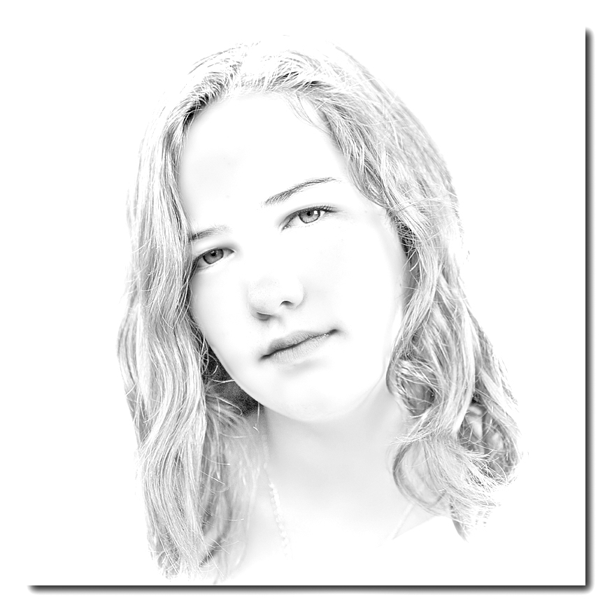
They're all really just "normal key" - there seems to be a common misconception that anything with a black background is "low key" and anything with a white background is "high key", but is just ain't so.
Think of it this way - the key light is the "main" light illuminating the SUBJECT (not the background); if that key light results in significant under-exposure then you'll have a low-key image - and if it results in significant over-exposure then you'll have a high-key image.
The actual background doesn't really enter into it as such.
Here's one of my high-key images as a "case in point" ...
And this is a low-key image (albeit not a great example)

Whereas these two are just normal key:

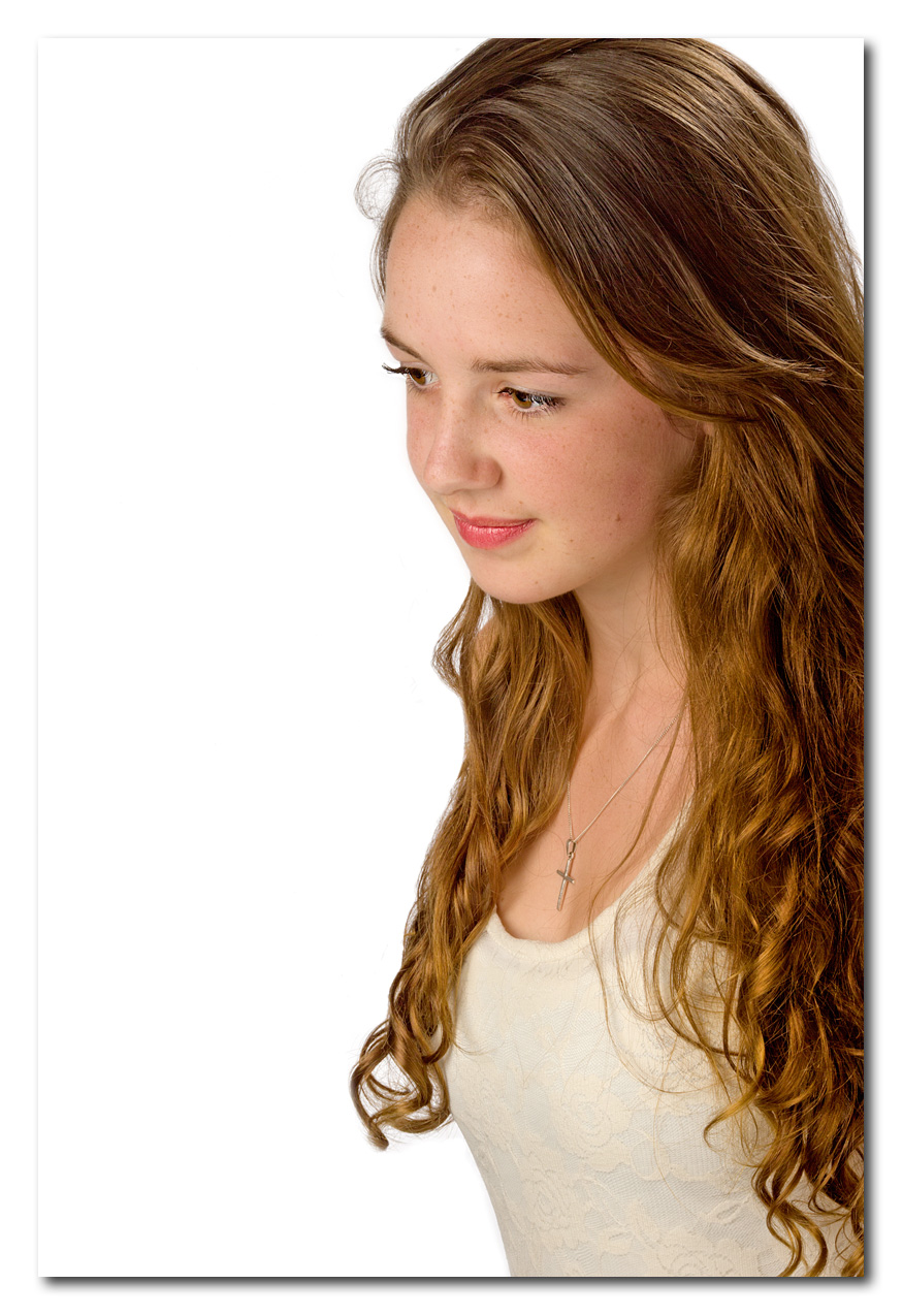
Hope this helps.
-
8th April 2014, 10:57 AM #16
Re: High Key / Low Key
 I'm perfectly capable of remembering low / high key the wrong way round Colin. Thanks for correcting me. It was mostly a lighting and maybe paper grade thing on film. Your high key fits in with the Olympus curves which also give a considerable lift to shadows.
I feel the important aspect is how soft how hard the shot appears and the degree of the effect used but that is more aimed at flattering photo's rather than saying it must be this or that. Me, well I had considerable difficult seeing if the lighting was correct. Bit of a pain on film as it takes a while to find out..
John
-
-
8th April 2014, 11:08 AM #17

- Join Date
- Dec 2008
- Location
- New Zealand
- Posts
- 17,660
- Real Name
- Have a guess :)
-
8th April 2014, 11:34 AM #18

- Join Date
- Dec 2008
- Location
- New Zealand
- Posts
- 17,660
- Real Name
- Have a guess :)
Re: High Key / Low Key
Hi Cliff,
I've got a few minutes before I head off to bed, so I thought I'd pass a few quick comments that you might find helpful.
Generally, side-on shots like this don't flatter the subject particularly - they tend to emphasise the bum and waist. A common one that I use is to have them face away and then swing back using hips and waist (dropping a shoulder) to give the appearance of a slimmer waist.
Flat lighting adds weight to faces because it's illuminating "all of the real estate". Normally for this kind of shot you'd go for loop lighting (start with the key light around 45 deg above and off-axis, then add fill light "to taste" (generally, the fuller the face the less fill light / higher contrast ratios that you need to use)
Same here. Also, it helps to taper off the lighting (or apply a digital GND) to the bottom of the frame so that the eye isn't drawn to the bright top.
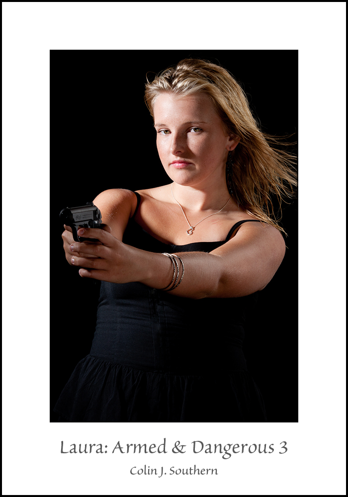
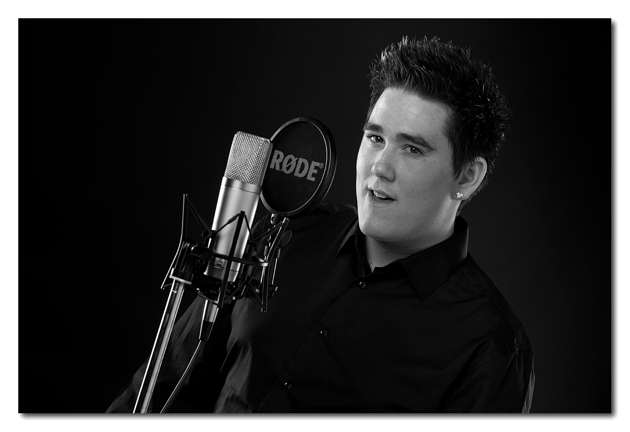
Get into the habit of using a dutch tilt (where you tilt the camera to give the illusion that the subject is on an angle). Also - generally - hard light like this isn't very flattering (you also need to raise the height of the light source), although hard light can be used on women if you're after a "bad ass" kinda look, eg
With a subject like you have, personally, I'd be looking towards a loop lighting setup - probably in the classic 45/45 (45 degrees above them and 45 degrees off axis) - reasonably contrasty, but very soft - using Dutch tilt and a bit more space for them to look into. You've also got quite a few post-processing things that aren't optimal, but we can work on those at a later stage (eg colour, texture, and contrast issues).
Great start though!
PS: A couple of good examples of Dutch Tilt below - they're both really standing straight up and down.
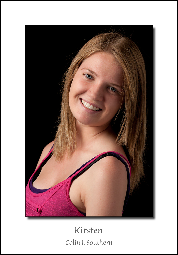
Last edited by Colin Southern; 8th April 2014 at 11:40 AM.
-
8th April 2014, 07:01 PM #19
Re: High Key / Low Key
Thanks everyone for the feedback! I appreciate you all taking the time to look and comment.
Clearly, I have some things to work on.
Kevin - there were 5 lights in the setup. A strobe with a gridded octobox was used as the main, positioned to camera left, set to f/8. Another strobe with a large rectangular softbox to camera right was used for fill. The lighting ratio was 2:1 main to fill. For the white background there was a strobe with a barn door on either side, using a 1:1 ratio with the main. There was a gridded strobe above and slightly behind her as a hair light, turned up 1 stop from the main. The black background was set up the same, but without the background lights, and with the hair light turned down a bit. We played a bit with moving the background lights even with the model, and with the barn doors closed a bit, but I didn't really like any of those shots.
Thanks again!
CliffLast edited by cliffmccartney; 8th April 2014 at 07:08 PM.

 Helpful Posts:


 Reply With Quote

