
 Helpful Posts:
 Hi, going forward on my photography venture I stopped and clicked another shot. Can you please review it and let me know what exactly is missing for it to make it much better?
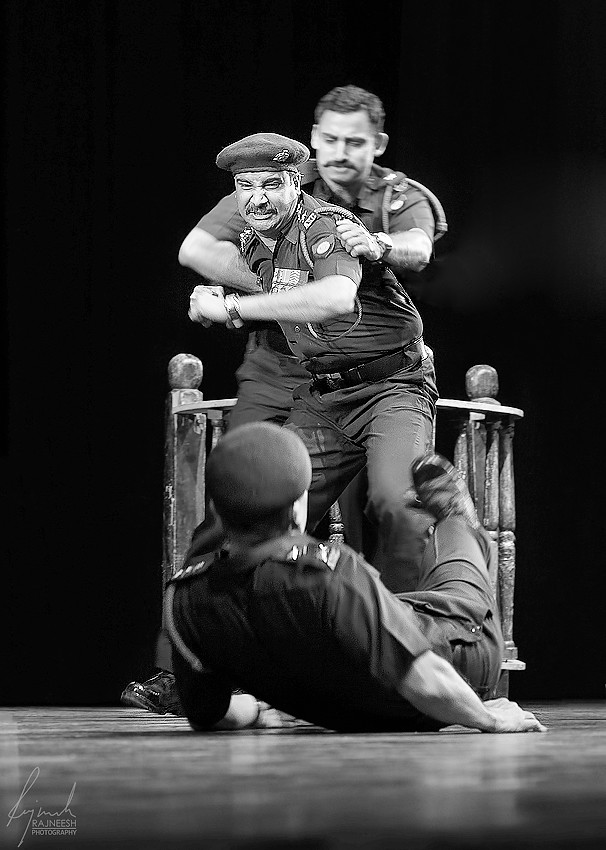
Recently i have attended a Theater play in New Delhi for a photo shoot. The story's title was "Court Martial" which is based on a story about caste system in India, in Indian Army where an officer shot his senior officer who was embarrassing and abusing him for past 2 years infront of everybody. It is a scene of an Army Court.
Here in this image i tried to show the emotions where other officers are trying to stop him to beat the other one lying on the ground.
I like the composition where is there is a dynamic balance between the officers and the hands coming from the right is acting as a leading line and adding to it. Also, the angry officer is surrounded with the hands which are acting as a vortex and bringing more attention to the office. Angry officer is gaining more attention because he is tack sharp and surrounded by the motion energy around him. Chopped table on the left is acting as a barrier to stop my eyes to go out of the frame. Wooden structure behind is making a frame for the officers. Please correct me if i'm wrong in observing the composition.
All the motion blur in the image is real and deliberately used a shallow DOF 90mm @ F4.5, 1/100 with the processing i hardly took 4 min. for the colored version and 10 min. for the colored version. I'm more inclined towards the B&W version because it is full of emotions.
Please provide your views and suggestion, which version is looking better colored or B&W and what can be done to improve it. Composition wise and processing wise.
Thank You
PS : Please click on the image for lightbox screen view (Highly recommended).
B&W Version :
Colored Version :
Update 1 : Remove the table and hands as suggested.
Results 1 to 15 of 15
Thread: Angry Officer C&C Welcome
-
14th April 2014, 01:18 PM #1

- Join Date
- Apr 2013
- Location
- India
- Posts
- 1,348
- Real Name
- Raj
Angry Officer C&C Welcome
Last edited by fotugraphy; 14th April 2014 at 01:38 PM.
-
14th April 2014, 01:25 PM #2

- Join Date
- Sep 2013
- Location
- Kemer, Fethiye, Turkey
- Posts
- 4,981
- Real Name
- David
Re: Angry Officer C&C Welcome
Good capture Raj

-
14th April 2014, 01:31 PM #3Moderator

- Join Date
- Mar 2012
- Location
- Ottawa, Canada
- Posts
- 22,262
- Real Name
- Manfred Mueller
Re: Angry Officer C&C Welcome
A very nice cature Raj. Somehow I prefer the B&W version, but only slightly.
I would remove the prop on the left side of the scene and would probably get rid of the hands on the right in post as well. These (especially the hands) do take away from the image.
-
14th April 2014, 01:38 PM #4
- Join Date
- Apr 2013
- Location
- India
- Posts
- 1,348
- Real Name
- Raj
Re: Angry Officer C&C Welcome
Thanks a lot for your kind review and m glad you like it Originally Posted by deetheturk

-
14th April 2014, 01:39 PM #5
- Join Date
- Apr 2013
- Location
- India
- Posts
- 1,348
- Real Name
- Raj
Re: Angry Officer C&C Welcome
Thanks a lot for your valuable review sir. Originally Posted by GrumpyDiver
Hope now the skin color is good with the color version. Really appreciated about the knowledge you gave about white balance correction.
really wanna learn the art of including and excluding the elements in the image. Here is the version as suggested and looking good :

-
14th April 2014, 01:45 PM #6

- Join Date
- Dec 2009
- Location
- WNY
- Posts
- 36,716
- Real Name
- John
Re: Angry Officer C&C Welcome
Nicely captured.
-
14th April 2014, 01:58 PM #7
- Join Date
- Apr 2013
- Location
- India
- Posts
- 1,348
- Real Name
- Raj
Re: Angry Officer C&C Welcome
Thanks for your kind review and appreciation Originally Posted by Shadowman
-
14th April 2014, 02:09 PM #8Moderator
- Join Date
- Mar 2012
- Location
- Ottawa, Canada
- Posts
- 22,262
- Real Name
- Manfred Mueller
Re: Angry Officer C&C Welcome
This is more effective, I think, but the unattached (ghostly) hands that are floating on the body need to disappear. Originally Posted by fotugraphy
-
14th April 2014, 02:19 PM #9
- Join Date
- Apr 2013
- Location
- India
- Posts
- 1,348
- Real Name
- Raj
Re: Angry Officer C&C Welcome
oops!! Sorry Forgot to remove them. Thanks a lot for pointing. Originally Posted by GrumpyDiver
Ps : Fixed

-
14th April 2014, 06:05 PM #10
- Join Date
- Dec 2013
- Location
- Turkey
- Posts
- 12,779
- Real Name
- Binnur
Re: Angry Officer C&C Welcome
Very nice Raj
-
14th April 2014, 09:02 PM #11
- Join Date
- Apr 2013
- Location
- India
- Posts
- 1,348
- Real Name
- Raj
Re: Angry Officer C&C Welcome
thanks for your kind review and appreciation Originally Posted by bnnrcn
-
14th April 2014, 10:01 PM #12
- Join Date
- Nov 2012
- Location
- Australia (East Coast)
- Posts
- 4,524
- Real Name
- Greg
Re: Angry Officer C&C Welcome
Good capture, Raj. I like the perspective and there is just enough motion blur in the victim's limbs. The solid black and white processing really adds to the drama of the scene. Very well done.
-
15th April 2014, 04:42 PM #13
- Join Date
- Apr 2013
- Location
- India
- Posts
- 1,348
- Real Name
- Raj
Re: Angry Officer C&C Welcome
thanks a lot for your kind review and appreciation. Originally Posted by FootLoose
-
2nd May 2014, 11:34 PM #14

- Join Date
- Jan 2013
- Location
- Woodlands, Singapore
- Posts
- 280
- Real Name
- Walad Jam
Re: Angry Officer C&C Welcome
How about this?
-
12th May 2014, 05:36 PM #15
- Join Date
- Apr 2013
- Location
- India
- Posts
- 1,348
- Real Name
- Raj
Re: Angry Officer C&C Welcome
Thanks for the review and suggestion. Originally Posted by Walj
Sorry the thread just skipped, dont know how.


 Reply With Quote