
 Helpful Posts:
 Tell me what you think of this one. I'm still playing with it and am undecided.
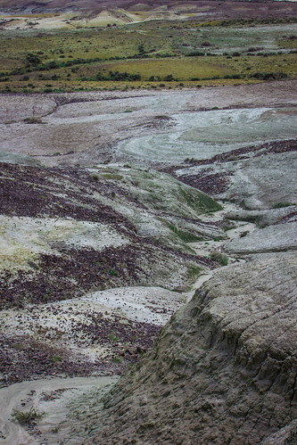
Violet by Amanda McClure, on Flickr
Results 1 to 11 of 11
Thread: non traditional landscape
-
19th April 2014, 01:46 AM #1


- Join Date
- Apr 2014
- Location
- Southwest Wyoming
- Posts
- 26
- Real Name
- Amanda
non traditional landscape
-
19th April 2014, 01:54 AM #2
- Join Date
- May 2012
- Location
- northern Virginia suburb of Washington, DC
- Posts
- 19,064
Re: non traditional landscape
It doesn't seem particularly non-traditional to me. That's only an observation in light of your thread title, not a criticism. The image is far too small for me to helpfully provide critique.
-
19th April 2014, 01:57 AM #3
- Join Date
- Apr 2014
- Location
- Southwest Wyoming
- Posts
- 26
- Real Name
- Amanda
Re: non traditional landscape
Here it is larger (I think)

Violet by Amanda McClure, on Flickr
-
19th April 2014, 02:03 AM #4
- Join Date
- May 2012
- Location
- northern Virginia suburb of Washington, DC
- Posts
- 19,064
Re: non traditional landscape
It's a nice image that would be even better in more appealing light.
There are two crops I think I would like better: Crop at the top so the top of the frame is about in the middle of the green area. Crop using a square format that includes everything in the bottom area.
-
19th April 2014, 07:16 AM #5
- Join Date
- Dec 2012
- Location
- Honolulu, Hawaii
- Posts
- 1,651
- Real Name
- Shane
Re: non traditional landscape
Hi Amanda...I'm with Mike on his crop suggestion and I lean towards having no green at the top. The lines and texture in your shot are great but it does lack a little pop because of the lighting as Mike also said.
I really like what you saw here and love the various shades of purple, green and clay colors. It is very soothing to my eye.
-
19th April 2014, 07:40 AM #6

- Join Date
- Dec 2013
- Location
- Chesterfield, Missouri/Melbourne, Australia
- Posts
- 17,827
- Real Name
- Izzie
Re: non traditional landscape
If you are going to crop most at the bottom, do not remove all of the grey rock, leave a little bit to be seen. I like it better ... just my opinion.
-
19th April 2014, 11:44 AM #7

- Join Date
- Apr 2014
- Posts
- 91
- Real Name
- Bob
Re: non traditional landscape
Because the lighting is flat across most of the image, it makes for a loss of dimension.... which moves it a bit toward abstract.
-
19th April 2014, 11:57 AM #8
- Join Date
- Dec 2009
- Location
- WNY
- Posts
- 36,716
- Real Name
- John
Re: non traditional landscape
It's an interesting shot as there is no sky to really define what the lighting conditions are, so you can experiment as you wish with different scenarios. Did the image originally contain areas of sky and you cropped out?
-
19th April 2014, 12:05 PM #9
- Join Date
- May 2011
- Location
- SE Michigan
- Posts
- 4,511
- Real Name
- wm c boyer
Re: non traditional landscape
Using what software?I'm still playing with it and am undecided.
-
19th April 2014, 05:55 PM #10
- Join Date
- Jan 2009
- Location
- South Devon, UK
- Posts
- 14,559
Re: non traditional landscape
Maybe you could try a slight boost to the highlights to add a little more in the way of contrast?
I did wonder about cropping to 4 x 5 ratio but that would mean losing too much, whichever end you croped.
-
20th April 2014, 12:18 AM #11

- Join Date
- Apr 2012
- Location
- New Jersey, USA
- Posts
- 800
- Real Name
- Ken Curtis
Re: non traditional landscape
Hi Amanda.
Beautiful colors and fascinating landscape. I can see what looks like a river cutting through the land and making interesting 's' curves, but it is difficult to see the depth. I am with the others in that the scene needs some light shining from the left or right to help define the rough terrain with some shadows.

 Reply With Quote