 Helpful Posts: 0
Results 1 to 13 of 13
Thread: Santa Cruz - California
-
10th March 2010, 05:47 AM #1
-
10th March 2010, 09:33 AM #2
Re: Santa Cruz - California
Ajith,
Very colorful, nice silhouettes.
-
10th March 2010, 03:15 PM #3

- Join Date
- Oct 2009
- Location
- Maryland, USA
- Posts
- 1,015
- Real Name
- Rick
Re: Santa Cruz - California
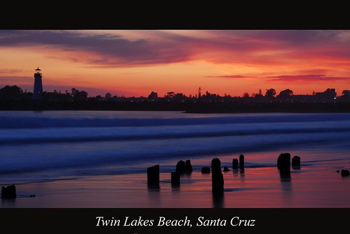
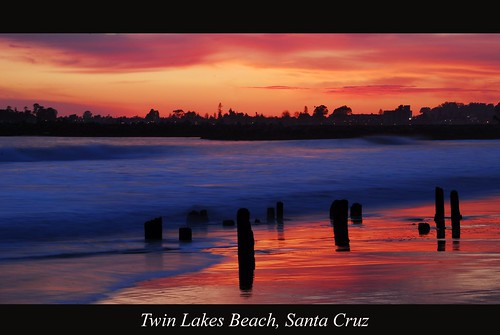
Great colors. I like #6 the best: it gives a great feeling of stillness.
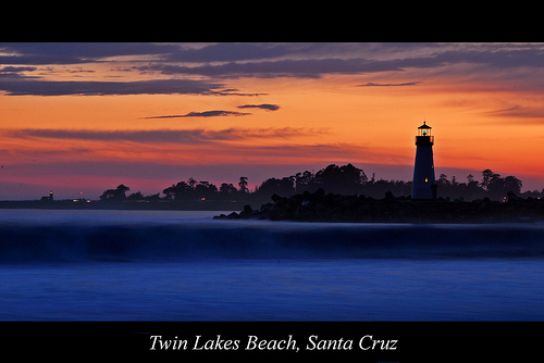
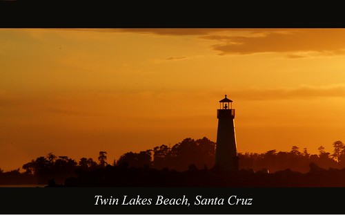
My only suggestion would be that the lighthouse seems a little far to the right in #1. If there's room to expand the crop to the right, or maybe cut some from the left, would it balance better?
Cheers,
Rick
-
10th March 2010, 05:55 PM #4
-
10th March 2010, 05:59 PM #5
-
10th March 2010, 06:01 PM #6
Re: Santa Cruz - California
#3 and #6 are my favorites. Nice pics!
-
10th March 2010, 06:03 PM #7
-
10th March 2010, 09:00 PM #8
Re: Santa Cruz - California
Hi Ajith,
Nice series, my C&C thoughts;
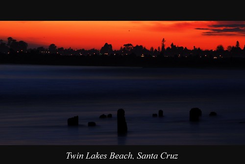
#2 has a spot, or plane, almost dead centre in sky that should be cloned out
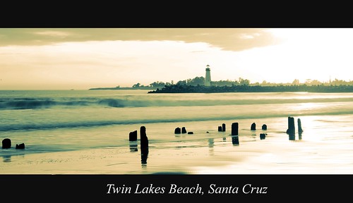
Maybe I'm just to stuck in my ways, but to me, a more obvious sequence in time would be better; e.g. #4, #6, #1, #3, #5 and #2.
Horizon on #1 slopes differently to #4, I think #4 is more correct.
I am happy with the compositions personally
Cheers,
-
10th March 2010, 09:24 PM #9
Re: Santa Cruz - California
Very nice Ajith: I particularly like 1, 3 and 6. I like the rich colors and dramatic feel.
Chuck
-
11th March 2010, 05:18 AM #10
-
11th March 2010, 05:19 AM #11
-
11th March 2010, 07:04 PM #12
-
12th March 2010, 04:46 AM #13


 Reply With Quote


