 Helpful Posts: 0
Results 1 to 13 of 13
-
12th March 2010, 08:06 PM #1
I like these let me know if you do
-
12th March 2010, 11:38 PM #2
Re: I like these let me know if you do
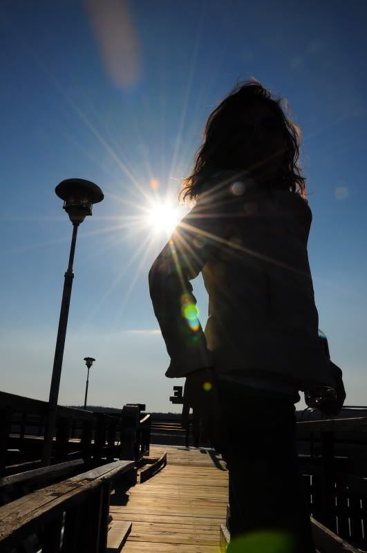
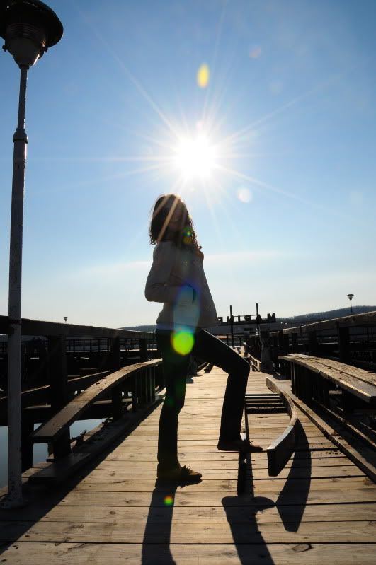
Not bad at all; but I think I'd clone out the flare on the bottom edge and possibly clean the front element/filter before this kind of shot

Part of me wants to perspective correct the lampstands (in PP), but that may spoil it completely.
There's a little too much stuff in the background behind the model's hand, but the rest is good.
I like it,
-
13th March 2010, 12:01 AM #3
Re: I like these let me know if you do
It is an interesting picture, but (not that I have not done it) looks like it is completely accidental. When i look at it, I am not sure where you want us to focus.
Also, the green areas bother me. I am sure you can easily take care of them, although not sure if you like the picture without them. Same for the gray area on top in the middle.
If only we could see some more detail of the subject (a little bit of rotation, etc), this would be much more interesting
-
13th March 2010, 03:33 AM #4
Re: I like these let me know if you do
-
13th March 2010, 04:51 AM #5
Re: I like these let me know if you do
Hook up with a copy of GIMPSHOP. It is free and does pretty much what PhotoShop does. You don't have the background support you have with PS, but you can get tips form PS users and figure out how to apply those techniques to GIMPSHOP. (This from a PS user.
 )
)
http://www.gimpshop.com/
http://www.gimpshop.com/download.shtml
Pops
-
13th March 2010, 08:11 AM #6

- Join Date
- Aug 2009
- Posts
- 4,049
Re: I like these let me know if you do
Personally (and it is a matter of personal choice) I like contre jour shots, but I prefer them to be complete silhouettes if there's sufficient shape to give the shot interest. I think yours may have benefited (as it's not a complete silhouette) by having some fill-flash on the girl. The star effect from the sun is good, but the detail on the girl is neither one way or the other - either not enough detail or none at all.
Here's what I mean with one that has hardly any detail... It's called Night Travellers. http://farm5.static.flickr.com/4026/...58951397_o.jpg
-
13th March 2010, 07:01 PM #7
-
13th March 2010, 07:04 PM #8

- Join Date
- Aug 2009
- Posts
- 4,049
Re: I like these let me know if you do
Alis
Try a CTRL/F5 refresh when you view it. You should be able to see it, or try my main flickr page (shot#1) http://www.flickr.com/photos/carregwenimages/
-
13th March 2010, 09:21 PM #9
Re: I like these let me know if you do
I've been trying to do a similar thing and what I've found out is;
1) Use a wide lens with as few elements as possible
2) Make sure it is immaculately clean
3) Stop down as far as reasonable, after your cameras diffraction limit things get progressively blurred but it will be anyway
4) Point at the sun, do not use mirror lock up or look through the viewfinder
5) Do not use filters
Of course some of these things are impractical for certain photo's but I've found that using replace colour brush easier than cloning.
This was part of a panorama gone wrong, the next image was just too bad but this one isn't and it was taken with a GND 8 hard grad filter.

-
13th March 2010, 10:01 PM #10
Re: I like these let me know if you do
i really liked your example and i see what your talking about by possibly using a fill flash. i was going for a full silhouette with the outsides of the model's hair being glowing on the edges. next time ill try using a fill flash to brighten her up.
Good looking out popsphotos, im going to download gimpshop later on today sounds like exactally what i need.
Arith, next time ill have to make sure my lens is clean. i would try using a wide angle lens next time but currently i dont have one. i liked your shot. i think the colors could have been a little brighter but you may have been going for that look. im not sure if you were going for the star around the sun but if you shoot at a higher aperature you can get the rays to be longer. i shot mine at f22 with a dx 18-105 mm with my d90. im hoping to get a better lens but i want to buy a good solid tripod first. i also wanna try out a gradient filter. great feedback though
-
14th March 2010, 12:08 AM #11
-
14th March 2010, 12:10 AM #12
-
14th March 2010, 11:39 AM #13
Re: I like these let me know if you do
I read that Alis, can't remember where but think he knew a bit.


 Reply With Quote


