 Helpful Posts: 0
Results 1 to 9 of 9
Thread: Keeping Watch
-
31st March 2010, 02:58 AM #1
Keeping Watch
Last edited by Dave Humphries; 31st March 2010 at 09:20 AM.
-
31st March 2010, 07:08 AM #2Moderator


- Join Date
- Feb 2009
- Location
- Glenfarg, Scotland
- Posts
- 21,402
- Real Name
- Just add 'MacKenzie'
Re: Keeping Watch
Steve
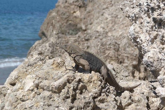
This is, I think, a super capture of an animal in, what appears to be, its natural environment. I would suggest a couple of points for your consideration. Edited comment - I would particularly note your excellent application of depth-of-field. I think you got that one spot-on.
- The outcrop just coming in to the left-hand side is very distracting, as is the land at the top. In addition, the land at the top is not level. You can see it sloping away to the right. So, crop those areas.
- The front part of the head is a similar tone to the rock behind it. So, use a levels curve to make the head more distinguishable from its background: - if you take down the front part of the head (I use the GIMP software, so pulled down the curve at the point at which it covers the head area, put on a black layer mask and then brushed white over the area to be changed - don't know how you do the same thing with Adobe products). The change is very slight.
The consequence of the cropping, however, is that the subject ends up dead centre. But I think that's a worthwhile pay-off - others may disagree. I downloaded your image and did what I have said above. Happy to post it here if you wish.Last edited by Donald; 31st March 2010 at 08:04 AM. Reason: As above
-
31st March 2010, 09:33 AM #3
Re: Keeping Watch
Hi Steve,
I am so glad you gave us a first name too
Welcome to the CiC forums.
I completely agree with Donald's part 1, but in that crop and twist, I personally would be quite agressive (i.e. zoom in more), especially if this was the full size image just reduced and not previously cropped. This may also help get Iggy non-central.
If that is done, giving quite a big enlargement; the sharpness of the subject may overcome the similarity of colour between Iggy and the rocks behind, avoiding the need to do part 2. However, I can see that the foreground rocks to right are already quite sharp and these may become overly dominant. If that happens, I personally would clone them away and replace with more of the background blur of rocks.
UPDATE: Added image

This gives the idea, but is obviously dire quality wise as the cropped image was quite small, which I tried enlarging for further processing but then reduced again for display.
I think Donald's part 2 may need doing afterall.
I also think I should have left a bit more sea in shot
Hope that helps,Last edited by Dave Humphries; 31st March 2010 at 09:48 AM.
-
1st April 2010, 02:07 AM #4
Re: Keeping Watch
All
Thanks for the comments. I do agree with the crop but believe it needs some of the water.
Donald, I would like to see your version. Thanks again.
-
1st April 2010, 07:04 AM #5
-
1st April 2010, 07:59 AM #6
Re: Keeping Watch
To me, the DOF is weird. The rocks in the back are a little blurred, but entirely distinguishable. I would greatly prefer that the rocks be in focus with a small aperture, or washed out with a large aperture, but I'm just speculating. I haven't quite read the thread yet, but I noticed the cropped version. Perhaps you could have zoomed in that close with your lens - it would have made the background blur out even more because of an enlarged entrance pupil with a greater focal length.
-
1st April 2010, 08:20 AM #7
Re: Keeping Watch
i like this dof, gives a bit of a 3d feeling to it
some vignette will look good on it i think, and make the foreground and background a little bit darker (burn tool)
so the attention goes to the subject
-
1st April 2010, 09:51 AM #8

- Join Date
- Feb 2009
- Location
- Bucharest,Romania
- Posts
- 1,367
Re: Keeping Watch
Hi,
I like all of them, my question is whose wife.


-
1st April 2010, 11:10 AM #9

- Join Date
- Aug 2009
- Posts
- 2,342
- Real Name
- Steve
Re: Keeping Watch
Here is my version.
I like the textures of the rock on the right, but it draws too much attention away from the subject, so i cloned it out. Added some contrast with USM set to .30 and radius 32, then adjusted opacity .
Added some saturation with LAB...........60% on the rock side and 20% on the water
Vignette using quickmask and setting the blend mode to multiply.........30%
Sharpening layer


 Reply With Quote


