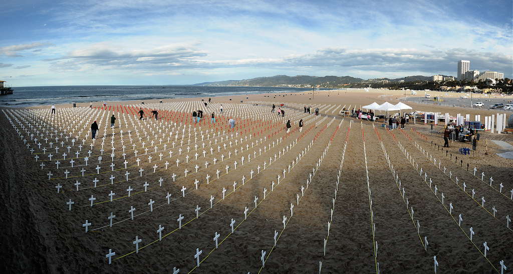
Here are two reworked versions of an image I posted a while back...
Additional image details...
 Helpful Posts: 0
Results 1 to 8 of 8
-
31st March 2010, 08:57 AM #1
Crosses of Santa Monica - reworked
-
31st March 2010, 09:07 AM #2Moderator


- Join Date
- Feb 2009
- Location
- Glenfarg, Scotland
- Posts
- 21,402
- Real Name
- Just add 'MacKenzie'
Re: Crosses of Santa Monica - reworked
eNo
Yes. Still think that this needs to be in B & W - that's the version I go for. Lifting the shadows and, I think, bringing up the whiteness of the crosses gives it more 'sparkle' and 'pop'. Interested to know what's actually happening here. Is this an event of some sort?
-
31st March 2010, 06:54 PM #3
-
31st March 2010, 07:46 PM #4
-
31st March 2010, 08:17 PM #5

- Join Date
- Aug 2009
- Posts
- 4,049
Re: Crosses of Santa Monica - reworked
A very unusual and interesting shot. It has great depth, and I like the way the crosses stand out so much. The B+W is better. Well done.
-
31st March 2010, 08:52 PM #6
Re: Crosses of Santa Monica - reworked
why are thees crosses there ?
-
31st March 2010, 08:55 PM #7
-
4th April 2010, 04:58 PM #8
Re: Crosses of Santa Monica - reworked
Excellent, simply excellent. Definitely best as B&W.


 Reply With Quote

