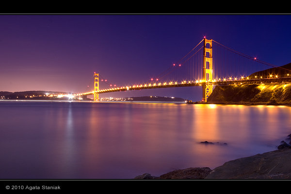
My second attempt: Golden Gate Bridge, San Francisco, CA.
Can also be viewed here (includes shooting data): http://www.flickr.com/photos/agatastaniak/4486477370
C&C welcome!
 Helpful Posts: 0
Results 1 to 20 of 28
-
3rd April 2010, 10:02 AM #1
Golden Gate Bridge, San Francisco
-
3rd April 2010, 10:36 AM #2
Re: Golden Gate Bridge, San Francisco
Very nice Agata, I bet it looks great full size.
I couldn't see how, from any link on the page you linked above, to get to the shooting information - fortunately I know the "flickr meta trick" - add "/meta" after the number in your link. is there a better way?
Was that 510 seconds at f16?
Thanks,
-
3rd April 2010, 10:43 AM #3Moderator


- Join Date
- Feb 2009
- Location
- Glenfarg, Scotland
- Posts
- 21,402
- Real Name
- Just add 'MacKenzie'
Re: Golden Gate Bridge, San Francisco
Last edited by Donald; 3rd April 2010 at 10:50 AM.
-
3rd April 2010, 11:25 AM #4
-
3rd April 2010, 11:26 AM #5

- Join Date
- Aug 2009
- Posts
- 4,049
Re: Golden Gate Bridge, San Francisco
Very good Agata. I especially like the colour reflections in the water. A long exposure and 03:16 in the morning! Was there much ambient light from the sky, or was it too early?
I see you are new to flickr. Have you got the desktop uploader? It makes it much easier to upload your shots, even just one or two. Here http://www.flickr.com/tools/ It also helps to create 'sets'. When you use the uploader you can specify which set it goes to. It helps keep your shots categorised and is very useful if you want to create slideshows, which you can email to others or incorporate into your website with the code they give you, like I did here Example of flickr slideshow If you click on my flickr below you will see my collections (which contain the sets) on the right. Apologies if you already know this stuff.
-
3rd April 2010, 12:13 PM #6

- Join Date
- Dec 2008
- Location
- New Zealand
- Posts
- 17,660
- Real Name
- Have a guess :)
Re: Golden Gate Bridge, San Francisco
Hi Agata,
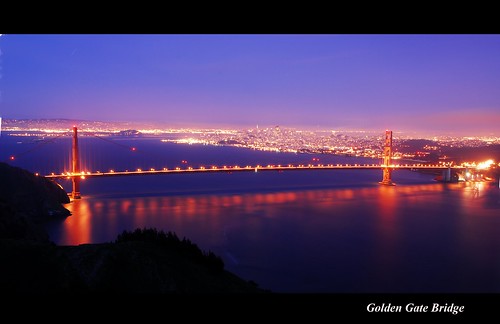
Looks great Would you be interested in seeing an "alternative interpretation" of the colours?
-
3rd April 2010, 05:07 PM #7
Re: Golden Gate Bridge, San Francisco
Thanks guys!
@Dave: Yes it was almost a 10 minute exposure!
@Rob: Don't look at the date and time from the camera - it's still in another timezone, I never changed it since I moved from Europe. The photo was actually taken around 1 hour after sunset, I think around 8pm.
@Colin: Always! I'm actually concerned about the colors. I don't like the yellow cast from the lights on the bridge. But, on the other hand, it really looks GOLDEN!
-
3rd April 2010, 05:54 PM #8

- Join Date
- Aug 2009
- Location
- Canada
- Posts
- 3,113
- Real Name
- Wendy
Re: Golden Gate Bridge, San Francisco
Nice one Agata. Your first one was great, but this is a huge step up. Really beautiful.I love the colours and the smooth glow on the water.
-
3rd April 2010, 08:20 PM #9

- Join Date
- Dec 2008
- Location
- New Zealand
- Posts
- 17,660
- Real Name
- Have a guess :)
-
3rd April 2010, 09:06 PM #10
Re: Golden Gate Bridge, San Francisco
Thanks Colin!
Interesting, you removed red/magenta and left it more towards blue and yellow. As much as I like the blue, I'm not that fond of the yellow. I was actually thinking the opposite - add more warmth to the yellows in the bridge and lights, to make them more orange, something like in this shot:
http://www.flickr.com/photos/sutanto/2244539268 - I like colors here very much. I'm wondering how the hell he managed to keep the natural color of the bridge with all this surrounding light giving the yellow cast!
I also like your pano format, unfortunately with my composition it's not possible without streching
-
3rd April 2010, 09:15 PM #11

- Join Date
- Dec 2008
- Location
- New Zealand
- Posts
- 17,660
- Real Name
- Have a guess :)
Re: Golden Gate Bridge, San Francisco
Hi Agata,
The big problem is that Blue & Yellow are colour opposites (more of one means less of the other) - so it becomes a compromise, unless you want to "employ other techniques", although having just said that, in LAB colour you can shorten the length of the B channel curve to kill one colour without adversely affecting the other ...
or ...
With my 2:1 pano format, you can do it 1 of 3 ways ... cropping - digital stretching - or just a combination of the two. I find that in practice I tend to use the 3rd option most - people seem to forget that wide-angle lenses are wide in BOTH dimensions - so often I can just lop off portions of foreground or sky, and then just plug in the number of pixels I want, to sort the rest. Often images tolerate it quite well - and it means that since I'm limited to the width of canvas I can print (which actually determines the height of the print), I can then create works that are wider and "more substantive".Last edited by Colin Southern; 3rd April 2010 at 09:28 PM.
-
3rd April 2010, 10:06 PM #12
Re: Golden Gate Bridge, San Francisco
Interesting Colin, thanks! I actually used Lab maybe a couple of times, this is one of those things overlooked by me.. God, why everytime I learn something new, I just realize how little I know, and how much more I need to learn? Will it ever end??
(Just kidding, i LOVE learning new stuff )
)
-
3rd April 2010, 11:05 PM #13

- Join Date
- Dec 2008
- Location
- New Zealand
- Posts
- 17,660
- Real Name
- Have a guess :)
Re: Golden Gate Bridge, San Francisco
I like using LAB for colour work - once I understood colour oponancy it just seemed so much more intuitive for colour-critical work (try removing a colour cast with just RGB sliders and see how easy that ISN'T!).
Will we ever stop learning? I hope not, because that'll be the day that I die, and I plan on living forever (so far so good!) (stolen from a CiC member!)
-
3rd April 2010, 11:55 PM #14
Re: Golden Gate Bridge, San Francisco
Beautiful Shot! There is so much to shoot in SF. I can't wait until I get a chance to come back outh there.

-
7th April 2010, 06:56 AM #15
-
7th April 2010, 09:35 AM #16
Re: Golden Gate Bridge, San Francisco
Very beautiful bridge!
-
7th April 2010, 10:33 AM #17
Re: Golden Gate Bridge, San Francisco
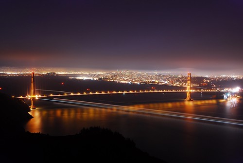
Very nice pictures, however, I find the second picture by Colin a little unusual and interesting. The purple sky and blue waters makes it look menacing
 .
.
I personally like the golden colour.I'm actually concerned about the colors. I don't like the yellow cast from the lights on the bridge. But, on the other hand, it really looks GOLDEN!

Here's without the "yellow cast". It looks a little rustic now.Last edited by Colin Southern; 7th April 2010 at 07:00 PM.
-
7th April 2010, 07:09 PM #18

- Join Date
- Dec 2008
- Location
- New Zealand
- Posts
- 17,660
- Real Name
- Have a guess :)
Re: Golden Gate Bridge, San Francisco
Possibly the key thing for Agata to take away from this is the fact that since blue and yellow are colour oposites, (a) they "resonate" well together because of the total colour contrast and (b) Because more of one will mean less of the other, changing the ratio between them will affect the overall presentation of the image quite dramatically.
Also Agata, because it's so sensitive to the blue / yellow ratio it could look quite different on an un-calibrated / un-profiled display (no way of knowing how you're seeing this) -- becuase you've got a good eye for composition - you're capturing the shots well from a technical point of view - and you're doing nice colour work, I think "it is time" that you made that investment in a colourimeter ... it would be a shame to have the wheels fall off the wagon at such a late stage for the sake of something so cheap (I use a spyder III for what it's worth; it's relatively inexpensive - it'll last forever - it does a good job - and it's great for "peace of mind!").
-
7th April 2010, 08:22 PM #19
Re: Golden Gate Bridge, San Francisco
Hi Colin

Actually I view my images on 3 different screens: a very crappy laptop screen, a slightly better laptop screen and on a Samsung SyncMaster 2343 at work. Oh, and on my two phones (haven't tried on my friend's iPad yet - good idea) None of these are calibrated but my images look similar, except for saturation. I learnt to predict how will colors look on the big screen and which colors get washed out on my cheap laptop
  I process my pictures on the worst screen, because this is the only computer I own and I can install my personal stuff. Therefore, I don't only need a colorimeter.. I need a computer, a good screen AND a colorimeter
  All together, not so cheap, but I'm getting to the point that I will squeeze my budget and buy it all.
Honestly, the cheap screen helps sometimes hehe . Because this is probably not even true 32 bit color, I'm guessing it emulates some of the colors. And it's so funny how it helps detect defects in pictures - like when you think color is solid but it's not, there;s a slightliest change in colors that good screen makes your eye not notice it.. but cheap screen exagerrates the problem. Same thing with blown out highlights etc. Plus my laptop's resolution sucks and it's not super sharp. So it shows the tiniest defects in a picture. If I can make my picture look good on that screen, you bet it looks cool on a better screen
Anyway, your images look completely different on my cheap screen, so NOW I'm getting what you wanted to show me, now that I watch them on my work computer.
-
8th April 2010, 12:41 AM #20

- Join Date
- Dec 2008
- Location
- New Zealand
- Posts
- 17,660
- Real Name
- Have a guess :)
Re: Golden Gate Bridge, San Francisco
Resistance is futile

Seriously, if your not working from a standardised screen then unfortunately it introduces another variable - and it's a BIG one if (like me) you often have to set the temperature (ie blue/yellow axis) quite accurately - your bridge shot is probably one of the best examples of that that I've seen. If you have warm / cool colour temp presets on you screen, try flicking between them to see the difference it makes to that image.Last edited by Dave Humphries; 8th April 2010 at 05:49 PM.


 Reply With Quote


