 Helpful Posts: 0
Results 1 to 20 of 28
Thread: Comments & Critics
-
7th April 2010, 04:16 PM #1

- Join Date
- Nov 2009
- Location
- Chandigarh, India
- Posts
- 1,541
- Real Name
- Sahil Jain
Comments & Critics
-
9th April 2010, 06:53 PM #2
Re: Comments & Critics
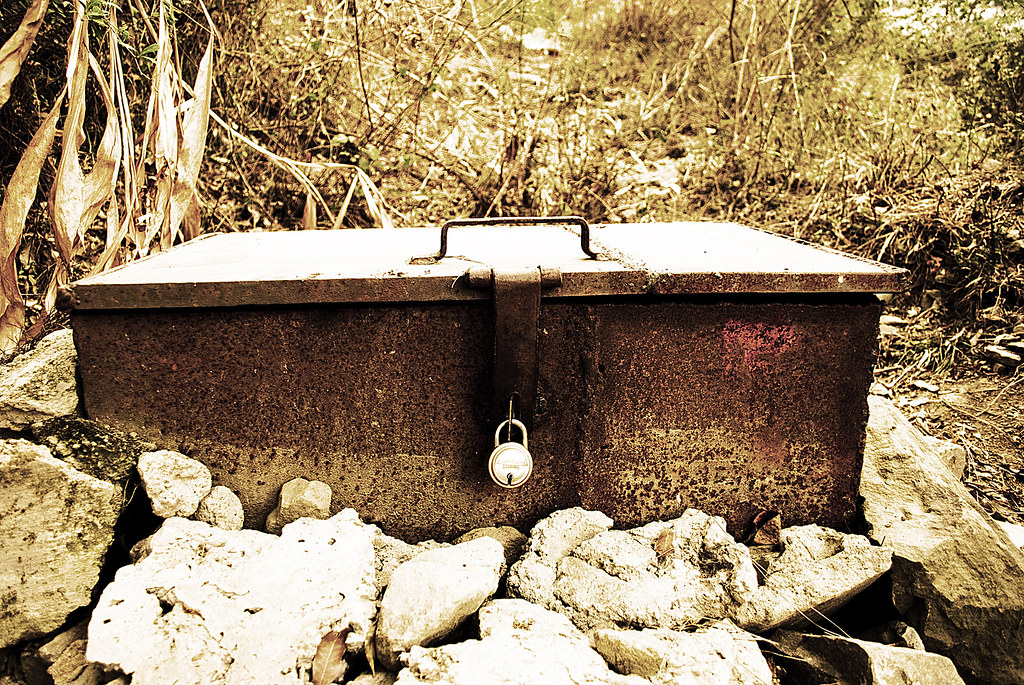
First time I saw the top one, I didn't even reflect on the blown out highlights. The whatever it is has a great structure. Perhaps if you take down the exposure a notch? Is it a RAW image? In such case, down with exposure a tad, up with recovery if possible without banding. Perhaps down with contrast, up the blacks? I would perhaps prefer the background to be a bit less prominent. It might be well served if you crop it a little bit - remove right upper corner. I think this image has some defining character which I like.
-
10th April 2010, 07:04 AM #3

- Join Date
- Nov 2009
- Location
- Chandigarh, India
- Posts
- 1,541
- Real Name
- Sahil Jain
Re: Comments & Critics
I did try selecting the overexposed area and then pulled down the exposure with curves. It looked ok. And yea, this was shot in RAW.
-
10th April 2010, 05:27 PM #4

- Join Date
- Jan 2009
- Location
- South Devon, UK
- Posts
- 14,589
Re: Comments & Critics
The next question is what RAW converter do you have? And do you still have the original image?
If possible, try to convert the original image again but use the Highlight Recovery settings to reduce those over exposed highlights. If your software doesn't have a Highlight Recovery option try again with reduced exposure during conversion.
Getting the highlight exposure correct during conversion should produce better results than using Curves afterwards. You can always give a final little tweak with Curves as required; particularly if it is making midtones or shadows brighter.
-
11th April 2010, 05:41 AM #5

- Join Date
- Nov 2009
- Location
- Chandigarh, India
- Posts
- 1,541
- Real Name
- Sahil Jain
Re: Comments & Critics
Geoff F, I use CS4 for RAW editing. Will try what you have suggested soon. Thanks

-
11th April 2010, 06:21 AM #6

- Join Date
- Nov 2009
- Location
- Chandigarh, India
- Posts
- 1,541
- Real Name
- Sahil Jain
-
11th April 2010, 06:48 PM #7

- Join Date
- Jan 2009
- Location
- South Devon, UK
- Posts
- 14,589
Re: Comments & Critics
That is a lot better, you have far more detail there. I would just give it a little extra boost (don't overdo it though) to improve contrast and saturation and I think it will work well.
-
11th April 2010, 06:53 PM #8

- Join Date
- Nov 2009
- Location
- Chandigarh, India
- Posts
- 1,541
- Real Name
- Sahil Jain
Re: Comments & Critics
Thanks Geoff F, But I tried the little boost, but the again the highlights were getting blown out. So stopped here.
-
11th April 2010, 07:49 PM #9

- Join Date
- Jan 2009
- Location
- South Devon, UK
- Posts
- 14,589
Re: Comments & Critics
Ideally, when problems arise I would work with a duplicate layer and mask to give different levels of adjustment.
But just starting with your latest adjusted image, I have tried a very quick extra tweak. Not sure if it will work as I really need an original RAW photo to start with.
All I have done is to use Curves with a reduction of highlights, increase in midtones, and darken of shadows. But all very slight. Plus a little extra Saturation and Unsharp Mask.
Possibly a duplicate layer with a suitable Blend Mode (like Soft Light) with reduced opacity and maybe a semi transparent mask would work better.Last edited by Dave Humphries; 11th April 2010 at 08:16 PM. Reason: remove those pesky extra IMG tags
-
12th April 2010, 04:54 AM #10

- Join Date
- Nov 2009
- Location
- Chandigarh, India
- Posts
- 1,541
- Real Name
- Sahil Jain
Re: Comments & Critics
Well, your version has really popped out. Thanks
-
12th April 2010, 04:55 AM #11

- Join Date
- Nov 2009
- Location
- Chandigarh, India
- Posts
- 1,541
- Real Name
- Sahil Jain
-
12th April 2010, 07:03 PM #12

- Join Date
- Jan 2009
- Location
- South Devon, UK
- Posts
- 14,589
Re: Comments & Critics
Yes that is an interesting use of light and textures. In this case, I like the out of focus background.
I assume you had to empty the can first!
-
12th April 2010, 07:26 PM #13

- Join Date
- Dec 2008
- Location
- New Zealand
- Posts
- 17,660
- Real Name
- Have a guess :)
-
12th April 2010, 09:03 PM #14
Re: Comments & Critics
Ahaha I remember I was shocked when I was in India and I discovered the airlines I flew with were actually beer producers too
 But Kingfisher turned out to be very nice - both the airlines AND the beer
-
13th April 2010, 04:35 AM #15

- Join Date
- Nov 2009
- Location
- Chandigarh, India
- Posts
- 1,541
- Real Name
- Sahil Jain
Re: Comments & Critics
LFMAO @ Colin. Thanks for giving me a good laugh right in the morning.

Yes Geoff, I can't hold a filled beer can for long, especially when its Kingfisher!
Kingfisher always gives a good experience, Agaace!
-
13th April 2010, 09:07 AM #16

- Join Date
- Dec 2008
- Location
- New Zealand
- Posts
- 17,660
- Real Name
- Have a guess :)
-
17th May 2010, 10:11 AM #17

- Join Date
- Nov 2009
- Location
- Chandigarh, India
- Posts
- 1,541
- Real Name
- Sahil Jain
-
17th May 2010, 11:20 AM #18
-
17th May 2010, 11:24 AM #19

- Join Date
- Nov 2009
- Location
- Chandigarh, India
- Posts
- 1,541
- Real Name
- Sahil Jain
Re: Insect Shot
Thanks, Dave

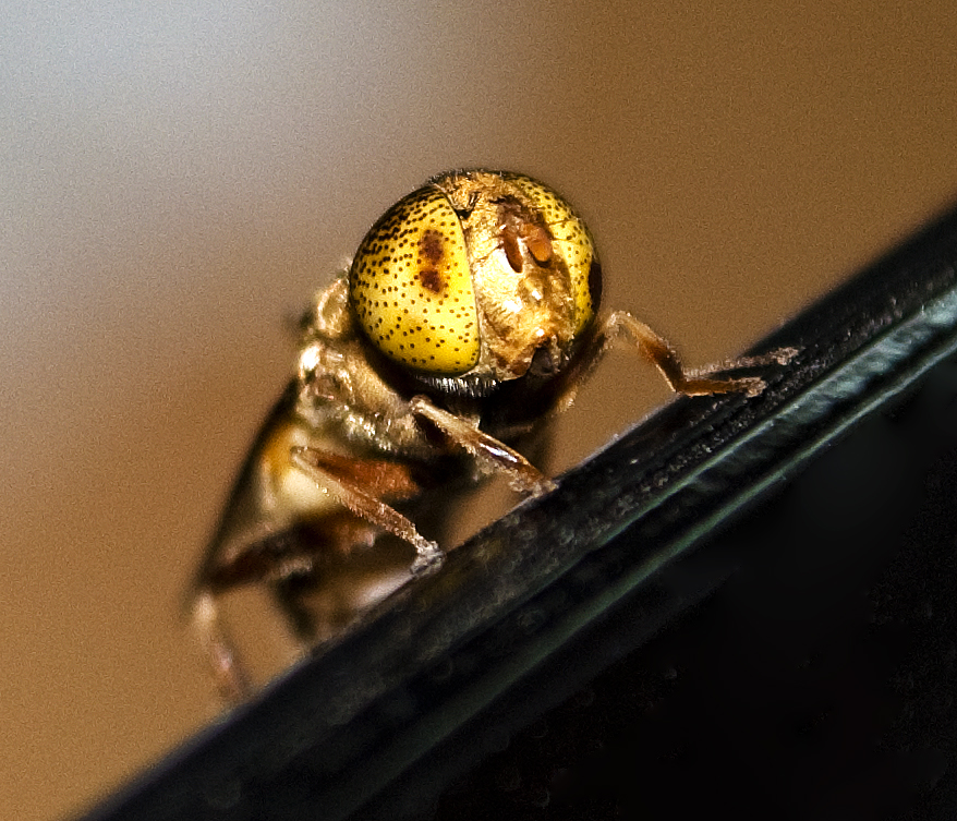
I used 18-55, f4-5.6 lens. Thats the only lens I have till now
I cropped the pic to have this view.
Yes, I used the built in flash!
-
17th May 2010, 11:35 AM #20


 Reply With Quote


