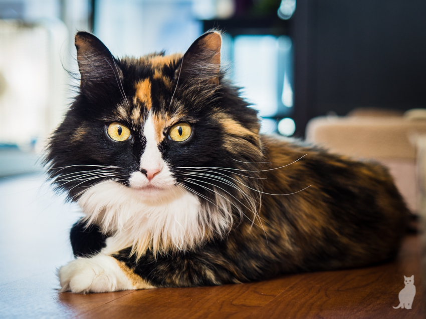
Hi all, another round of pet photos. I would love critiques on any or all of the following photos, whether it be shooting related or post-processing. Feel free to be nitpicky and no need so sugar-coat, that's why I'm here. Thanks much in advance!
All shot with an Olympus E-M10, 12-40 2.8 (x2 to get FF equivalent)
#1 -- 19mm (38mm FFE), f/2.8, 1/3200s, iso 200
#2 -- 34mm, f/3.2, 1/250s, iso 200
#3 -- 40mm, f/2.8, 1/500s, iso 200
#4 -- 40mm, f/2.8, 1/1000s, iso 200
#5 -- 40mm, f/2.8, 1/640, iso 2000
#6 -- 40mm, f/2.8, 1/160, iso 200, flash
#7 -- 40mm, f/3.5, 1/250, iso 200, flash
Thanks again for looking!
 Helpful Posts: 0
Results 1 to 5 of 5
Thread: Cats & Dogs, Oh My!
-
1st October 2014, 01:29 AM #1New Member

- Join Date
- Jun 2014
- Location
- Washington
- Posts
- 5
- Real Name
- David
Cats & Dogs, Oh My!
-
1st October 2014, 07:41 AM #2


- Join Date
- Dec 2013
- Location
- Chesterfield, Missouri/Melbourne, Australia
- Posts
- 17,827
- Real Name
- Izzie
Re: Cats & Dogs, Oh My!
By the look of your info at the left side, I reckon you are a vet.
 or an animal specialist?
Anyway...my fav is #2...the cat one. I like the pose there.
#1 -- much as I like the sexy pose, you cut the toe on the front paw and both the ears.
#3 -- this will benefit from a portrait crop. Also brush out the three distracting blades of grass near it's head on the left. This is a beautiful dog...
#4 Two distracting things here that might be remedied: the overexposed background on the top of the dog and the guy at the top right side that doesn't contribute to the shot. The guy can be remove by content aware in Photoshop.
#5 backlighting on the dog is OK but the overexposed background is distracting. May need close cropping?
#6 Pretty face. Miss Prissy here need a square crop at the right side because of the unbalance (? -- is this the right word?) of the big head as against its body.
#7 is pretty as it is for me...might be nice if you can remove the car light and that yellow object at the right side too.
My favourites are #2 and #3.
How did I go? -- I am not giving you too much to work on, did I? Sometimes it is easier to get instant responses on not too many images uploaded so it is easier to work on them as they go along instead of posting a whole lot of them at the same time for a start...just a thought...not many people wanted to stay put in front of the computer for a long time just looking at one post. I know I don't...it is just that it is 2:30am here in MO when I accessed my laptop. I'd rather be in bed if it is kind of time or shooting something ...
-
1st October 2014, 08:57 AM #3
Re: Cats & Dogs, Oh My!
Nicely done, love the angle.
-
1st October 2014, 09:40 AM #4


- Join Date
- Sep 2010
- Location
- up on a knob above Paden City, West Virginia
- Posts
- 2,101
- Real Name
- Marie Hass
Re: Cats & Dogs, Oh My!
The animals are all cute. Globally, I would suggest scoping out your backgrounds so that they are complementary to the subject.
'Rie
-
1st October 2014, 04:51 PM #5
Re: Cats & Dogs, Oh My!
+1 for Rie and Izzie comments, especially regarding the backgrounds.
My favorite is #2 but I might like it a bit better when much of the image left is cropped out. In this cropping, the important (to me) portion of the image (the cat's face) is at the intersection of the rule of thirds vectors at upper image left. IMO, this places interest on the face.

Additionally, I used NIK Software Viveza's control points to add structure to the cat. I love the Viveza structure slider. Here is an explanation of the Viveza Structure Slider found on http://www.johnpaulcaponigro.com/blo...colorefex-pro/
"Like Photoshop’s High Pass filter, Viveza’s Structure provides a single slider but offers more options with the inclusion of negative values for soft focus effects. In contrast to High Pass, Structure enhances contours with a line that is not as pronounced as Unsharp Mask (Structure is almost incapable of producing artificially hard contouring.) and thinner than High Pass (Structure can’t be used for enhancing planar contrast like high values of High Pass.). Structure accentuates texture somewhat, which can enhance noise as well as detail, but not as much as Unsharp Mask. When Structure is applied, luminosity contrast increases, more so in shadows than in highlights where very high values stop just short of compromising shadow detail. Think of Structure as occupying the visual territory that lies between Unsharp Mask and High Pass."
I also darkened the background with a combination of using Viveza control points and using the burn tool. I did this to decrease the visibility of the BG and increase the visibility of the cat...
I left a rather large portion of the BG in back of the cat's whiskers intact because IMO whiskers are a very important part of a cat's portrait...Last edited by rpcrowe; 1st October 2014 at 05:05 PM.


 Reply With Quote