 Helpful Posts: 0
Results 1 to 11 of 11
Thread: Grand Central
-
28th September 2008, 11:24 AM #1
Grand Central
Last edited by David; 28th September 2008 at 11:26 AM.
-
28th September 2008, 05:11 PM #2
Re: Grand Central
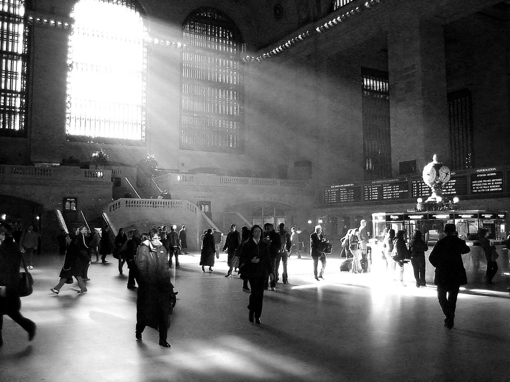
Another interesting and detailed image, well done.
It is difficult to suggest any improvement, you've been skillful not to overdo any of the processing.
I might have tried a transform (or Shift-N) to correct the converging verticals.
However, I know from experience that sometimes this can compromise framing unacceptably and need to be undone, so perhaps you've already been there (and back!).
Keep posting, thanks, Dave
-
28th September 2008, 07:02 PM #3

- Join Date
- May 2008
- Location
- Pittsburgh PA, St. Augustine FL
- Posts
- 136
Re: Grand Central
Well First I hated This.............
Second Viewing, I liked it......Good Job.....
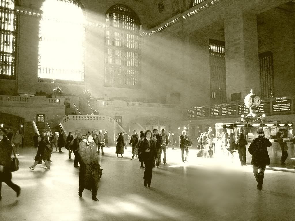
From the clock it appeared to be morning.....this suggested a light toning.....a little recovery of shadow details and some smudging to even out a couple of places.......Just for your consideration.....

I also made a B&W, from this, without toning more like your picture, which has a nice impact....Last edited by willgoss; 28th September 2008 at 07:05 PM.
-
29th September 2008, 07:41 AM #4
Re: Grand Central
this pic is a very comfortable looking pic indeed! one can spend a lot of time gazing at all those wonderful ppl here
 i like the pure black and white effect only
 the other one is ruining it totally
the rays landing on those ppl is a way over exposed! those ppl need to show some detail the empty floor in front of the crowd, should be cropped as its taking the viewers eye out off the frame
 very interesting pic and faces all around
-
29th September 2008, 04:56 PM #5
Re: Grand Central
Hi Willgloss - thanks for the comments. I, too, tried toning the image away from pure B/W, but I did not get anything I thought better. At the end of the day, it's all about personal taste, but I shall remember to test different tones on other B/W images. Thanks again.
David
-
30th September 2008, 07:33 AM #6
Re: Grand Central
Grand Central is an impressive place to photograph and whilst I didn't have any hassle, other photographers have been 'moved on' whilst trying to get a shot.
The stream of light is impressive, suggesting a Cathedral or similar and in many respects this is a cathedral to a past era of railway expansion and building.
The person in the front left foreground intrigues me with the light strongly on their face, despite the main light streaming in from the rear. However, this could be a trick of the light with the way the windows are arranged in Grand Central?Last edited by shreds; 30th September 2008 at 07:35 AM.
-
30th September 2008, 09:41 AM #7
Re: Grand Central
Thanks for the comments Shreds; I agree with the cathedral analogy. The point about the person front left is a good one - it hadn't struck me before. There appears to be back shadows from this figure and another which suggests a light source immediately in front. There are windows in the front facade but I would not have thought enough light was coming through them. Well, a good excuse to go back and look!!
David
-
30th September 2008, 04:16 PM #8
Re: Grand Central
Well done, David.
Is anybody else bothered by the overexposed area near the kiosk? I think it is too much, specially where the light hits the ground.
Sedali
-
1st October 2008, 10:12 AM #9
Re: Grand Central
I am trying to recall what might be to the left of the picture in the way of booths or something else that could be reflecting back the light onto the characters face. I was last there in January but like you say, need to go and take another look.
-
1st October 2008, 11:50 AM #10
Re: Grand Central
Hi Sedali - I take your comment, but I think that this is one thing that helps make the image work. Others may, of course, disagree. For me, the morning light from the main windows steams in and very brightly illuminates a key point in the frame of the photo (something to do with the Golden Mean). The "whiteout" emphasises the dark, almost forbidding nature of the other areas.
Cheers
David
-
2nd October 2008, 08:11 AM #11
Re: Grand Central
Hello David.

I have been to Grand Central once in my life. I came in from the trains and was impressed by the light. That was some years ago. May be 6 I don't know, as time flys quickly.
I like best the B&W and I don't care if it has burned areas are too dark ones.
It is very nice. It looks indeed like a cathedral.
I also have seen more pictures of this central but your is very good.

Thanks for letting us see it


 Reply With Quote

