 Helpful Posts: 0
Results 1 to 8 of 8
Thread: Lady in Blue
-
29th September 2008, 03:51 PM #1
-
29th September 2008, 04:50 PM #2
Re: Lady in Blue
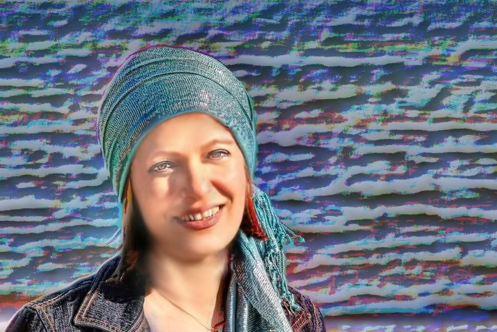
Hi Sedali - nice image with good blue theme in the colours. If I were working on this image, I would crop out the pale blue sky at the top and the sand at the bottom, and crop a very small amount off the right-hand side. Finally, I would remove via cloning the the small blue triangle on the girl's lower neckline.
Cheers
David
-
29th September 2008, 06:38 PM #3

- Join Date
- May 2008
- Location
- Pittsburgh PA, St. Augustine FL
- Posts
- 136
Re: Lady in Blue
I like this in color and composition, typical of many outdoor shots I have taken....
In my opinion, this is a nice point to start developing a portrait.....David suggested changes moving in that direction...following that,
I would do dodging, cloning and burning on the face to improve the lighting...
Then, I would sharpen the eyes and mouth followed by a very mild Gaussian blur to soften the sharpening....
This is the road I would head down....but thats today....and I would put more and better effort into the face work...

Note my secret approach....most lenses seem to widen the ladies face.....so make it a little thinner......Last edited by willgoss; 29th September 2008 at 09:40 PM.
-
30th September 2008, 07:26 AM #4
Re: Lady in Blue
We will all have different interpretations, this is my view:
A more subtle treatment cropping the background and sharpening of the eyes only.Last edited by shreds; 8th April 2009 at 05:15 PM.
-
30th September 2008, 07:47 AM #5
Re: Lady in Blue
mrsedali.....u caught a very pleasant expression
 the twinkle in the eye shows the moment is right too
 light and shadow play is all over the place......... the light on the face, is not enhancing the beauty of the girl........study some simple light patterns and u will do wonders
 mrshreds cropped image is far better than yours
Last edited by taken; 30th September 2008 at 07:49 AM.
-
30th September 2008, 04:09 PM #6
Re: Lady in Blue
I completely agree with you, Taken. The shadows are not helping at all but it is more a result of lack of equipments rather than an artistic expression!
I personally did not like the more dramatic changes Will suggested! I am not even sure if he is joking or not... I like the more subtle changes Shreds suggested.
However, the way he cropped it is not the best way to do it in my view. I think by leaving some of the blue see on the right side of the picture, as suggested by David, it becomes about the harmony between the colors and her eyes, her smile, the sorrow in her face, and the vastness of the sea, much more than a passport sized photo! Am I going to far here?
Sedali
-
30th September 2008, 05:55 PM #7

- Join Date
- May 2008
- Location
- Pittsburgh PA, St. Augustine FL
- Posts
- 136
Re: Lady in Blue
sedalli.....
My suggestions were made before posting the picture......please reread my comments .....following that, I only posted the picture to show that the face and shading and cropping could be improved.....
The enhanced picture was just me playing with an enhancement from a plugin, was did not suggest he do this.....this was to give him suggestion and not to criticize his posting...It is not submitted as a critique, after all this is a commentary and not a critique photo section...
I think he has a good picture, but it should be treated as a portrait as there is nothing else there....it also is typical, in that it needs to be white and color balanced along with some of the suggested improvements....an additional example is the Water (out of focus) that adds nothing to the picture and needs to be addressed (my reason for playing with the plugin)....
-
30th September 2008, 07:02 PM #8
Re: Lady in Blue
Hi Sadali,
In this shot, I agree with Shred's cropping.
Here's what I think.
Use of 1/3 rule is good but I would have the model looking in to the RHS of the picture. For me, eye direction or eye movement just doesn't seem to flow in the original picture.
I'm guessing because the lack of flow, people here are trying to do something about the negative space by either cropping it out or give it a funky treatment.
Just my take on the pic.
Keep it up and chat with ya later.
Ray


 Reply With Quote
