 Helpful Posts: 0
Results 1 to 20 of 20
Thread: Reverse PP
-
22nd April 2010, 02:20 AM #1
Reverse PP
Last edited by McQ; 25th April 2010 at 03:40 AM. Reason: original artist unknown -- try to include in the future
-
22nd April 2010, 08:39 AM #2

- Join Date
- Aug 2009
- Posts
- 4,049
Re: Reverse PP
Alis
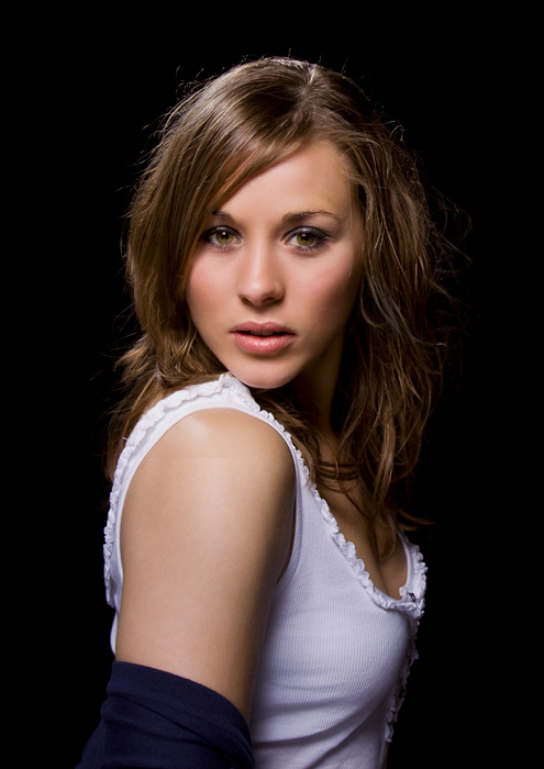
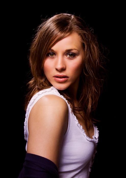
I don't normally like the effect you refer to. But you should be able to make the main adjustment at the RAW stage with the white balance. You can do it after, as I did with the shot below but I normally only do it to non-people shots. I used Optik Verve filters which allow you to set certain colour tints. In this one I used 'Fall colours' which adds a reddy-brown tint, and I think it adds more contrast.
http://www.optikvervelabs.com/
Before...

After Opitk Verve Fall colours added...

-
22nd April 2010, 01:20 PM #3

- Join Date
- Jul 2009
- Location
- Kolkata - INDIA
- Posts
- 537
-
22nd April 2010, 01:30 PM #4

- Join Date
- Jul 2009
- Location
- Kolkata - INDIA
- Posts
- 537
-
24th April 2010, 03:00 AM #5
Re: Reverse PP
Thanks, Rob. Although I think the one I posted looks much warmer and nicer for some reason. As Ashwin mentioned, your version looks oversaturated.
I will download the software and give it a try.
-
24th April 2010, 03:01 AM #6
-
24th April 2010, 06:55 AM #7

- Join Date
- Jul 2009
- Location
- Kolkata - INDIA
- Posts
- 537
Re: Reverse PP
Hi Ali,
There is nothing special in Colour of the photograph you have posted, on the contrary there is bit little BLUE CAST
Skin colour is missing or she may have dark complection.
To me Background colour appears to be normal. Wall bricks are Natural Red, and door also
Pose is also normal ( Not extra ordinary )
Lighting is from Right side of the model - or it may be day light.
Anyhow, photograph is good, pleasant looking...
Is it taken by you.?
-
24th April 2010, 08:39 PM #8
-
24th April 2010, 09:34 PM #9

- Join Date
- Dec 2008
- Location
- New Zealand
- Posts
- 17,660
- Real Name
- Have a guess :)
Re: Reverse PP
Hi Ali,
Judging by the softness of the shadow I'd say the shot probably had a full lighting setup - and so was probably professionally retouched as well. To be honest, the warmth of the image background looks pretty natural to me - which in turn means that (a) it really was like that or (b) the retoucher did their job properly! - so probably one of those situations where I can't give you an answer; only more questions!
For what it's worth though, I have seen bricks that colour - additionally though - it's a trivial matter to produce two versions of the image and create a layer mask to transition between them (the mask doesn't have to be overly precise when dealing with relatively subtle colour saturation differences). The added vingette also gives the illusion that they've controlled the lighting quite tightly around the model and the immediate surroundings.
Why don't you emulate the shot and give us all a crack at replicating the effect?
-
24th April 2010, 09:48 PM #10
-
24th April 2010, 09:49 PM #11
-
25th April 2010, 04:54 AM #12
-
25th April 2010, 09:00 AM #13

- Join Date
- Jul 2009
- Location
- Kolkata - INDIA
- Posts
- 537
-
25th April 2010, 09:05 AM #14

- Join Date
- Jul 2009
- Location
- Kolkata - INDIA
- Posts
- 537
-
25th April 2010, 09:51 AM #15
Re: Reverse PP
Hi Ali,
It's probably not as bad as you think, this photo comes "with baggage" - because it's obviously an indoor shot and we can see outside, the rosy glow effect can be confused in our minds trying to reconcile the WB issues we are looking for in such a picture.
A cone and a tub, wow
(or have you given him yours )
)
As Ashwin says, we know you can do it
I think it does need the right subject photo to work thoughLast edited by Dave Humphries; 25th April 2010 at 10:17 AM.
-
25th April 2010, 10:22 AM #16
Re: Reverse PP
Actually the girl doesn't look right in the location, her hairdo cost more than that flat plus she looks terrified. The flat is probably a council one because only the council choose that colour and single glazed front doors in rough places. There seems to be a change in colour balance and artificial vignetting but that is all.Judging by the softness of the shadow I'd say the shot probably had a full lighting setup - and so was probably professionally retouched as well. To be honest, the warmth of the image background looks pretty natural to me - which in turn means that (a) it really was like that or (b) the retoucher did their job properly! - so probably one of those situations where I can't give you an answer; only more questions!
-
25th April 2010, 12:38 PM #17

- Join Date
- Jul 2009
- Location
- Kolkata - INDIA
- Posts
- 537
Re: Reverse PP
Hi Ali,
Just friendly advice
Don't just shoot, there should be action, or expression. Your Model should not LOOK as if he is inactive, or doing nothing, if he ( your model ) is doing something, he should have his full attention on what he is doing or what he is supposed to do, if surrounding is appropriate to what he is doing will add to realm of the photograph, don't make any arrangement which look artificial.
Choose the Mood, capture his Mood, If he is playing, let him play normally, if he is reading, not only he should look as if he is reading attentively but his entire attention should be on what he is reading.
In outdoor take photograph with natural light. Keep little reflactor handi, for fill in light, or to eliminate harsh shadows on eyes. Don't bother too much on white balancing, it can be done with later on.
In indoor take as much advantage of available light as possible, keep reflactor on stand in such a position that it compliments available light, and use bounce flash.
Hope you will find this unsolicited advice of mine helpfulLast edited by Ashwin; 25th April 2010 at 12:45 PM.
-
25th April 2010, 03:45 PM #18
Re: Reverse PP
It is very helpful, Ashwin. Thanks! As he gets older I will keep these in mind to do them.
My job and other responsibilities do not let me do actual photography. This is just to document his growth. Hopefully, when I have more free time, and I can plan things with him or others, I am sure what I learn here will be even more helpful.
-
25th April 2010, 03:47 PM #19
-
25th April 2010, 03:52 PM #20
Re: Reverse PP
You are absolutely right, Dave! It is not a good picture. I should have picked a similar portrait at least.
About the cone and the cup (tub), it is an American thing. He likes the cone, but they put so much on it (it gets very close to the limits of quantum physics) that for a kid, it becomes impossible to even hold it upright and eat it at a slow fun pace, so what I do is to get a cup also and immediately put the top part of the cone into the cup with a spoon. And believe me it can serve three people. And this is just the kiddie size, they have a large cone that I have never tired before


 Reply With Quote

