 Helpful Posts: 0
Results 1 to 7 of 7
Thread: lightening Spring!
-
23rd April 2010, 03:32 PM #1
-
23rd April 2010, 03:44 PM #2
Re: lightening Spring!
This one looks ok to me. I like bright colours.
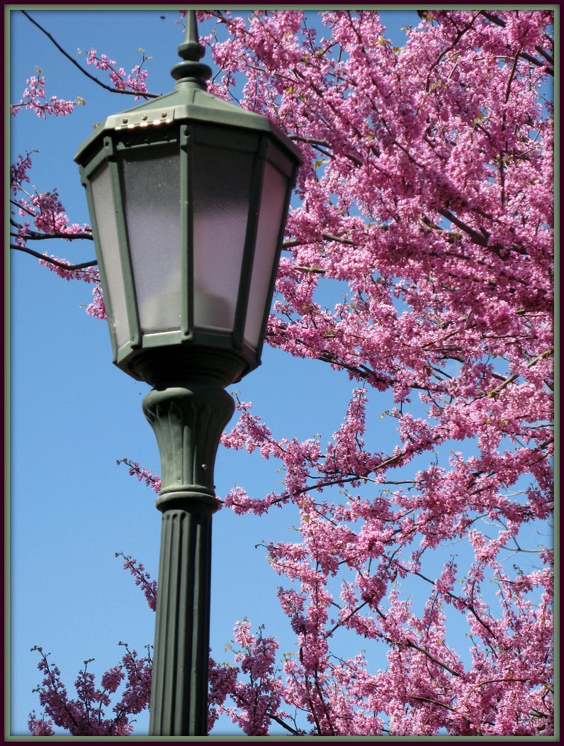
I think the image would look better if the light post's top wasn't cut off and the blossoms were more in focus. A wider aperture might do the trick, but I don't know exactly the scene was. Would you mind posting the EXIF data?
-
23rd April 2010, 08:14 PM #3
Re: lightening Spring!
Hi Jeroen, Carol,
If viewed full screen (in a new window, not the lytebox) and expanded to 1:1, it looks ok focus wise to me on blossom and tree, if anything, it is the lampost which is slightly softer.
I think I agree about ideally being able to see the top of the lamp.
Good exposure and composition.
-
24th April 2010, 02:22 AM #4
Re: lightening Spring!
I like it as a composition. I agree with the top of the lamp suggestions and it has a slight list. It would be interesting to repeat the shot when/if the light comes on....if it can be done.
Chuck
-
24th April 2010, 05:01 AM #5

- Join Date
- Aug 2009
- Posts
- 4,049
Re: lightening Spring!
I like the colours and the use of the lamp against the blossom, but the lamp needs to be occupying about 25% less relative space in the shot than it currently is. At present the lamp looks too dominant.
-
24th April 2010, 07:22 AM #6

- Join Date
- Jul 2009
- Location
- Kolkata - INDIA
- Posts
- 537
-
24th April 2010, 09:45 AM #7
Re: lightening Spring!
The EXIF data is unavailable other than file name, date and time the image was stored. Thanks again for fixing me up. I'm still learning and experimenting and obviously used the wrong settings in this particular image. I use a Canon g7 without any bells and whistles. I really appreciate all your help.


 Reply With Quote

