 Helpful Posts: 0
Results 1 to 7 of 7
Thread: Tomb Raider (HDR)
-
23rd April 2010, 08:16 PM #1New Member

- Join Date
- Apr 2010
- Location
- New Delhi, India
- Posts
- 6
- Real Name
- Tirtha
Tomb Raider (HDR)
-
23rd April 2010, 08:21 PM #2

- Join Date
- Aug 2009
- Posts
- 4,049
Re: Tomb Raider
Hi Tirtha and welcome.
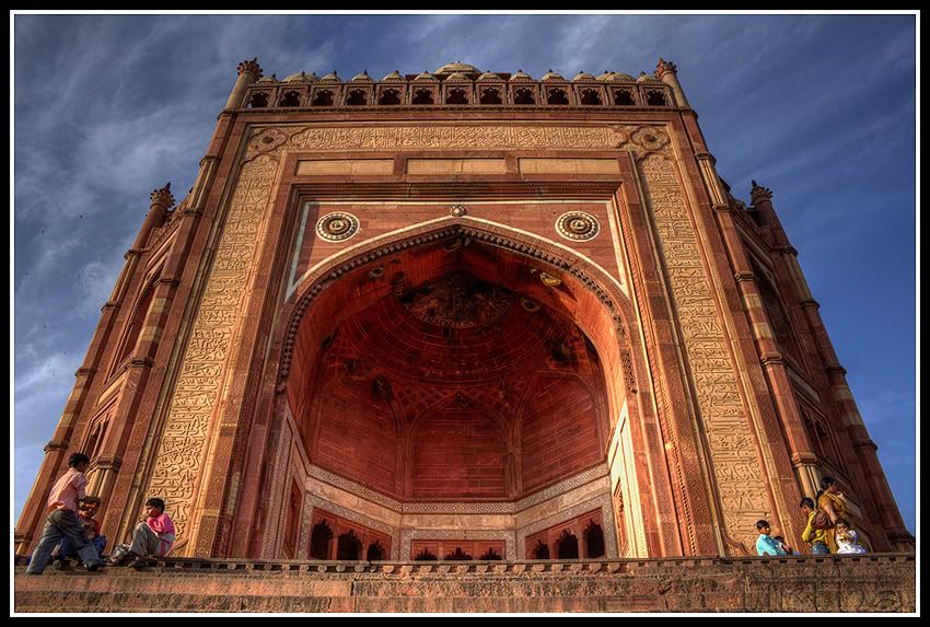
Very good shots - good strong composition and colours. I like the addition of people in #1 as it gives a needed sense of scale. What program did you use for the HDR tone-mapping?
-
23rd April 2010, 08:45 PM #3New Member

- Join Date
- Apr 2010
- Location
- New Delhi, India
- Posts
- 6
- Real Name
- Tirtha
-
24th April 2010, 07:40 AM #4
Re: Tomb Raider
Hi Tirtha,
You'd be surprised how many people forget to do a final re-touch after Photomatix Pro !
These look great, the first is my favourite, good angle and (as Rob says, scale with the people), nice framing and no halos
With #2, as shot from further away; the perspective distortion of camera angle doesn't contribute to the composition as in #1, so I think it might look better with the perspective corrected in CS3 to get the building vertical. Now that isn't something I need to do everyday, so I can't advise exactly how, but looking at it, I suspect it'll need a canvas stretch vertically to avoid it looking too 'flattened' if you just drag the corners outwards alone (clearly you don't want to lose the top of the spires).
A good first pictures post, well done,
-
24th April 2010, 08:36 AM #5New Member

- Join Date
- Apr 2010
- Location
- New Delhi, India
- Posts
- 6
- Real Name
- Tirtha
Re: Tomb Raider
Hi dave, thanks a lot for commenting and for all the inputs. I already have fixed the perspective distortion in this picture. Could not find the copy while posting. Will find it and post it soon.
Photomatix is good for tone mapping but for the final Saturation, color kick and sharpness, I always depend on PS.
-
24th April 2010, 03:03 PM #6

- Join Date
- Apr 2010
- Posts
- 45
- Real Name
- Francisco
Re: Tomb Raider
Very good result, with a single RAW has done a perfect job.
I can see only some saturated reds (I have a Wide Gamut monitor and it shows easily)
-
24th April 2010, 05:42 PM #7

- Join Date
- Nov 2009
- Location
- Chandigarh, India
- Posts
- 1,541
- Real Name
- Sahil Jain
Re: Tomb Raider
Hi, Tirtha. Welcome to the forum. Neat job done with the pic. Like the composition.
I have been there and there is something special about the door, besides it being HUGE. Was it clapping in front of it and it echoing? I was 12-14 when I went there, so have a vague memory.


 Reply With Quote

