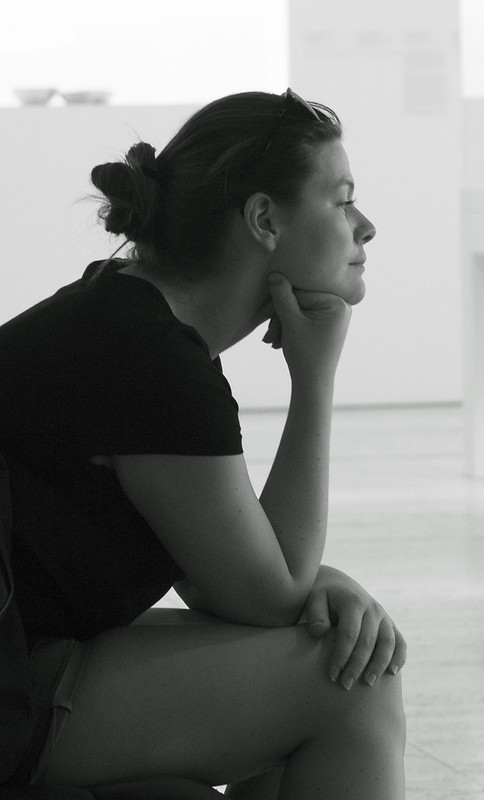
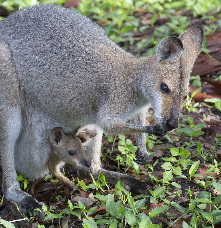
I am starting this in the nick of time for week 1. I would have posted in people and pets except that many of the next items are likely not to be about people.
My objectives are generally to improve what I do, and there are many possibilities for me. I need to improve my aesthetic judgement, find out what makes a good picture and how to see a good picture in what is around me. Your opinions will help me.
Later on, I plan to do some more mini-studio work where I construct a scene rather than just looking at what is there, which will mean developing techniques in lighting.
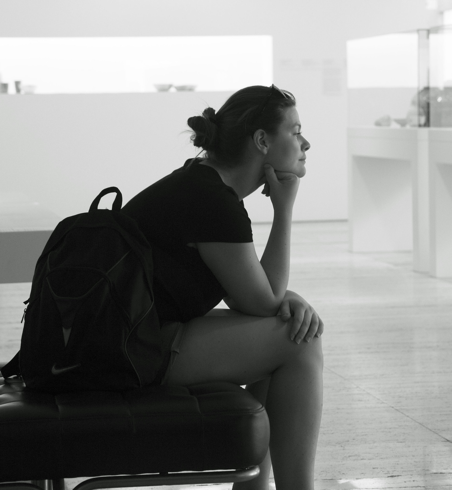
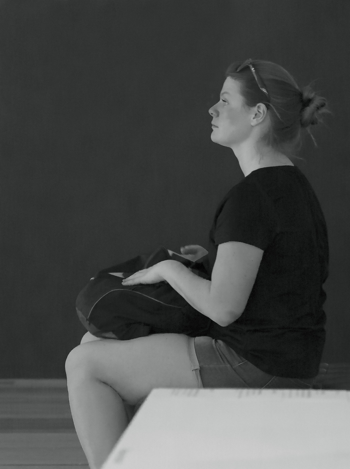
I went to the Queensland Art Gallery today for some street photography, not to photograph art. I don't know if this is strictly street photography. This girl was sitting on a bench in the gallery looking out the window. She is not posing and I think she was unaware that I was photographing her. Somewhat unusually for me, I prefer the black and white versions although I would have been happy to have posted the coloured versions.
Results 1 to 20 of 20
-
4th January 2015, 01:26 PM #1

- Join Date
- Nov 2011
- Location
- Brisbane, Australia
- Posts
- 1,107
- Real Name
- Tony Watts
2015 Project 52, 1st quarter by Tony (TonyW)
-
4th January 2015, 01:39 PM #2
Re: 2015 Project 52, 1st quarter by Tony (TonyW)
Nice start, enjoy your project.
-
4th January 2015, 01:40 PM #3
Re: 2015 Project 52, 1st quarter by Tony (TonyW)
Hi Tony,
it looks street to me, no1 is the better for me but id tighten up the crop to eliminate the bottom of the chair, Street isnt easy and in western culture take a big set of balls to do, so i admire you for having a go! ive done a fair amount of it and find that these images are more dramatic if the subject is more engaged but its a personal preference and much depends on the setting
-
4th January 2015, 06:05 PM #4

- Join Date
- Dec 2013
- Location
- Turkey
- Posts
- 12,779
- Real Name
- Binnur
Re: 2015 Project 52, 1st quarter by Tony (TonyW)
Hi Tony
 I like #1 more and I agree with Mark about cropping the chair.
-
6th January 2015, 01:13 AM #5

- Join Date
- Nov 2011
- Location
- Brisbane, Australia
- Posts
- 1,107
- Real Name
- Tony Watts
Re: 2015 Project 52, 1st quarter by Tony (TonyW)
Thanks John, Mark and Binnur for your comments on my week 1 effort.
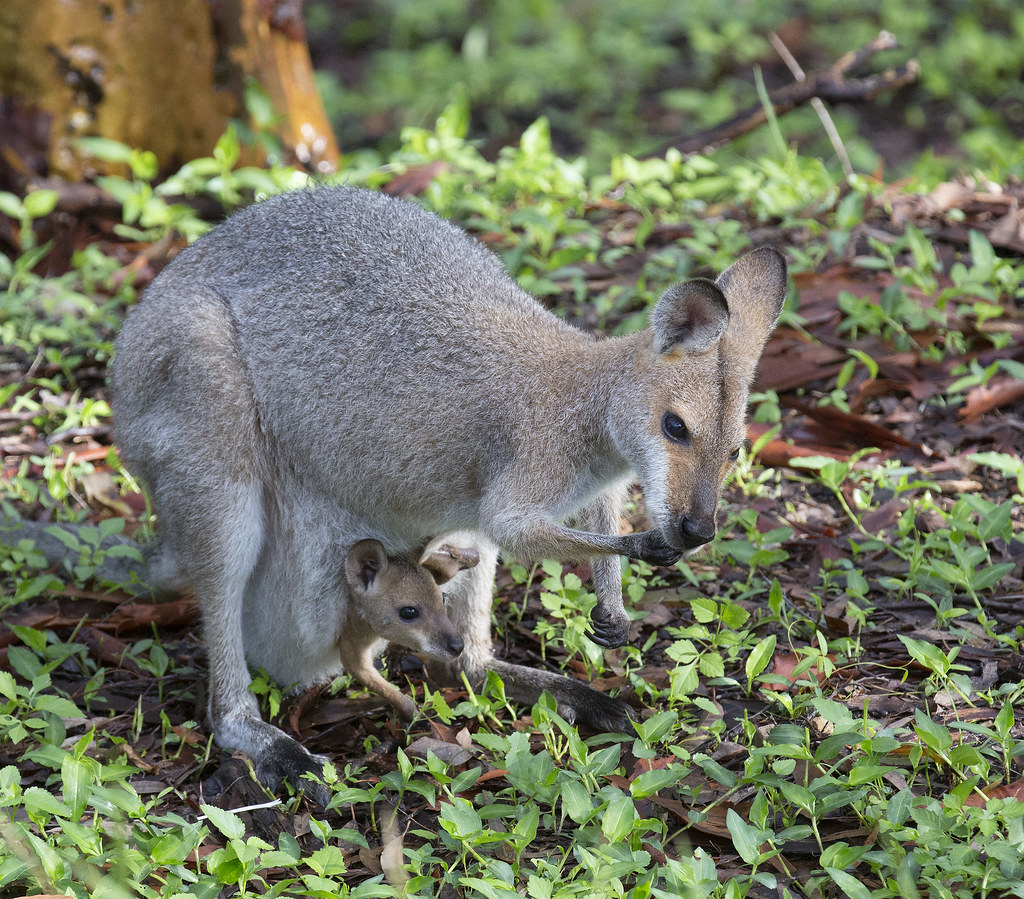
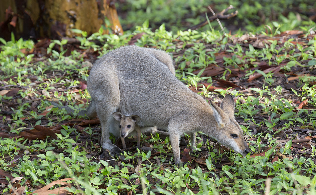
For week 2, I am being less adventurous and reverting to something more usual for me. I went outside to photograph a bird this morning but it flew away and I found this instead. It's cute but not photographically creative.
It's obviously the breeding season. We have had some rain recently and the wallabies are coming up for the freshly growing weeds.
-
6th January 2015, 01:55 AM #6
-
6th January 2015, 02:00 AM #7


- Join Date
- Dec 2013
- Location
- Chesterfield, Missouri/Melbourne, Australia
- Posts
- 17,827
- Real Name
- Izzie
Re: 2015 Project 52, 1st quarter by Tony (TonyW)
In your week 1 I prefer #1 shot too. In Week 2 I love #1 too even if #2 is also cute. It is the actions of both animals that I find very adorable...
-
6th January 2015, 05:41 AM #8
Re: 2015 Project 52, 1st quarter by Tony (TonyW)
Good start Tony, & nice to hear someone else unsure of where to put their project 52 thread lol.
I'm sure no one will mind as some weeks we might have landscape & then others people, the main thing is we're using the project to plan & improve on our work.
Of your week1 pair, the first is a much more striking image in my view, I find myself wondering what she is thinking of and looking at, well done. The only suggestion for improvement is to not crop at the ankles, for some reason people are better cropped higher or ankles included..for some un fathomable reason, but it works
And week 2 the critters are very cute!
Looking forward to sharing the journey with you!
-
6th January 2015, 10:55 AM #9

- Join Date
- Nov 2011
- Location
- Brisbane, Australia
- Posts
- 1,107
- Real Name
- Tony Watts
Re: 2015 Project 52, 1st quarter by Tony (TonyW)
Thanks Izzie and Kay. While I agree that the first of each pair is the better, I feel that each of those needs the other to give a comparison. With the first pair, i like the contrast of the dark skin against the light background and then the light skin against the dark background. Also, I like looking at her hands and the bare thigh gives it a sort of nude look without being erotic or rude.
I hope to do something completely different next week. And being experimental, it won't have the finish that some people would produce.
-
6th January 2015, 01:42 PM #10
Re: 2015 Project 52, 1st quarter by Tony (TonyW)
The first of week one is an interesting image, Tony. I find myself looking at her face and wondering what she is thinking. As the bulk of the interest (for me) is her face, would this make a better head and shoulders image than a full body one?
I like the story told by the week two images! Gotta' get junior a bigger car seat!
-
6th January 2015, 05:27 PM #11

- Join Date
- Dec 2013
- Location
- Turkey
- Posts
- 12,779
- Real Name
- Binnur
Re: 2015 Project 52, 1st quarter by Tony (TonyW)
Lovely shots
 I think I would prefer tighter crops for these cute animals to stand them out more, and may be adding some contrast selectively to the animals would be a good idea , just thinking loudly
-
7th January 2015, 12:19 PM #12

- Join Date
- Nov 2011
- Location
- Brisbane, Australia
- Posts
- 1,107
- Real Name
- Tony Watts
-
7th January 2015, 01:22 PM #13
Re: 2015 Project 52, 1st quarter by Tony (TonyW)
I agree Tony. Much better. When there are people or pets in the scene, the viewer’s eye drawn to faces before other image elements, and on the face, the eyes first.
In both images it is the eyes that set the mood and makes us wonder what they are thinking and planning to do next and that helps communicate a story. Having a story as part of the image enhances it's appeal.
Very well done!Last edited by FrankMi; 7th January 2015 at 07:28 PM.
-
7th January 2015, 06:12 PM #14


- Join Date
- Dec 2013
- Location
- Chesterfield, Missouri/Melbourne, Australia
- Posts
- 17,827
- Real Name
- Izzie
Re: 2015 Project 52, 1st quarter by Tony (TonyW)
Nicer Tony...I agree...what a difference a different crop makes...
-
8th January 2015, 02:57 AM #15
Re: 2015 Project 52, 1st quarter by Tony (TonyW)
That Roo or Wallaby (which?) is really fine! The lighting and detail is super, plus the catch-light in both animals' eyes.
-
11th January 2015, 05:51 AM #16

- Join Date
- Nov 2011
- Location
- Brisbane, Australia
- Posts
- 1,107
- Real Name
- Tony Watts
Re: 2015 Project 52, 1st quarter by Tony (TonyW)
Week 3
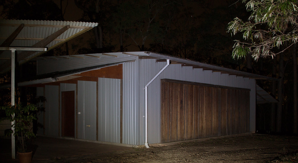
My theme for this week is lighting. The pictures (except for the last but including the one of the torch itself) are lit only by a small LED torch (that's a flashlight for North Americans), about 8 inches long.

A few years ago we had a separate granny flat and shed built. A few weeks ago, the builder came around with a professional photographer to get some pictures for his new web site. I was inspired to go out that night and get a photograph using only the torch for light. The exposure time was 30 seconds.
One of my aims is to learn to do small studio style photography. This is my attempt with a box I made a coupe of years ago now used as a jewellery box by my wife. The torch puts out a blue light so that I had to change the colour balance significantly to get the colours right. Sometimes when I look at this, the perspective looks wrong but it is largely an illusion.

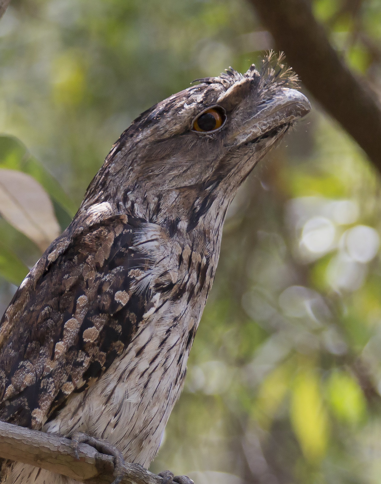
Finally, to continue the head and shoulders theme of the first two weeks, this is the result of some serendipity during the week. This tawny frogmouth was sitting in a tree near our house for a few hours and was not perturbed by me getting quite close.
-
11th January 2015, 06:00 AM #17
Re: 2015 Project 52, 1st quarter by Tony (TonyW)
Very clever Tony, to think outside the box & put different light sources to use!
I have some of those very bright LED torches here, so I should follow your lead & think of something to light them with.
I find the owl image quite wonderful!
It is that good, I feel tempted to suggest cloning out the branch on the right & maybe a teeny lightening of the eye, & toning down a touch the bright spot on the feathers...sorry I have gone all portrait retouching on you here, but I find the image worth it, well done!
-
11th January 2015, 07:43 AM #18


- Join Date
- Dec 2013
- Location
- Chesterfield, Missouri/Melbourne, Australia
- Posts
- 17,827
- Real Name
- Izzie
Re: 2015 Project 52, 1st quarter by Tony (TonyW)
Love it Tony! especially the frogmouth -- I had not seen one like it and you've captured that one well, very sharp and every feather are accentuated..the pearl one is good too but I do not like the shadow that is so harsh on the box at the RHS. I suggest putting a velvet layer at the bottom of the necklace. The granny flat is a good lighting experiment and from the looks of it, when it is not used as a granny flat anymore will be a good place to transform it into a studio...
-
11th January 2015, 10:54 AM #19
Re: 2015 Project 52, 1st quarter by Tony (TonyW)
Nice Idea Tony, gunna try some light painting when i go ho home...
-
11th January 2015, 12:54 PM #20

- Join Date
- Nov 2011
- Location
- Brisbane, Australia
- Posts
- 1,107
- Real Name
- Tony Watts
Re: 2015 Project 52, 1st quarter by Tony (TonyW)
Kay, Izzie and Mark, thanks for the comments.
Kay, I agree about lightening the bright spot on the bird. I have already brightened the eyes a little but will try some more. I tried to clone out the tree as you suggested but couldn't do it without spoiling the eaters sticking out in front.
Izzie, I should try to soften the shadow. Normally, it would require an extra light but with the constraint I am imposing on myself I would have to do it with a passive reflecting surface. I could use the shed as as studio but it is far too messy at present.

 Helpful Posts:

 Reply With Quote
